
The Secret to Beautiful Websites (Without Being Creative)

Prefer to watch?
Here’s the video!
Mentioned in the Video:
*Yup - that’s an affiliate link! My margarita fund thanks you kindly!
Rather read all about it?
Picture this: You're sitting in front of your computer, staring at a blank Squarespace template.
Your client is eagerly awaiting a stunning website, but your mind feels as blank as the screen in front of you.
Sound familiar? Don't worry—you're in good company.
What if I told you that the less "creative" you think you are, the better your designs could be?
I know, it sounds about as likely as me turning down a perfectly creamy gelato on a hot summer's day.
But stick with me here, because I'm about to let you in on a little secret that changed everything for me.
Confession Time: I'm Not a "Creative Genius" Either
Here's a tidbit about yours truly that might surprise you: I used to design websites for a living, and spoiler alert—I'm not exactly the 'creative genius' type either.
Shocking, right?
It's like finding out your favorite French patisserie doesn't actually make their croissants from scratch (the horror!).
I vividly remember sitting in front of my screen, feeling completely stuck. I was convinced I wasn't creative enough to design anything worth looking at. It felt like everyone else had this magical ability to conjure up beautiful designs out of thin air, while I was stuck trying to make sense of a Squarespace template on a Monday morning (and we all know how those go).
But then... I figured out the secret. And no, it doesn't involve channeling your inner Picasso or having a eureka moment in the shower (though I won't discourage either of those things).
It's Not About "Seeing" It All at Once
Here's the thing—I can't just 'see' a finished design in my mind's eye.
My husband? He's one of those people who can look at our backyard and instantly envision it transformed with a majestic oak tree here and a cozy fire pit there.
Me? That's about as likely as me gracefully navigating a packed Parisian metro during rush hour.
I used to think this was a major flaw. I mean, how could I possibly be a designer if I couldn't picture it all perfectly from the start?
But then I had a revelation…
The Truth About Creativity in Web Design
Here's what I've learned: creativity in web design isn't about having some grand vision that pops into your head fully formed.
It's about piecing things together, bit by bit, like assembling a jigsaw puzzle.
Most of my best designs come from trial and error, from actually putting things together and seeing what works. I rely on tools like they're my trusty Strathberry bag—essential, stylish, and always there when I need them.
So, are you ready to learn how to create beautiful websites without feeling like you need to be the next Monet? Let's dive in, shall we?
Practical Steps to Web Design (Without Needing to Be 'Creative')
Here are my tried-and-true steps for designing beautiful websites, even if you think you're about as creative as a potato (which, by the way, can be quite versatile in the right hands).
Step 1: Start with Inspiration (AKA: The Pinterest Binge)


First things first: before you even think about your client's content, it's time for a good old-fashioned inspiration binge.
This is where I gather all the things that make my design-loving heart skip a beat—colors, layouts, even elements from nature that catch my eye.
My go-to tool? Pinterest.
It's like the digital equivalent of that perfectly curated mood board (minus the need for thumb tacks and a steady hand).
But here's a little secret: I don't just look at websites. Some of my favorite inspiration comes from unexpected places:


Packaging design (because who doesn't love a beautifully wrapped French soap?)
Interior design (think less "Live, Laugh, Love" signs and more "effortlessly elegant Parisian apartment")
Fashion (Sézane lookbooks, anyone?)
There's something magical about how a beautifully designed package or a chic room comes together that can spark ideas for web design.
It's like finding the perfect accessory that ties your whole outfit together—suddenly, everything clicks.
Remember, you don't need to have the whole design in your head before you start. This step is about building a foundation to work with. And trust me, once you have these inspiration boards in front of you, things start to fall into place.
Step 2: Dive Into Your Client's Content
Next up, it's time to cozy up with your client's content.
This step is key because, surprise surprise, your client's words, story, and brand messaging are going to guide the design, not your supposed lack of creativity.
Think of it like this: if your client's content was an outfit, your job is to be the stylist who makes it look fantastic.
You wouldn't try to squeeze a cozy, hygge-inspired brand into a sleek, minimalist design, would you? (If you would, we need to have a serious talk about fashion crimes.)
Here's how I approach it:
Read through all the content carefully. Don't worry about designing yet- just focus on understanding what the content is asking for.
Look for key elements that stand out. Is there a bold, attention-grabbing headline that's begging for center stage? Or maybe a series of detailed service descriptions that need some breathing room?
Consider the overall tone. Is it playful and energetic? Serious and professional? Warm and inviting? This will guide your design choices later on.
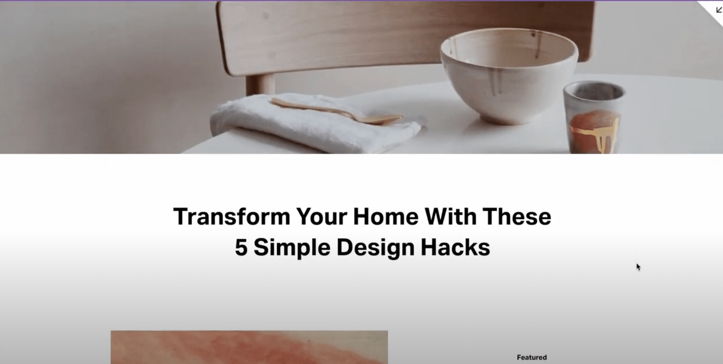
For example, let's say your client has a bold headline like:
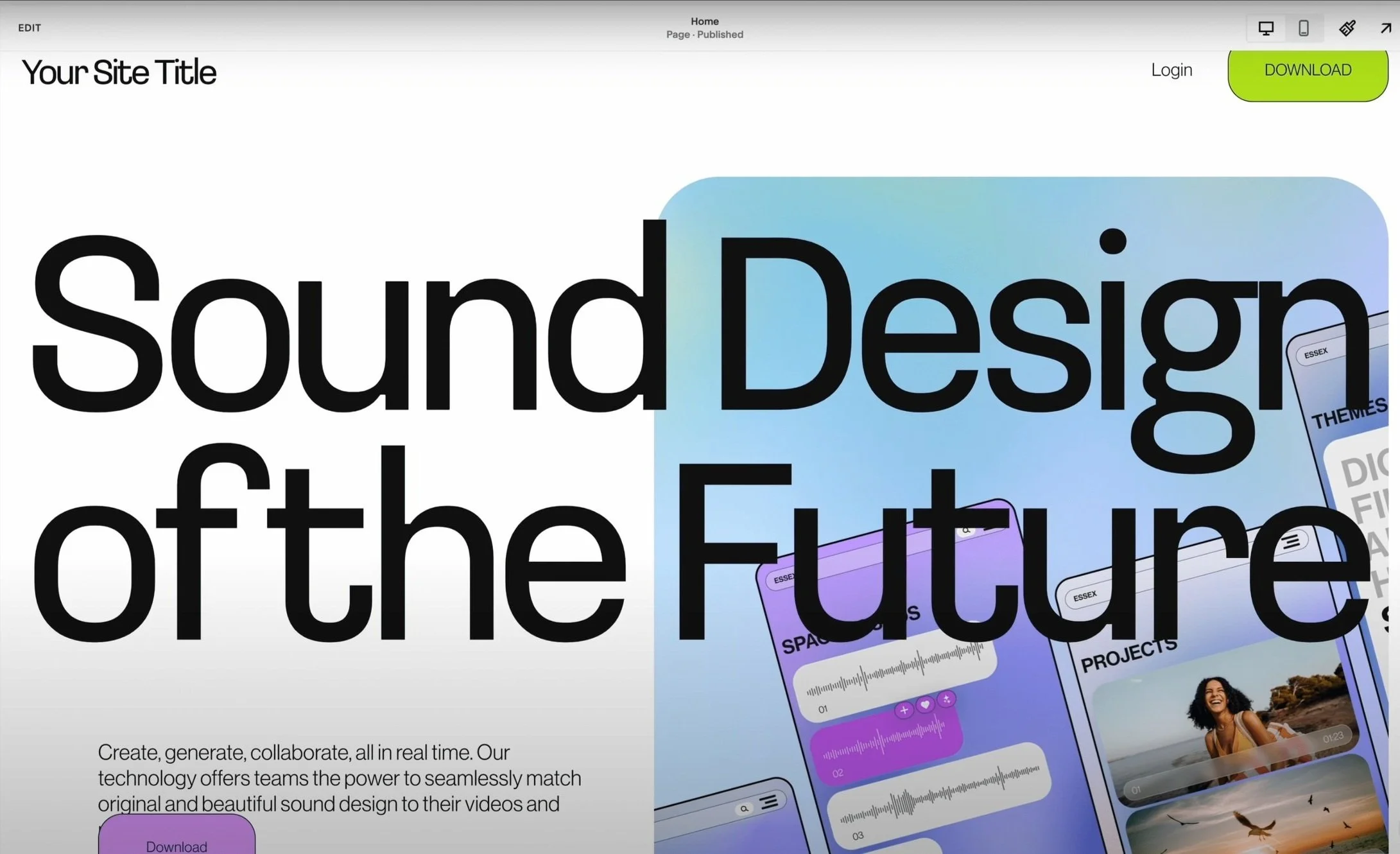
"Transform Your Home with These 5 Simple Design Hacks"
This might work best with a bold centered layout - something that gives the headline space to breathe and grabs attention once the page loads. 👇
On the flip side, if you're working with more detailed content, like a story or a description of a service, you might need a more subtle layout with smaller sections or columns to make those paragraphs of text easier to read. 👇
See how this takes the pressure off? ✨
You're not designing in a vacuum. The content is already doing half the work for you by showing you what type of layout makes the most sense.
In the next steps, we'll look at how to match this content with the perfect layout and make those final tweaks that'll have your design looking more put-together than a Parisian's capsule wardrobe.
Step 3: Match Content with Layout (It's Like Playing Dress-Up, But for Websites)
Alright, now we're getting to the fun part. With your inspiration board at the ready and your client's content in hand, it's time to play matchmaker.
Think of it like a puzzle: for each piece of content (be it a headline, testimonial or service description, you’re looking for the layout that makes the most sense and fits to that message.
Start with the big pieces: pick out the most important content elements. Maybe it's that attention-grabbing headline or a key product image.
Find the right fit: For each piece of content, look for a layout that makes it shine.
Create a hierarchy: Not everything can be the star of the show. Decide which elements need to stand out and which can play a supporting role.
Let's break it down with some examples:
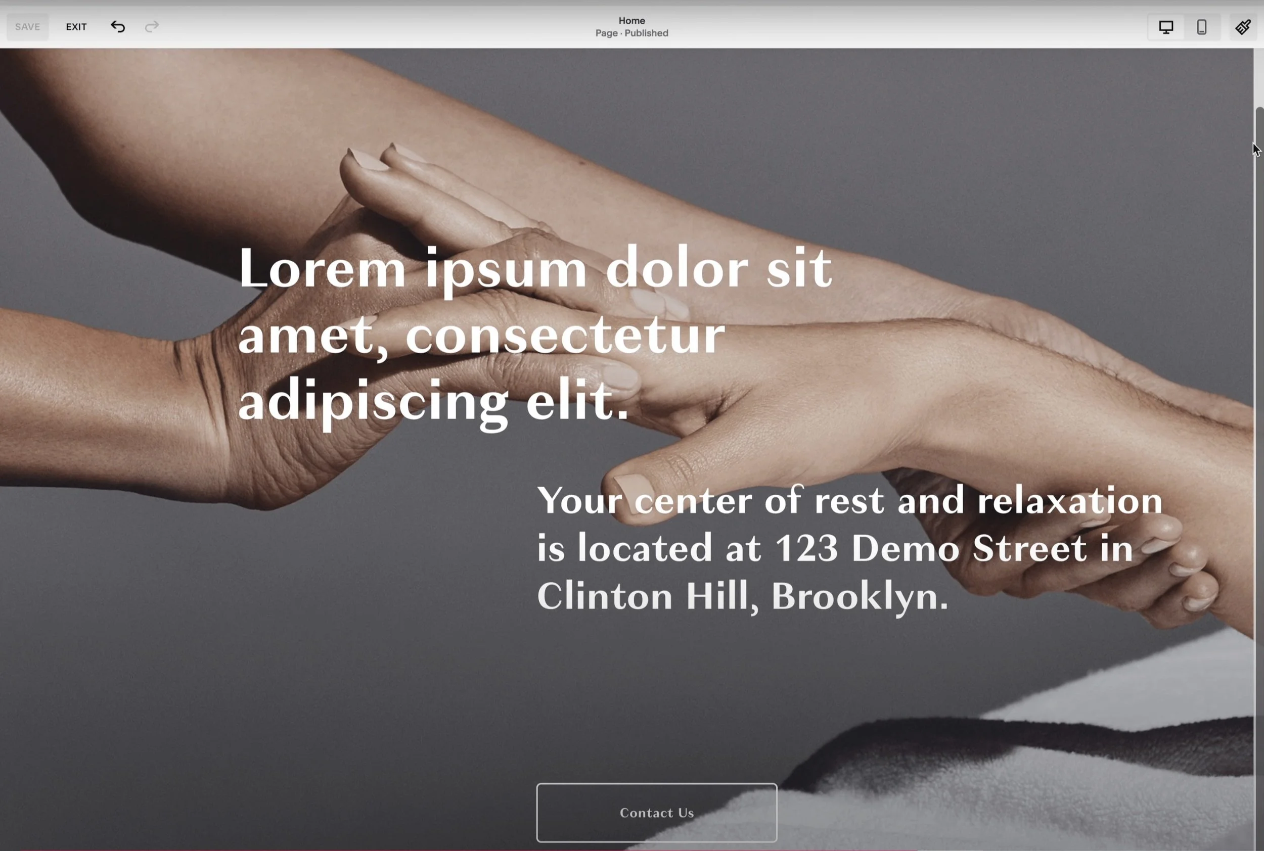
Lets say your client has a simple but bold testimonial.
You might go for a layout with really clean lines and central text to draw attention to it. 👇

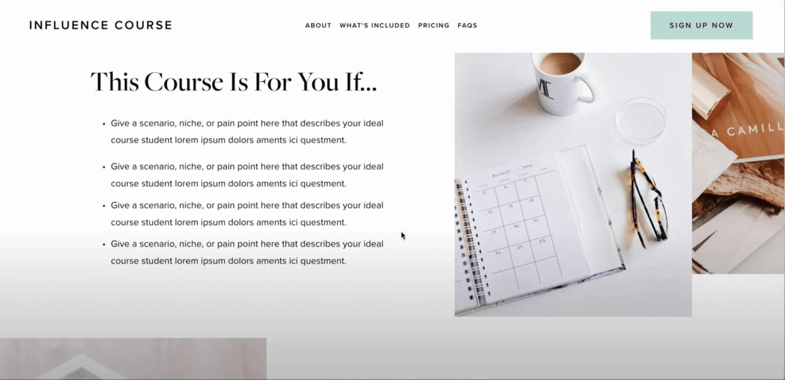
Working with more detailed content like a service breakdown?
Opt for something that gives space for multiple sections like a layout with columns or icons.
This makes the intense amount of text more skimable and digestible. 👇

Remember, the goal here is to make the content easy to read and visually appealing without overcomplicating things.
Once you’ve matched the content to the right layout, the design process starts to naturally flow from there. ✨
Step 4: Trust Your Gut + Tweak as You Go (AKA: The Fun Part)
Now, here's where the magic really happens. Once you've got your layout and content cozied up together, it's time to step back and listen to your gut.
Does something feel off?
Here’s my step-by-step for you:
Take a breather: Step away from your design for a bit.
Trust your instincts: If something feels off, it probably is.
Make small adjustments: Sometimes, the tiniest tweaks can make the biggest difference.
Let's look at some common tweaks and how to handle them:
Spacing issues:
Say you’ve placed a headline at the top of the page but it just feels too cramped because there’s not enough breathing space around it. 👇
Thats a sign that your spacing or margin needs adjusting.
Give the elements more space to breathe and suddenly the whole design will feel a bit lighter and more balanced.
Color clashes:
Color is a big one. Say you've paired a bright neon pink with a natural, earthy brown and yellow tones.
That can feel jarring because the nyon clashes with the earthy muted shades.
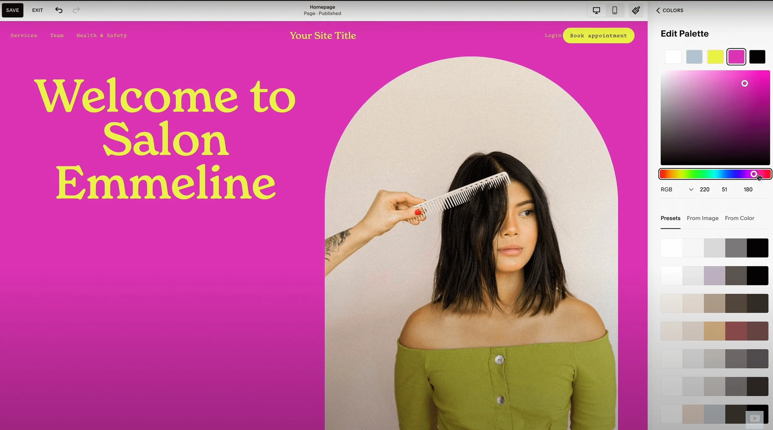
Try adjusting to more complementary colors, like swapping the neon for a soft pastel pink instead of nyon and the whole design will start to feel more cohesive and balanced.
Font fiascos:
Fonts can definitely throw things off. If your body text is competing with your headlines, it's like having your accessories overshadow your outfit.
Try using a lighter font weight or a simpler typeface for body text to restore balance and also make it easier to read.
Awkward images:
Sometimes an image just feels out of place.
Maybe it’s too large or doesn’t align with the other elements on the page.

Try resizing or repositioning it until it feels right.
Remember, there's no one-size-fits-all solution here.
It's all about what feels right for your specific design.
And if you're not sure about a change? Duplicate your design and experiment!
The key takeaway? Trust your instincts. You've got better taste than you think, I promise.
Alright, let's address the elephant in the room (or should I say, the blank Squarespace template on the screen). If you're still thinking,
"But Paige, I'm just not creative enough for this,"
I'm going to let you in on a little secret: It's likely not that you're not creative—you're just afraid.
That fear? It stops all your creative ideas before they even have a chance to bloom.
When you're new to something—like web design—it can feel overwhelming because you haven't built up your confidence yet. But here's the truth: that nervousness is blocking your creative potential.
A web design project might feel daunting, but when you have clear steps to follow, that fear starts to melt away.
I know that first step is the hardest, but trust me, once you get going, the process becomes so much easier. It's like learning to ride a bike—wobbly at first, but before you know it, you're freewheeling down the Champs-Élysées (metaphorically speaking, of course).
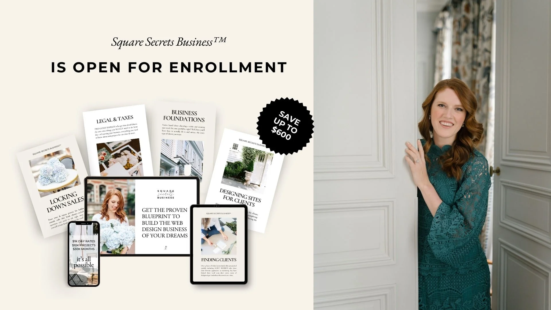
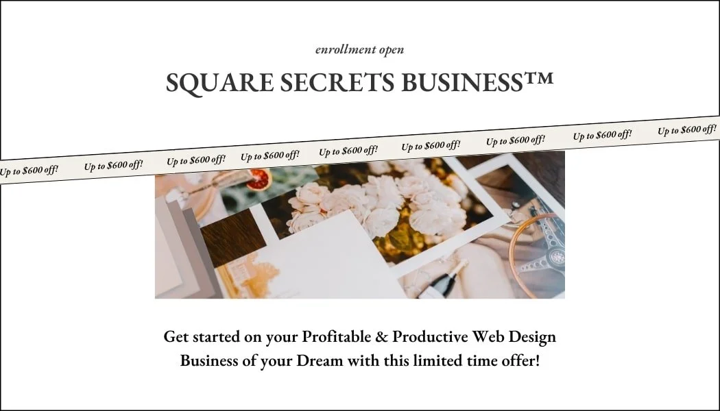
That's exactly why I created my course Square Secrets™to teach you the technical steps of building beautiful, strategic websites on Squarespace.
Inside Square Secrets™, I guide you through everything, from designing layouts to creating a website that not only looks great but works strategically. You don't have to guess your way through it or feel like you're not 'creative enough'—I'll show you the exact steps to follow, like a GPS for your web design journey (minus the frustrating "recalculating" moments).
Now, I hear you thinking,
"But Paige, what about the business side of things?"
Don't worry, I've got you covered like a perfectly tailored trench coat.
You can bundle Square Secrets™ with Square Secrets Business™, my course that teaches you how to turn your web design skills into a thriving business. With the bundle, you'll get everything you need—from mastering website design to building a profitable business that lets you work from wherever your heart desires (hello, remote work from Bali!).
Here's the exciting part—my courses are only open for enrollment a couple of times a year, and right now is one of those golden moments.
It's like stumbling upon a Sézane sample sale- you don't want to miss this opportunity!
Imagine the confidence you'll feel when you can design beautiful websites and run a successful web design business.
Whether you're building your first site or landing your next dream client, these courses will give you the tools you need to thrive.
Not only will you have the skills, but imagine having built a lifestyle-first business.
One that allows you to live the life you've been dreaming of - whether that's having the flexibility for school pickups, indulging in your favorite morning Pilates class, or maybe even both! 🧘♀️
I've been where you are—feeling unsure of my creativity, wondering if I could really build websites people would love.
But with the right steps, I figured it out, and I want to help you do the same. And when you join, you're not just getting courses—you're joining a community of like-minded women who are creating their own web design businesses.
It's like finding your tribe, but with better website portfolios.
Join Square Secrets™ and get all the tools to start building beautiful websites. Or, if you're ready to go all in, grab the bundle and learn how to build your entire web design business from the ground up.
So, what do you say? Are you ready to turn that "uncreative" mindset into your secret weapon for web design success? Your beautiful future is just a click away!
You’ll Also Love...
How To Charge More As a Web Designer: A Guide to High-Value Niches
Niching Early: How Charlotte Quickly Filled Her Calendar as a New Web Designer
How This Stay-At-Home Mom Earns $6K/Month Working Just 10 Hours/week
From Burnout to a Thriving, High-paying Web Design Business - Diane’s Story
The Ugly Truths of Being a Web Designer (And Why It’s Still Worth It)