12 Beautiful Squarespace Website Examples for Interior Designers
An interior designer's website has a harder job than most. Your clients are hiring you for your eye, so the site itself is the first room of yours they ever walk into. If it feels considered, they assume your work is too.
The good news is that Squarespace suits interior designers beautifully. It handles large photography well, the typography options are lovely, and you can update your own portfolio without calling anyone.
We went through hundreds of interior design websites to find twelve built on Squarespace that we think get it right. For each one we've noted what we love and one idea you can borrow. And if you would rather hand the whole thing over, our team of Squarespace website designers builds custom sites for studios just like these.
1. Sabrina Barazin Studio
Montreal, Canada · sabrinabarazinstudio.com
We love how brave this one is. The homepage opens on a deep oxblood background, with the studio name in an enormous cream serif that overlaps two offset photographs, and it closes on an olive footer where the name runs edge to edge in chartreuse. In between, everything calms down: a short description, three recent projects, a portrait of Sabrina. The colour does exactly what her interiors do, which is the whole point. You know within two seconds whether this is your designer.
Idea to borrow: Pull your site's colour palette from your own projects. If your rooms are rich and moody, a white website undersells you.
2. Logan Killen Interiors
New Orleans, USA · lkistudio.com
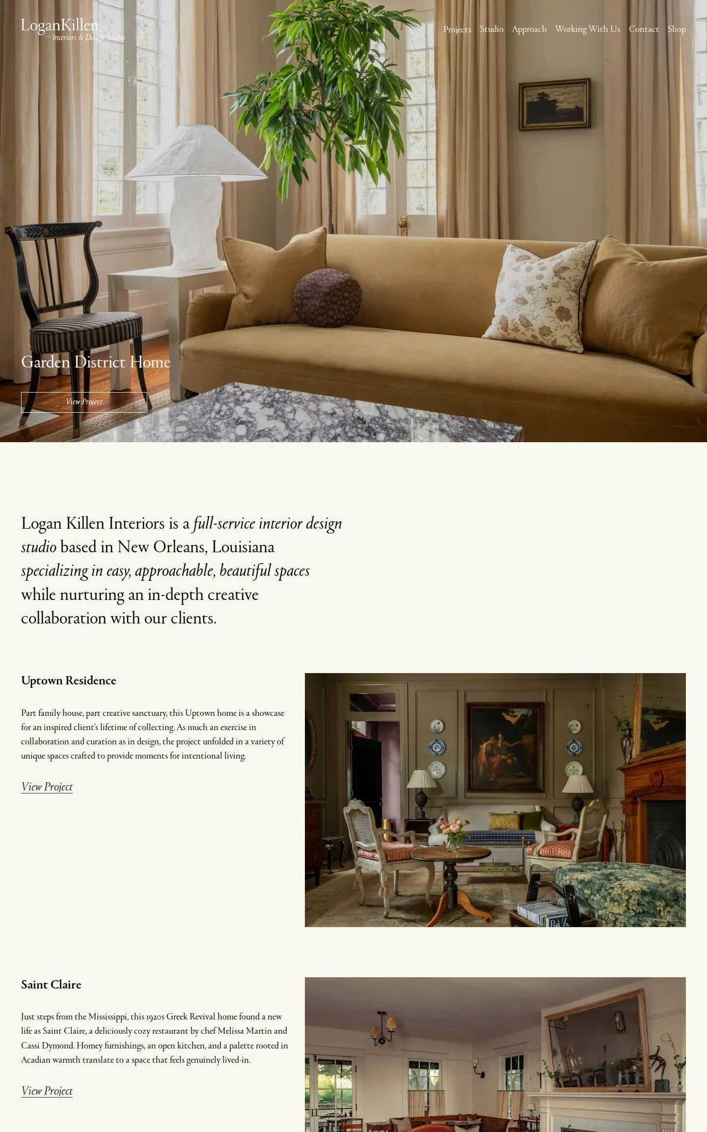
We love the pacing here. A full-screen photograph opens the page, then a single sentence in a large serif tells you who they are, where they are, and what they do, with the key phrases set in italics. Three featured projects follow, each with a short story on the left and one large photograph on the right. Those little project descriptions are beautifully written and make you want to click. A warm portrait of the two founders closes the page.
Idea to borrow: Write two or three sentences about each featured project. A story about who lives there sells far more than a project name alone.
3. Decorotation
San Francisco Bay Area, USA · decorotation.com
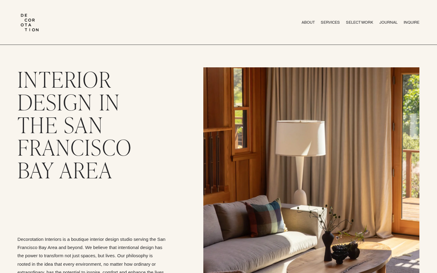
We love that this feels like a design magazine. A very large, light serif headline states plainly what the studio does and where, and then project photographs appear at different sizes in a staggered layout, each with a small caption giving the location and project name. Thin lines divide the sections, and a scrolling band of press names runs across the page. Nothing is centred in a predictable grid, so your eye keeps moving.
Idea to borrow: Vary the size and position of your portfolio images instead of using an even grid. It instantly looks more editorial.
4. A.LONDON
London, UK · a-ldn.com
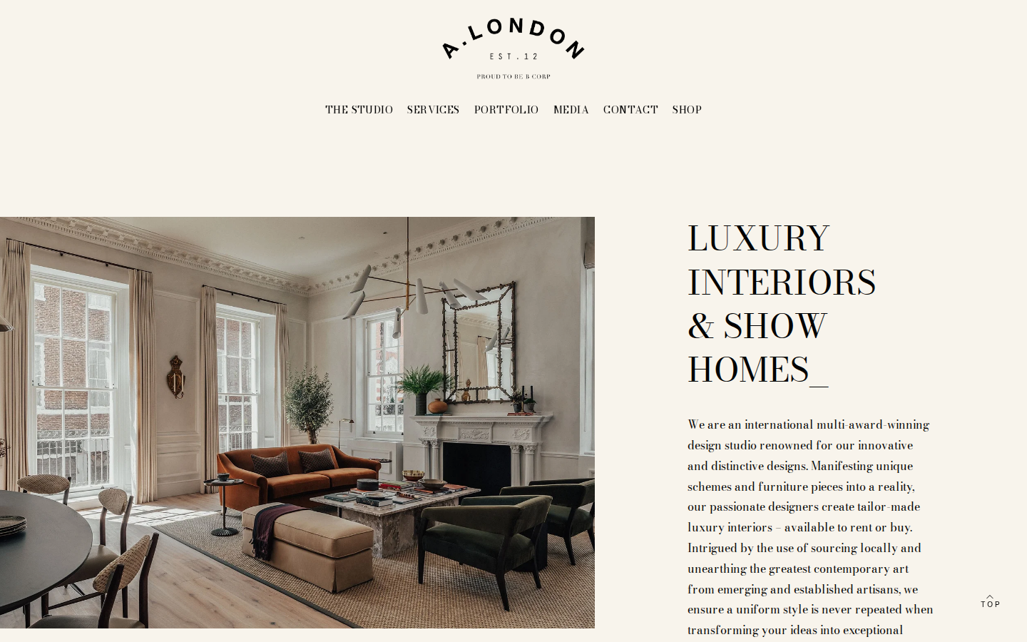
We love how much trust this homepage builds. On a soft cream background, a high-contrast serif headline sits beside the hero photograph, and directly below it comes a large client testimonial with award badges alongside. Further down, a press section shows publication names laid over project photographs. By the time you reach the contact link, you have seen the work, heard from a client, and seen who has featured them.
Idea to borrow: Move your best testimonial up to just under the hero. Most studios bury theirs at the bottom where few people scroll.
5. Kobel + Co
USA · kobelandco.com
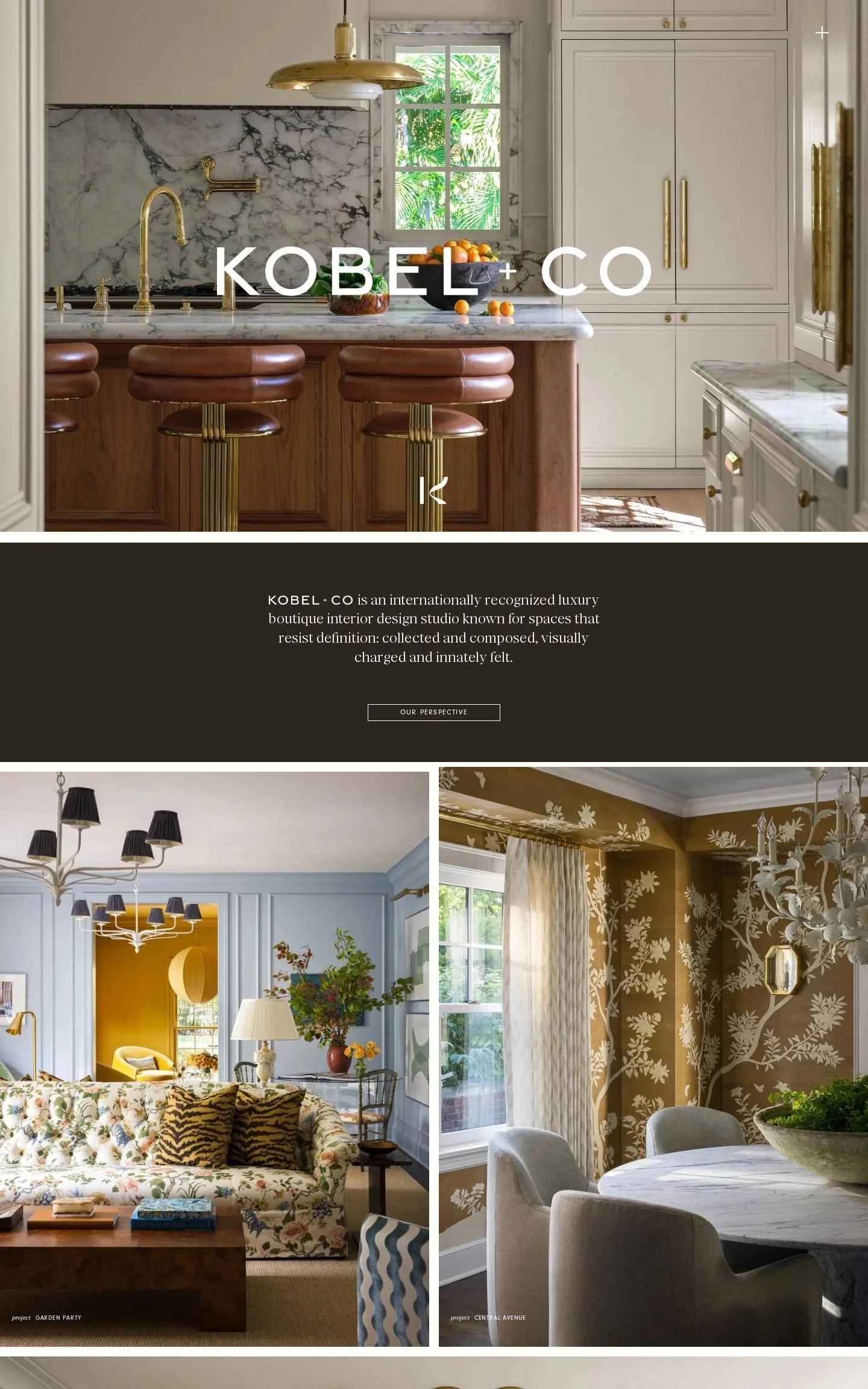
We love how this reads like the opening pages of a design book. The studio name sits in large white letters over a full-screen kitchen photograph, a dark band below carries one short paragraph and a single button, and then the photographs take over: two side by side, one full width, two side by side again, separated only by thin white lines. Each has a tiny caption with the project name. There is nothing else, and nothing else is needed.
Idea to borrow: Alternate pairs of images with one full-width image. The rhythm keeps people scrolling far longer than an even grid.
6. Claudia Pakes Design Studio
Austin and the Texas Hill Country, USA · claudiapakes.com
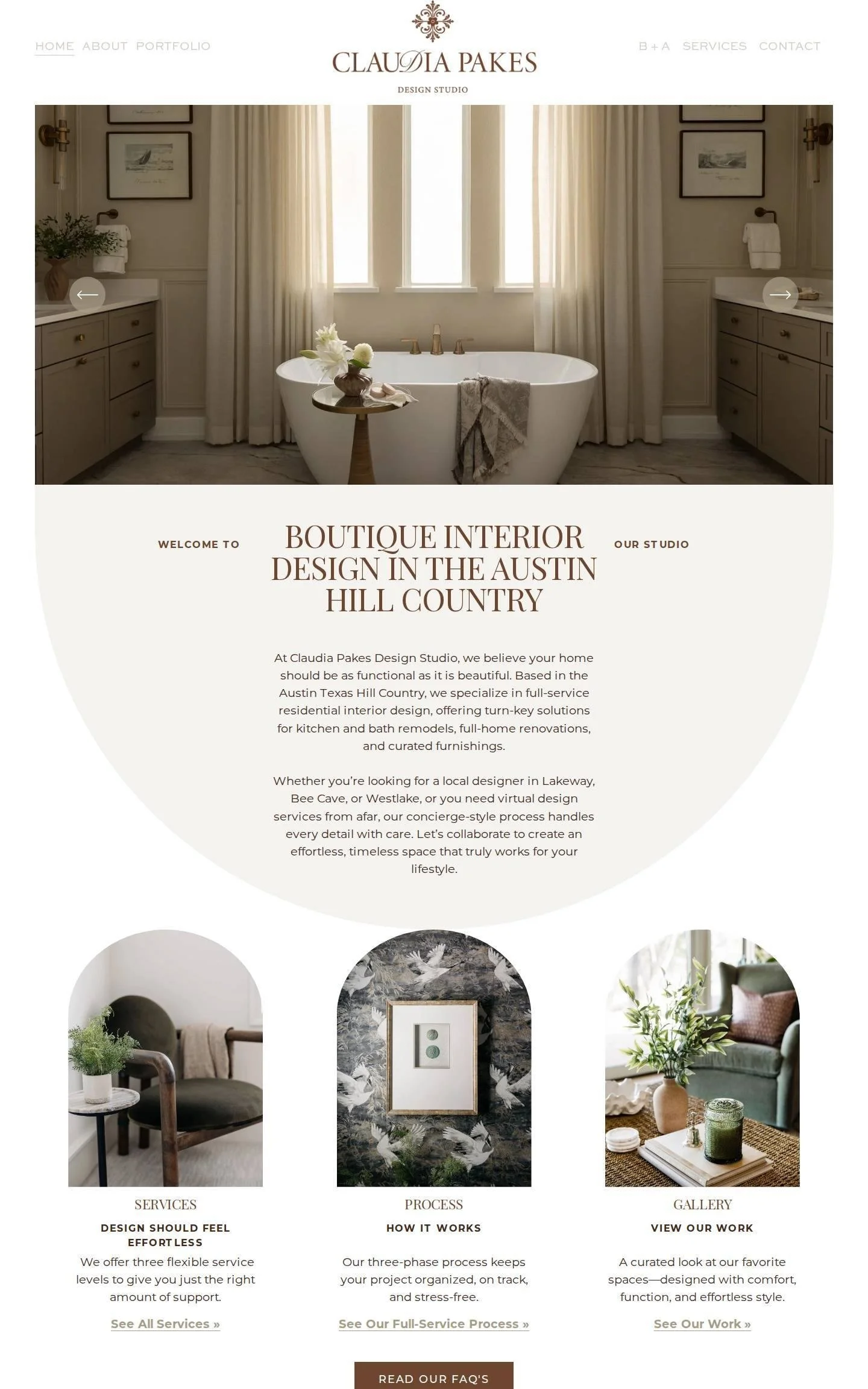
We love the shapes. The introduction sits inside a large semicircle, three arch-topped photographs lead to Services, Process and Gallery, and another image is cropped into a circle. Combined with warm terracotta headings, the curves make the whole site feel soft and welcoming. There is also a before and after gallery, and a simple strip listing each town the studio serves, which is quietly very good for being found on Google.
Idea to borrow: List the towns and neighbourhoods you serve on your homepage. It helps local clients, and search engines, know you work near them.
7. Jessica Nelson Design
Seattle, USA · jessicanelsondesign.com
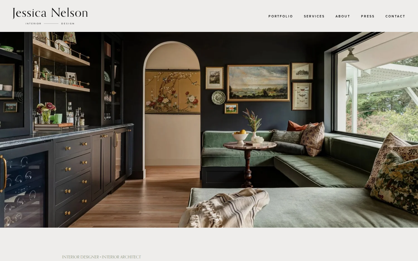
We love how clearly this site leads you to the next step. After a moody dark green opening, you meet Jessica in a portrait beside a button inviting you to learn about the studio's design process. Then come four project thumbnails, a client testimonial in a framed box, and three clearly named service packages for new construction, remodels and full furnishing. The page ends with a friendly invitation to schedule a consultation.
Idea to borrow: Name your services after the client's situation, such as "Remodel" or "New Construction", so visitors can find themselves straight away.
8. Sarah Montgomery Interiors
Chicago, USA · sarah-montgomery.com
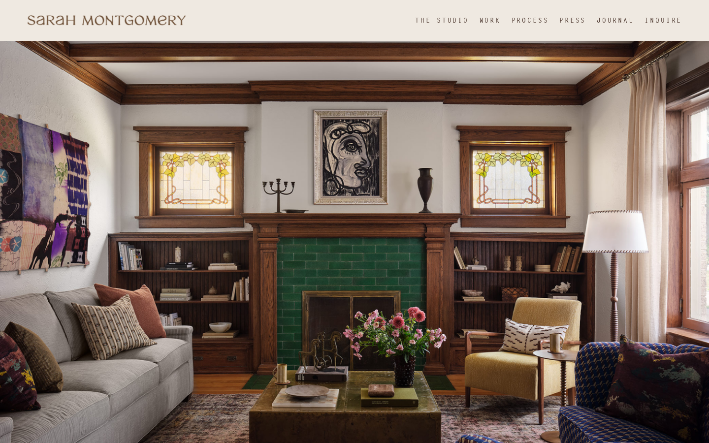
We love the typography. A soft, slightly retro serif is used for the logo and headings, and the body text is set in a typewriter-style font in olive green, which is unexpected and completely suits her artistic, colourful rooms. The page moves from a clear headline, to a portrait and short biography, to a row of magazine logos, to a full-width photograph of a dining room with a patterned ceiling. A short list of frequently asked questions closes the page.
Idea to borrow: Add four or five frequently asked questions to your homepage. They reassure clients and help you appear in Google for those exact questions.
9. Sisällä
Melbourne, Australia · sisalla.com.au
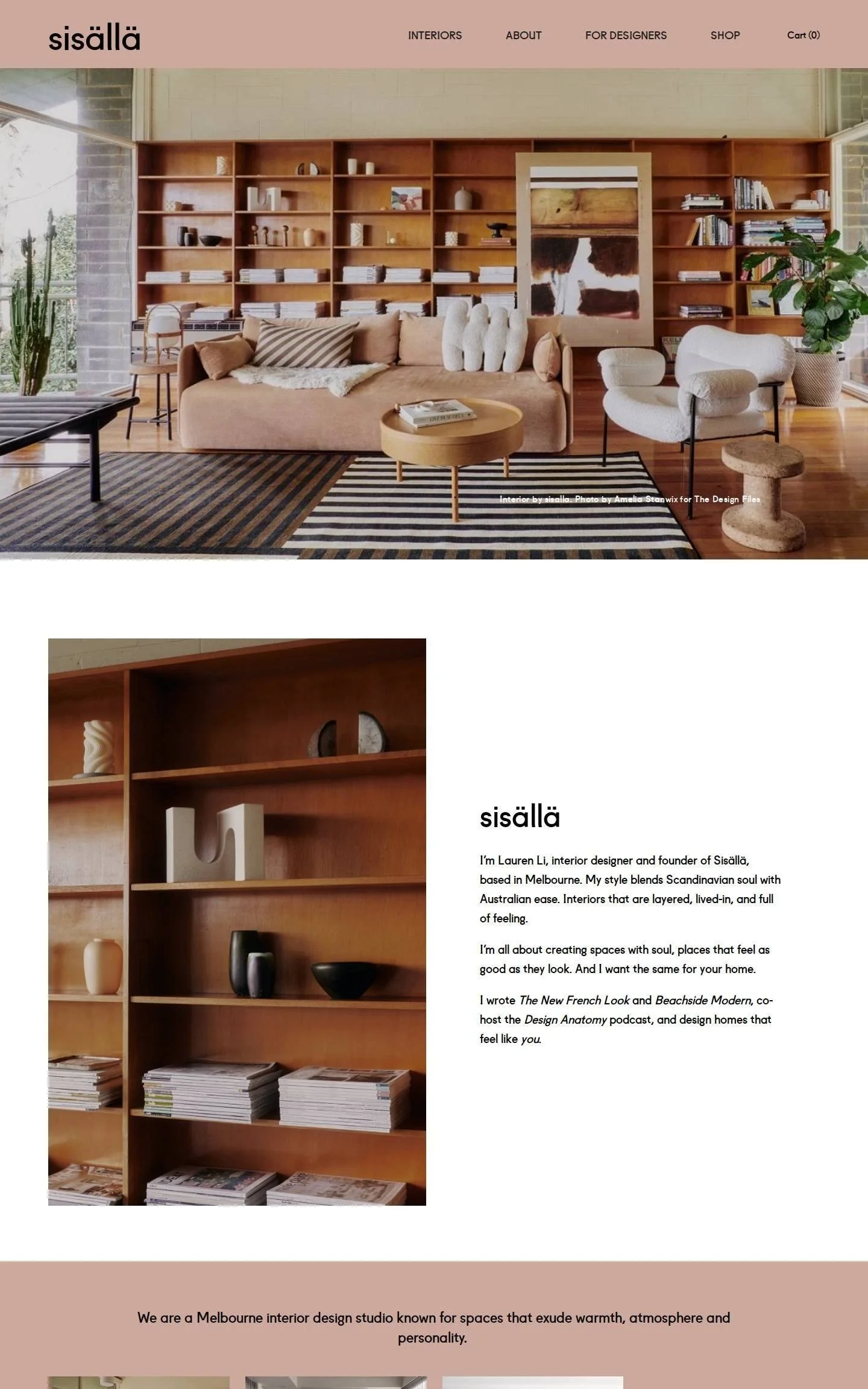
We love how warm and simple this is. A dusty pink header and matching panels frame photographs full of timber, books and stripes. Founder Lauren Li introduces herself in the first person in three short paragraphs, and mentions her books and podcast along the way, which is credibility without any boasting. A row of four projects and one black button are all the page needs to send you into the portfolio.
Idea to borrow: Introduce yourself in the first person near the top. "I'm Lauren" feels much closer than "our studio was founded in".
10. Studio HA/WA
Toronto, Canada · studiohawa.com
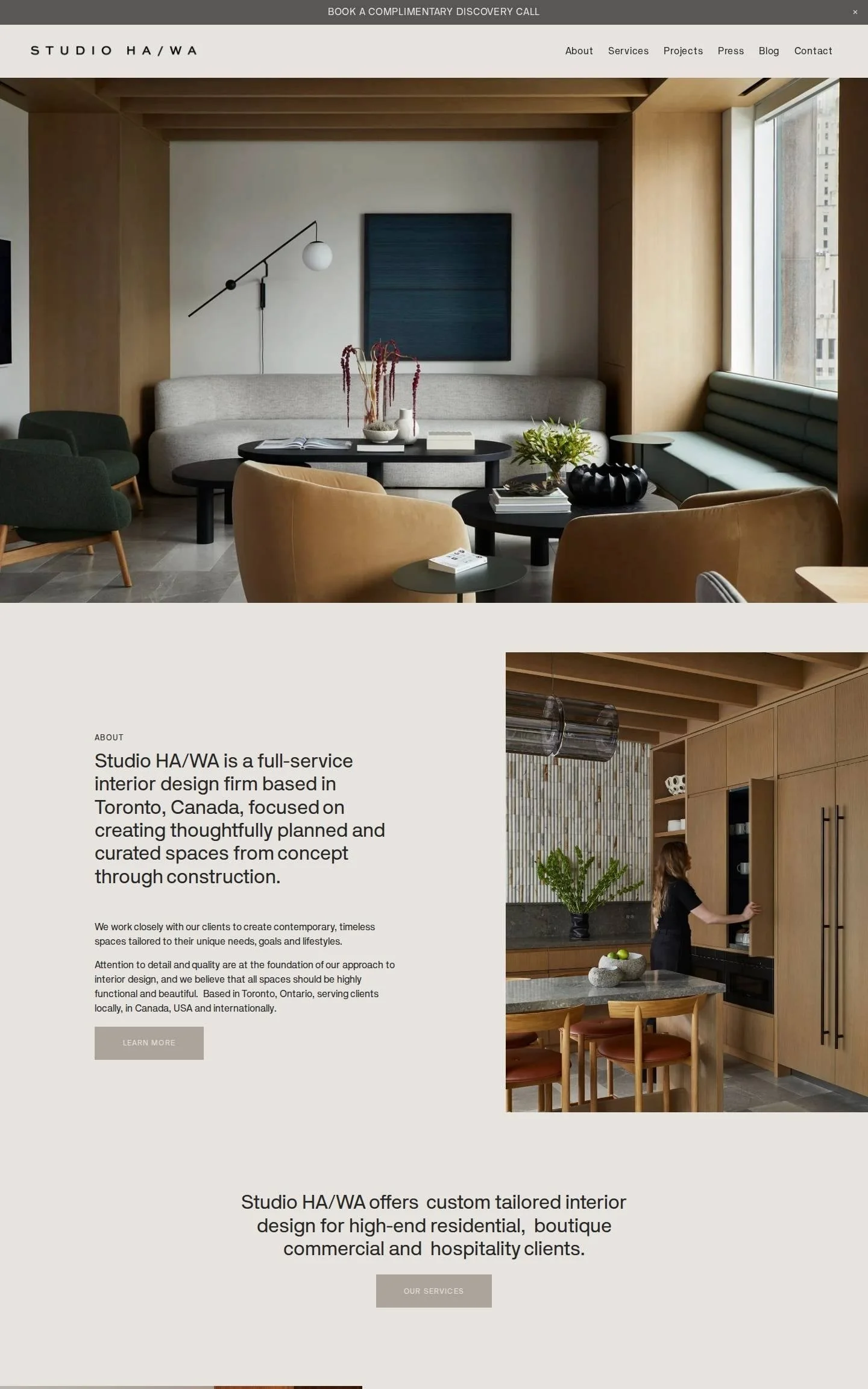
We love the restraint. A warm grey background, a modern sans-serif typeface and soft taupe buttons let the photography carry everything. The layout alternates text and tall images from left to right, features one project in depth, and then shows recent work and recent press. A slim bar across the very top invites you to book a complimentary discovery call, so the next step is always in view.
Idea to borrow: Use the announcement bar at the top of your site for your consultation offer. It appears on every page without taking up room.
11. Ellen Kavanaugh Interiors
Palm Beach, USA · ellenkavanaugh.com
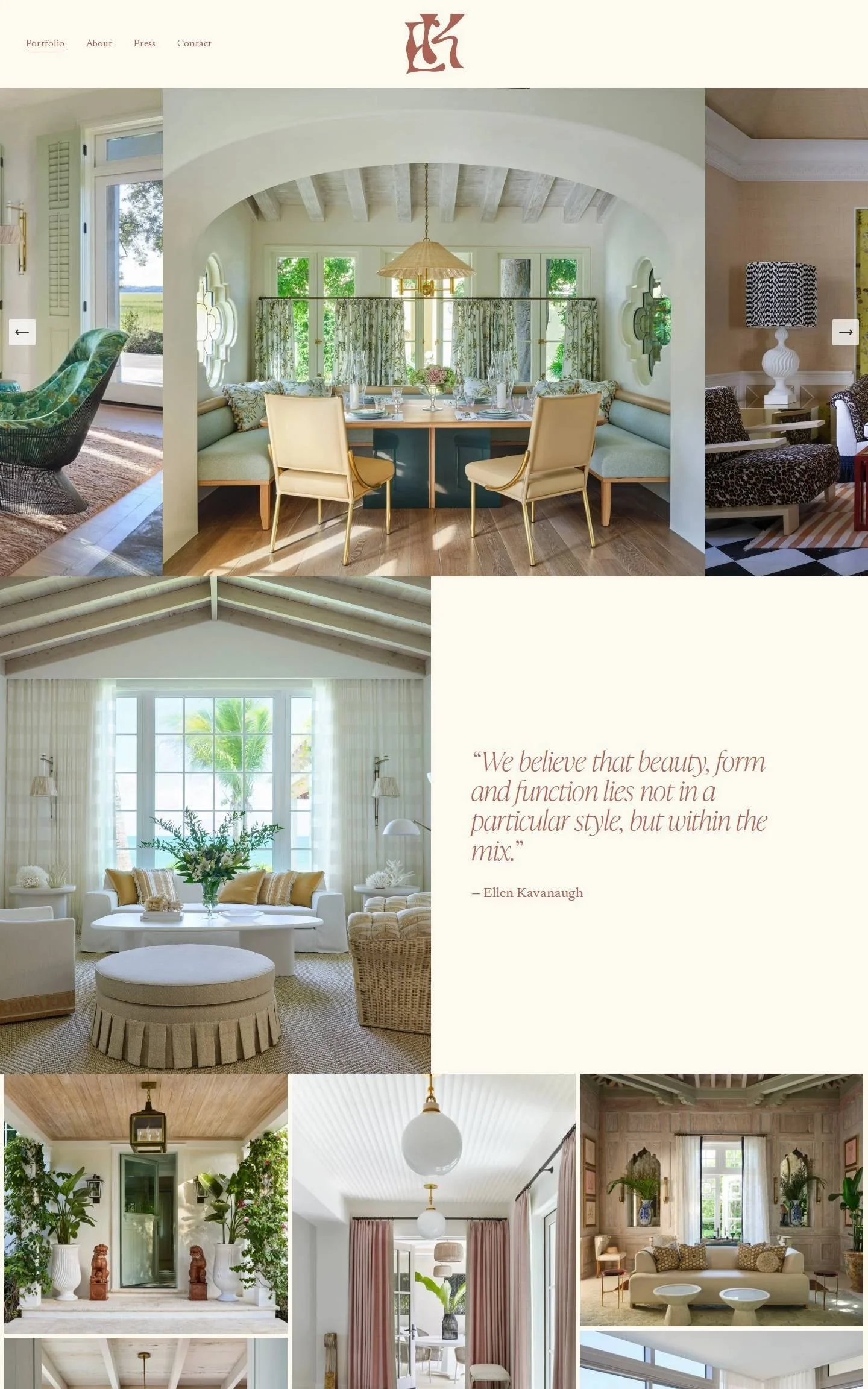
We love how little is said. A terracotta monogram, four small links, an edge-to-edge carousel of rooms, and then a single quote about her belief that beauty lies in the mix. After that the page is simply a mosaic of project photographs. For a designer with a strong portfolio and a well-known name, that confidence is exactly right.
Idea to borrow: Sum up your design philosophy in one sentence and give it a whole section to itself.
12. Little by Little Interiors
Portland, Oregon, USA · littlebylittleinteriors.com
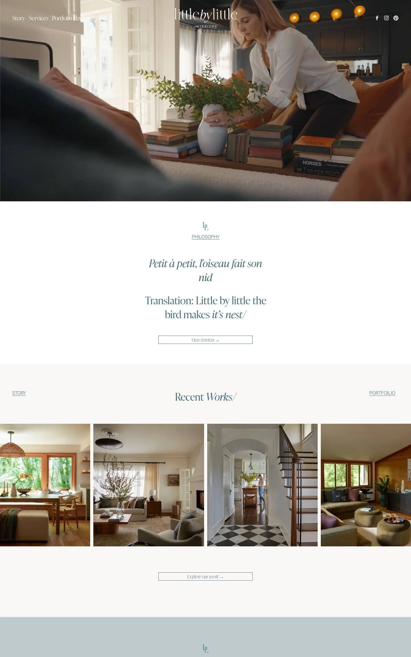
We love how gentle and personal this is. The page opens with footage of the designer arranging flowers on a stack of books, followed by the French proverb the studio is named after, with its translation, in a slate blue italic serif. Section headings such as "Recent Works" and "Our Story" end with a small slash, a tiny detail repeated throughout. Services sit in a simple expanding list on a pale blue panel, and the story section shows her on the stairs with her dog running past.
Idea to borrow: Tell the story behind your studio name near the top of your homepage. It gives visitors something to remember you by.
What the best interior design websites have in common
They say what they do and where in the first screen. "Interior design in the San Francisco Bay Area" is clear to visitors and to Google.
The photography is large. Every one of these sites gives images most of the page and keeps text short.
The site matches the interiors. Moody rooms get a moody site, and soft, traditional rooms get a soft, traditional one.
There is a person. Nearly all show a portrait of the designer on the homepage.
There is proof. Testimonials, press features or awards appear before the visitor is asked to get in touch.
There is one clear next step. A call, a consultation or an enquiry form, repeated more than once.
Want a website like these?
If your interiors are beautiful but your website is not showing them at their best, we would love to help. Our team designs custom Squarespace websites for interior designers, launched in one to two weeks, and you will be able to update your own portfolio afterwards.