12 Beautiful Squarespace Website Examples for Wedding Professionals
Couples choose their wedding team with their eyes first. Before they read a word about your packages, your website has already told them whether you're their kind of planner, florist or venue.
Squarespace is a wonderful platform for wedding businesses, because it lets photography lead and keeps everything else out of the way. To show what's possible, we looked through hundreds of wedding websites built on Squarespace and chose twelve that get it right.
For each one, we've noted what works and one idea you could borrow for your own site. And if you'd rather have yours designed for you, our studio builds Squarespace websites for wedding professionals.
1. Vieira Events
Wedding planner and designer, Washington, DC · vieiraevents.com
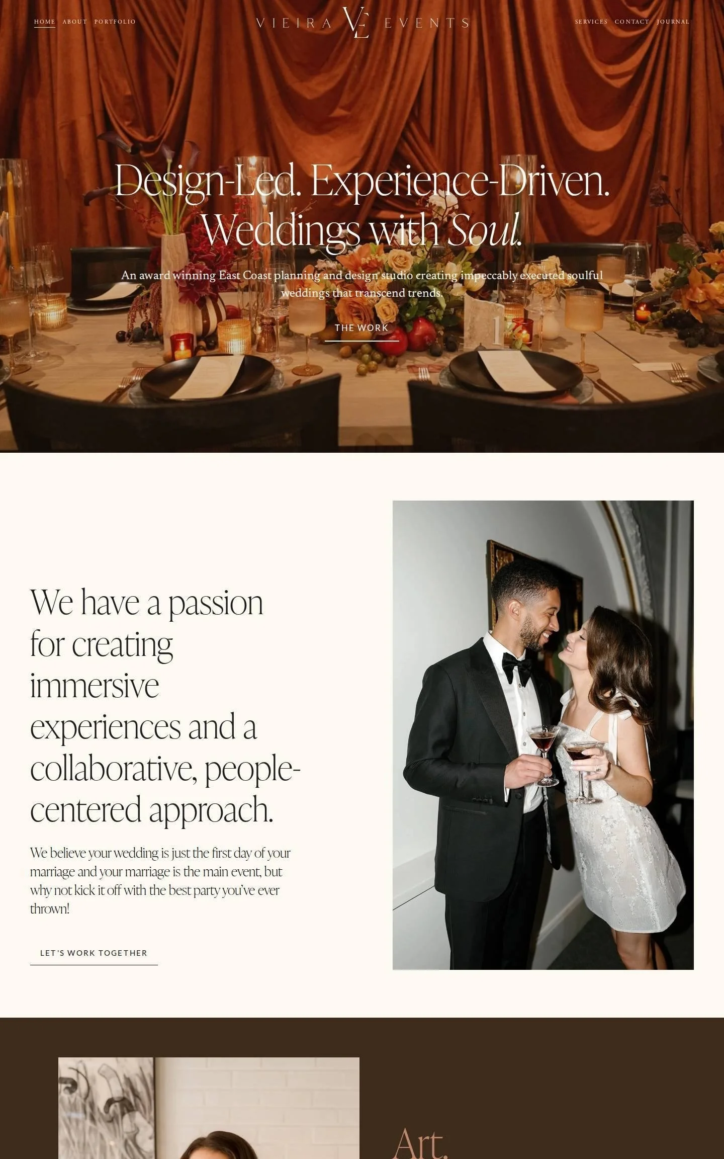
We love how Vieira Events opens on a rust velvet curtain and a candlelit table, then carries that color through the whole page in blocks of chocolate brown, olive and cream. The headlines are set in a tall, condensed serif with italic accents ("Weddings with Soul."), so the type feels as styled as the photography. Sections alternate between large statements, portrait photos and short client quotes labeled "Overheard," and each one ends in a small underlined link rather than a loud button.
Idea to borrow: Pull your color palette straight from your hero photo so the page feels like one room.
2. Derèves
Wedding planner and floral design studio, Toronto, Ontario · derevesstudio.com
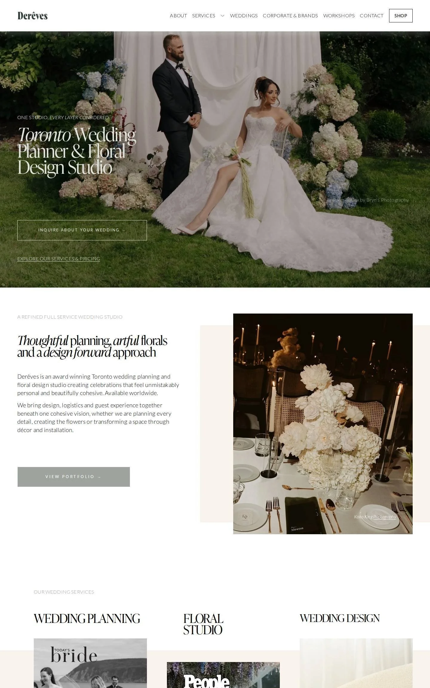
We love how clearly Derèves explains a multi-service studio. The hero headline, "Toronto Wedding Planner & Floral Design Studio," sits left-aligned in a tight serif with italics, with an outlined "Inquire about your wedding" button right beneath it. Further down, three columns (Wedding Planning, Floral Studio, Wedding Design) each get a photo, a short paragraph and their own "Explore" button. A row of press and brand logos beside a testimonial closes the page on a soft cream band.
Idea to borrow: If you offer several services, give each its own column with one photo and one button.
3. Bellwood Blooms
Wedding florist, Toronto, Ontario · bellwoodblooms.com
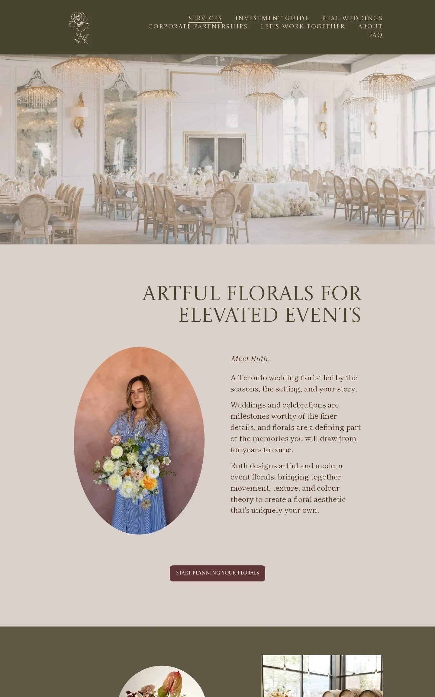
We love the earthy palette here: deep olive, warm taupe and dusty rose, each used as a full-width band so the page reads in clear chapters. Headlines are all-caps in a classic serif, and the florist's portrait sits in an oval frame beside a short "Meet Ruth" introduction. The olive section scatters circle- and rectangle-cropped photos around a centered headline, which feels like a collage. Testimonials scroll sideways, each paired with a photo and the couple's names.
Idea to borrow: Crop a few photos into ovals or circles to break up a grid of rectangles.
4. Muriwai Estate
Private villa and wedding venue, Auckland, New Zealand · muriwaiestate.co.nz
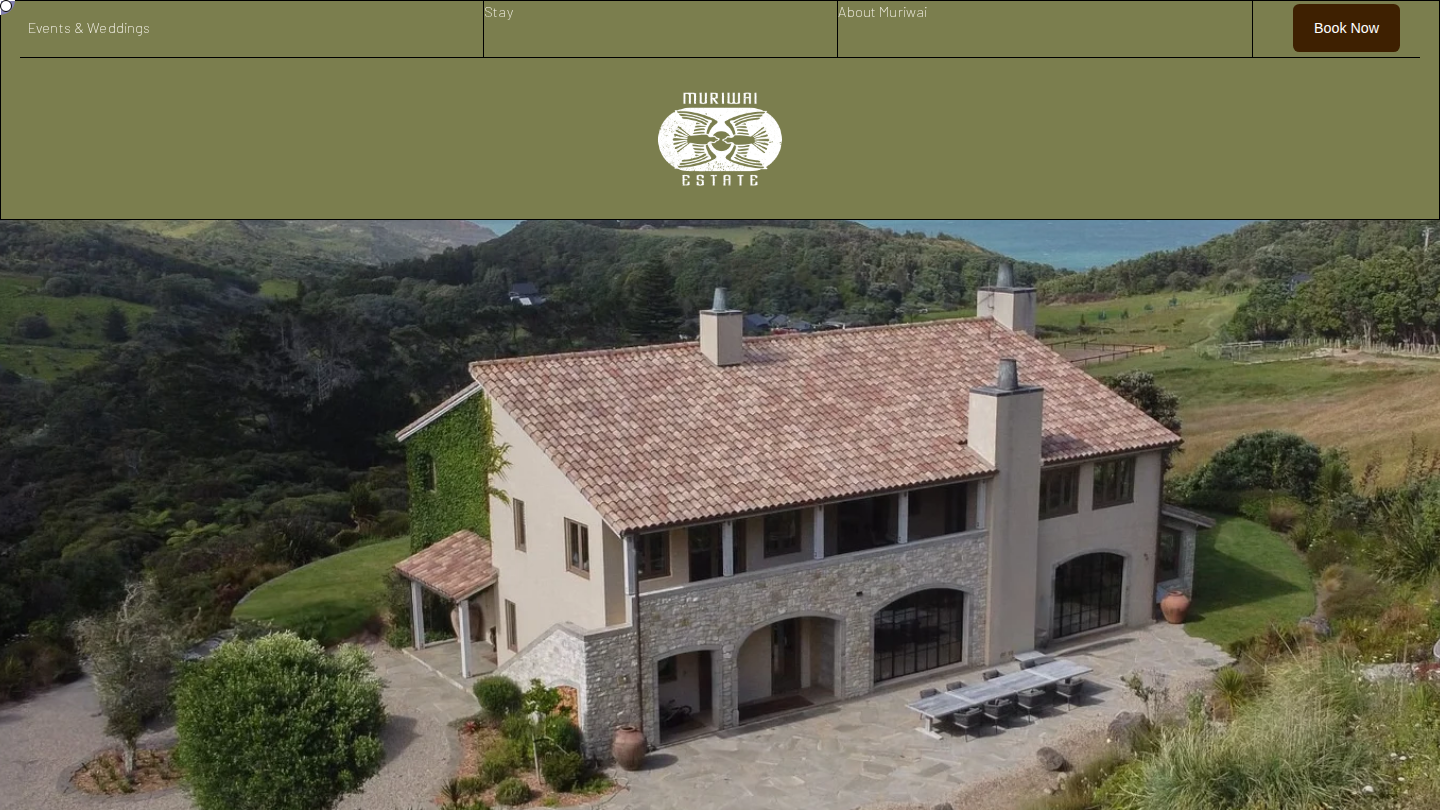
We love the olive green header with the centered crest, sitting above an aerial photo of the stone villa and the coastline. A "Check availability" date search comes right after the hero, so the next step is never in doubt. Four tall image panels labeled The Region, Villa, Concierge and Book act as a visual menu. Wide-spaced, all-caps headings on a warm cream background alternate left and right with photos of sand, sea and stone.
Idea to borrow: Turn your main pages into a row of tall photo panels to create a visual menu.
5. Mandy Marie Events
Destination wedding planner, Arizona, California and Mexico · mandymarieevents.com
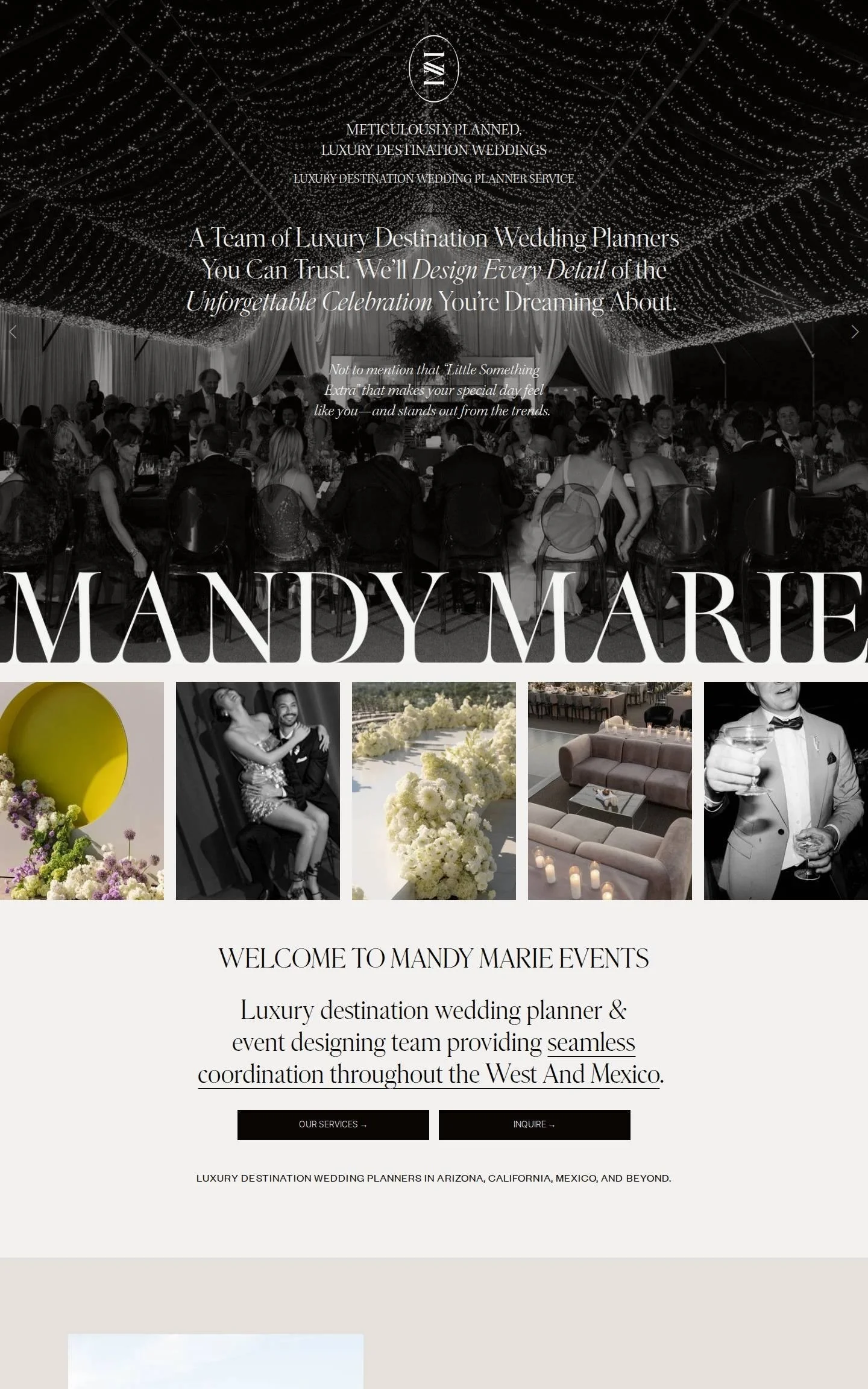
We love the drama of this one. A black-and-white party photo fills the first screen, and just below it the name MANDY MARIE runs edge to edge in a huge high-contrast serif, cropped by the browser window. A strip of five square photos follows, then paired "Our services" and "Inquire" buttons in solid black. Body headlines mix roman and italic and underline key phrases, so you can skim the page and still get the message.
Idea to borrow: Set your business name very large, once, as a design element in its own right.
6. Still Life Flowers
Floral design and styling studio, London, UK · stilllifeflowers.co.uk
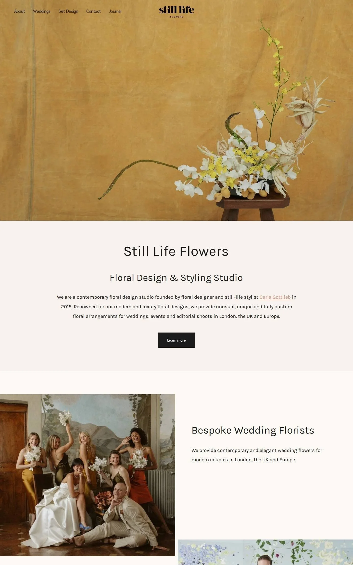
We love that the hero is a single sculptural arrangement on a wooden stool against a mustard canvas backdrop. It looks like a painting and tells you the studio's style in a second. The chunky lowercase logo sits centered, with a five-link menu on the left. Below, the page is short and calm: one paragraph, two services shown as offset photo-and-text pairs, one testimonial, and a "Book a consultation" button.
Idea to borrow: Choose one hero image that looks like your work at its most distinctive, not your most typical.
7. DPNAK Events
Wedding planner and coordinator, Philadelphia area · dpnak.com
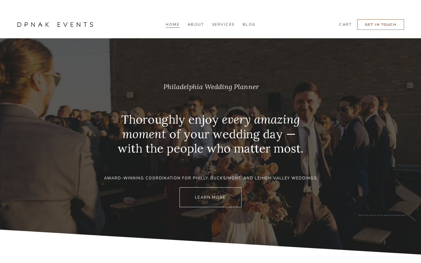
We love how this site leads with a promise rather than a name: "Thoroughly enjoy every amazing moment of your wedding day," in a warm serif with italics, over a darkened photo. The hero's bottom edge is cut on a slant, a small detail that keeps it from feeling like a template. Slate blue and copper carry through quote blocks and buttons, award badges sit in one tidy gray row, and a "Get in touch" button stays in the header.
Idea to borrow: Write your hero headline about how the client will feel, and put your location in the small line above it.
8. Rose Press
Wedding stationery and letterpress studio, Nottingham, UK · rosepress.co.uk
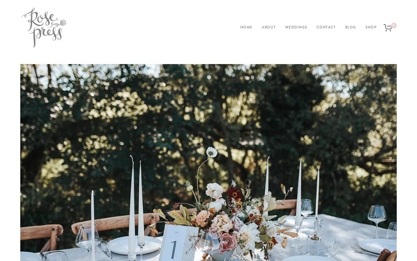
We love how quiet and paper-like this site feels. A hand-lettered logo sits top left, the hero is a single tablescape framed by wide white margins, and headings are in a soft gray serif. Three photo tiles sort the work into Save the Dates, Invitations and On the Day Stationery. Semi-custom collections get blush label cards that overlap the photos. Thin gray rules separate each section, and the footer is pale pink.
Idea to borrow: Use thin divider lines and wide margins to make a page feel like fine stationery.
9. The Hill
Wedding venue, Hudson, New York · hudsonvalleyweddings.net
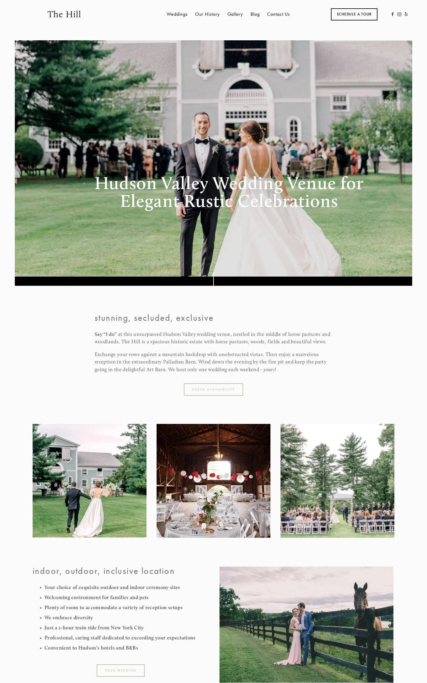
We love how simple and confident this venue site is. The header is just "The Hill" in a serif, five links, and an outlined "Schedule a tour" button. The hero photo is inset with white margins and overlaid with a clear headline. Below, three matching photos introduce the Palladian Barn, the Art Barn and the Grounds, each with a short caption. A bulleted list covers practical details, such as the two-hour train ride from New York City.
Idea to borrow: Name each of your spaces and give each one a photo and a three-line description.
10. Flourish Florals
Wedding florist, Chicago, Illinois · flourishfloralschicago.com
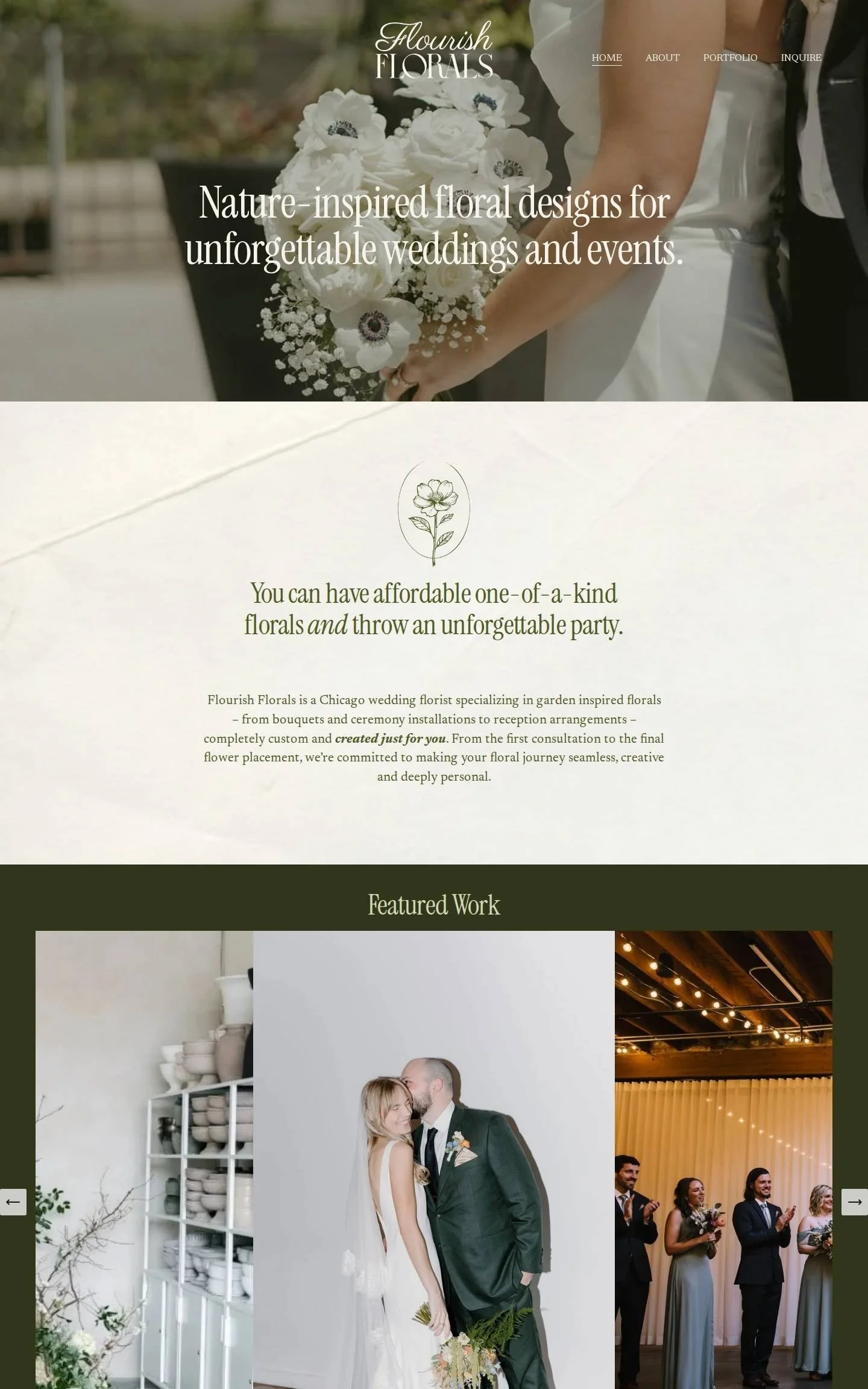
We love the combination of deep olive green, a crumpled-paper texture and a condensed serif headline. The cream intro section has a small line-drawn flower emblem above a clear statement about one-of-a-kind florals. "Featured Work" sits on solid olive as a carousel of tall photos, with leaf illustrations tucked into the edges. A "Meet the Designer" section pairs a portrait with a first-person note, and green buttons guide you down the page.
Idea to borrow: Add a subtle paper texture behind a text section to warm up a plain background.
11. Sarah Kazemburg Events & Styling
Wedding planner and designer, Washington, DC · skbevents.com
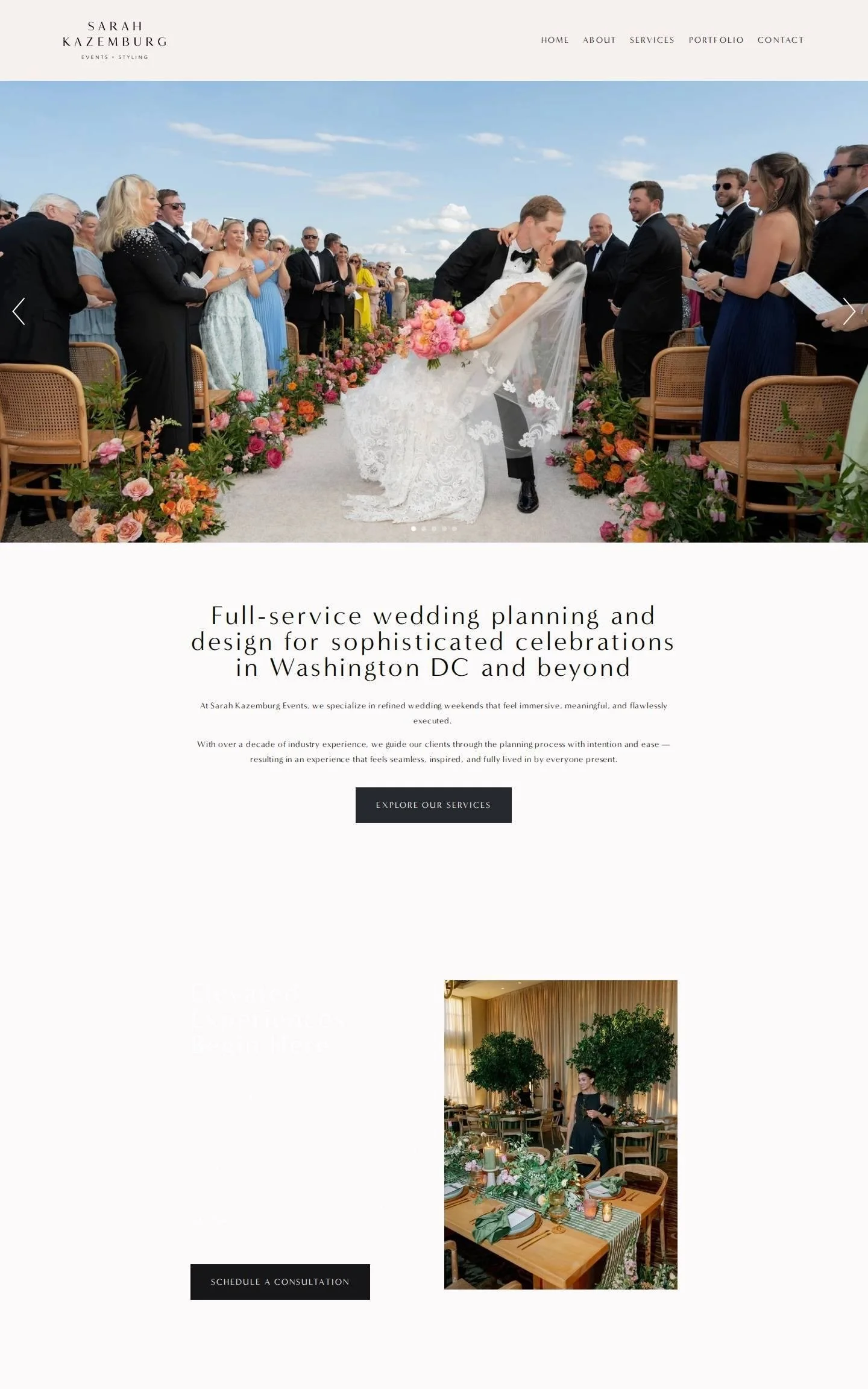
We love how the photography does the talking. The header is a pale blush bar with a small, wide-spaced serif logo and five links. Under it, a full-width slideshow opens on a ceremony aisle lined with bright flowers. One centered sentence states the service and the location, followed by a dark "Explore our services" button. "Featured Weddings" shows three tall photos, each labeled with its venue name.
Idea to borrow: Label portfolio thumbnails with the venue name; couples often search by venue.
12. Frida's Field
Restaurant and wedding venue, Byron Bay Hinterland, Australia · fridasfield.com
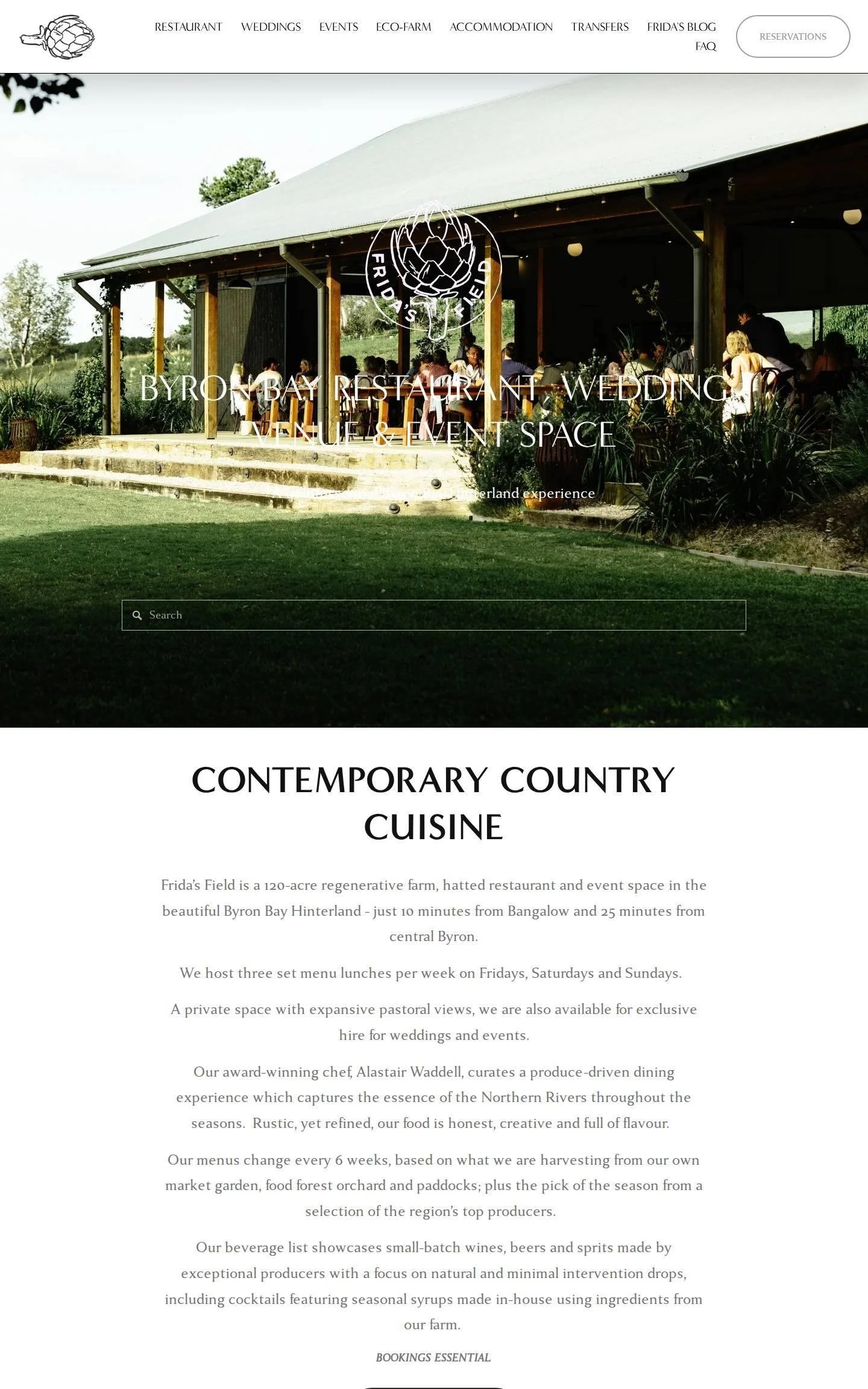
We love the hand-drawn artichoke logo, which appears in the header and again as a white emblem over the hero photo of the open-sided barn. Headings are in elegant all-caps, and the buttons are pill-shaped outlines. Two of them are stacked together, "Make a reservation" and "Enquire about a wedding or event," so both audiences know where to go. Testimonials are paired with square photos of plated food and the grounds.
Idea to borrow: If you serve two audiences, give each its own clearly labeled button, side by side.
What the best wedding websites have in common
One strong hero image that shows the style of work at a glance.
A color palette taken from the photography, used in bold bands down the page.
A clear next step near the top: inquire, check availability or schedule a tour.
Services explained simply, often as three columns or three photo tiles.
Real client words, kept short and paired with a photo.
Want a website like these?
My team and I design Squarespace websites for wedding professionals and other taste-led businesses. Projects take one to two weeks, and you leave knowing exactly how to manage the site yourself.