12 Beautiful Squarespace Website Examples for Landscape and Garden Designers
A garden takes years to grow in, and a potential client cannot walk through one before they hire you. Your website is the closest thing they have to a visit. It is where they decide whether your planting, your stonework and your way of thinking belong outside their home.
Squarespace is a very good fit for this kind of work. It gives large photographs room to breathe, it keeps type and spacing tidy on a phone, and adding a newly finished garden to your portfolio takes minutes, with no developer required.
We looked through hundreds of landscape and garden design websites built on Squarespace and chose twelve we keep coming back to. For each one we have noted what we love and one idea you can borrow for your own site. And if you would prefer to hand the project over, our team of Squarespace website designers builds custom sites for studios like these.
1. Daniel Combes Design
Wiltshire, UK · danielcombes.co.uk
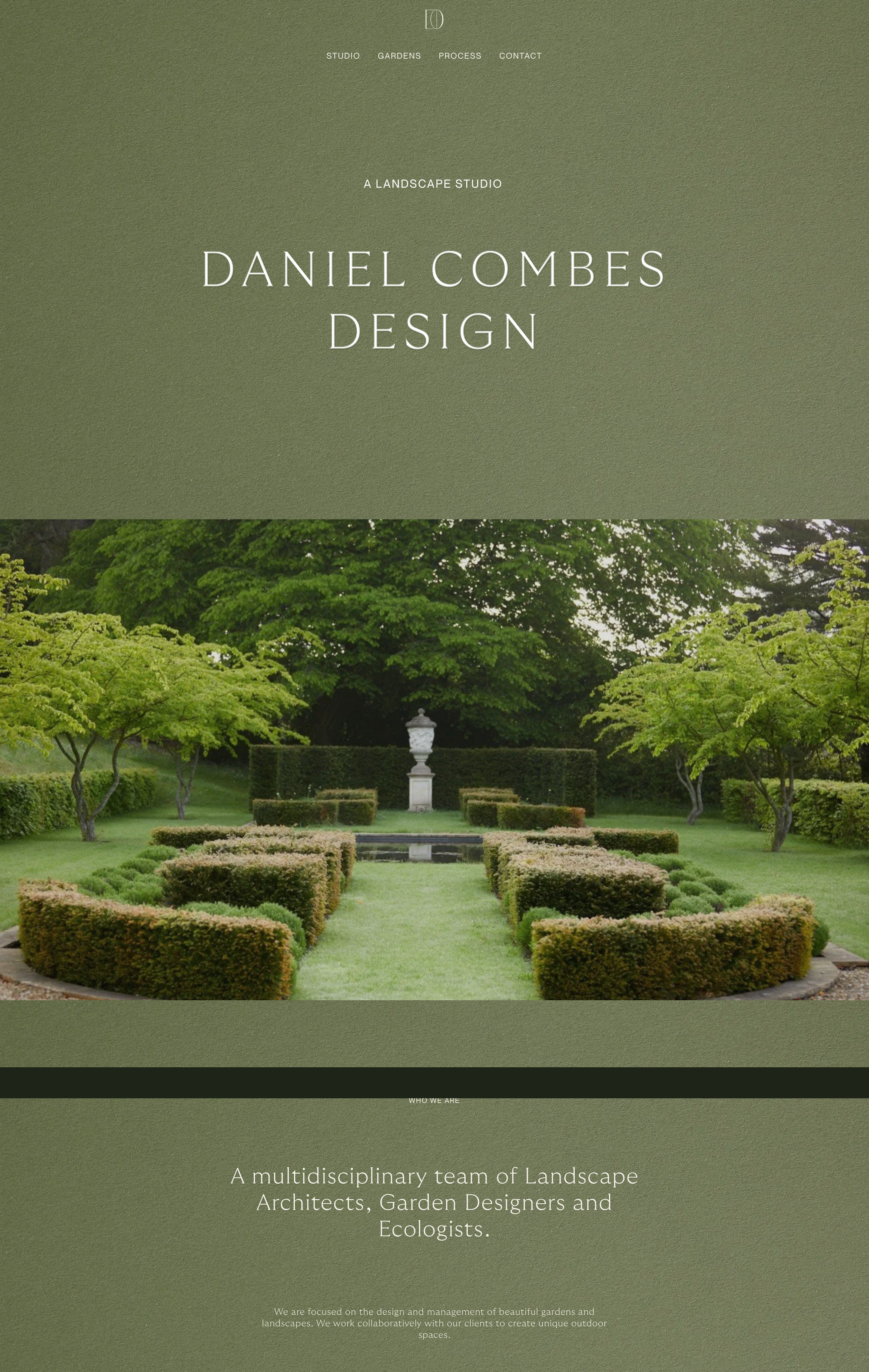
We love that the whole page is the color of a clipped hedge. The background is a soft moss green from top to bottom, with the studio name in wide, pale capitals and a small line above it reading "A landscape studio". Then full-width photographs of formal gardens alternate with short centered statements, each under a tiny label such as "Who we are", "Our aim" and "Our belief". The page closes by naming the counties the studio works in. It is calm, ordered and green, much like the gardens.
Idea to borrow: Give each belief about your work its own short section with a small label above it, and place one large photograph between each. It reads far more easily than a long About paragraph.
2. Super Bloom
Australia · thesuperbloom.com.au
We love the sheer joy of this one. It opens on a close photograph of flowers with "PLANTS for the people." in bold white capitals, and then three enormous words, "wonder", "beauty" and "MAXIMALISM", run down a white page in deep plum, scattered with flat illustrated flowers in pink, orange and lilac. Below, a six-part list sets out exactly what the practice offers, from strategy and design to curation. You understand the personality of the practice before you read a single full sentence.
Idea to borrow: Choose three words that sum up your approach and set them very large. A few illustrated flowers or leaves in your brand colors will make them memorable.
3. The Outside Design Studio
Chicago, USA · theoutsidedesignstudio.com
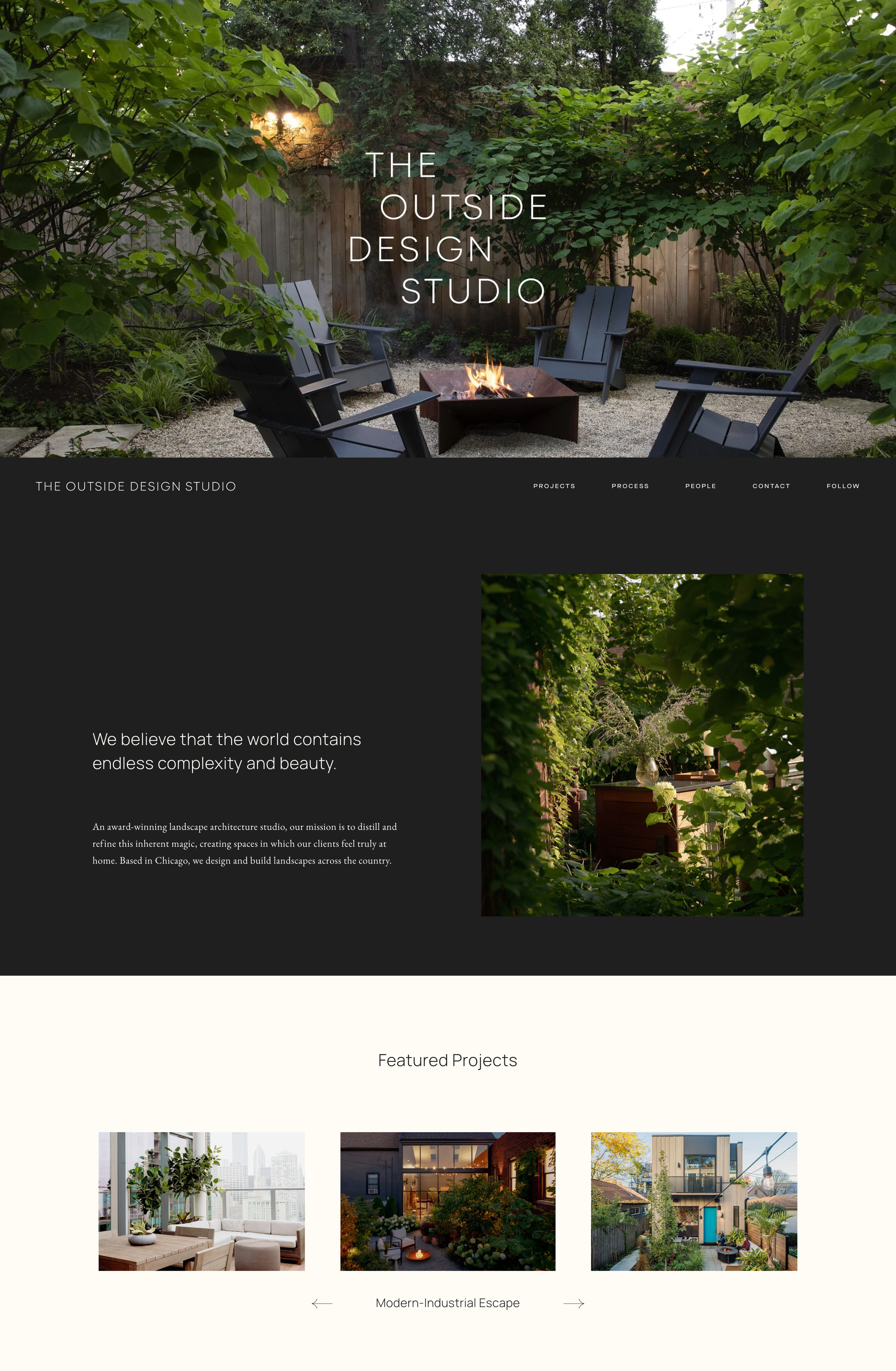
We love how much this homepage feels like dusk in a garden. The studio name is stacked in thin white capitals over a photograph of dark chairs around a lit fire pit, and the sections beneath alternate between charcoal and warm cream. Each has a short headline, such as "At our core, we are artists with a deep love for nature.", a few lines of small serif text, and one photograph. A Featured Projects carousel in the middle shows three projects at a time with the project name beneath.
Idea to borrow: Photograph at least one project in the evening with the lights and fire on. Clients picture themselves using the garden, and that is when they use it.
4. Craft
Los Angeles, USA · craft-la.com
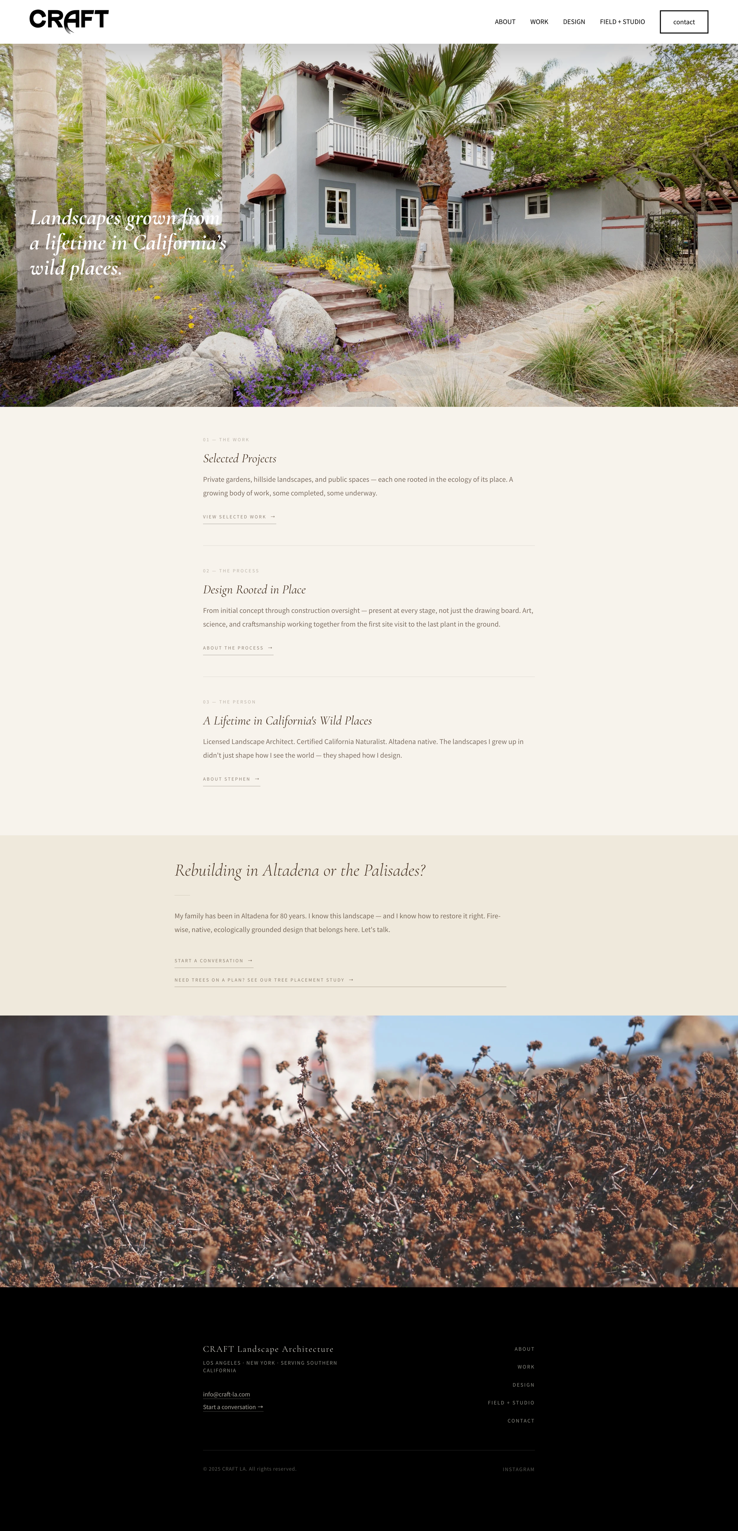
We love how personal the writing is. Over a photograph of a hillside garden, an italic serif headline reads "Landscapes grown from a lifetime in California's wild places." Three numbered sections follow on a cream background, The Work, The Process and The Person, each with two sentences and one underlined link. Then comes a section headed "Rebuilding in Altadena or the Palisades?", written in the first person by someone whose family has lived there for 80 years. It speaks to one specific client at exactly the moment they need help.
Idea to borrow: Add a short section that speaks directly to one type of client you most want to hear from, with a heading phrased as their question.
5. Peachy Green
Fairfield, Victoria, Australia · peachygreen.com.au
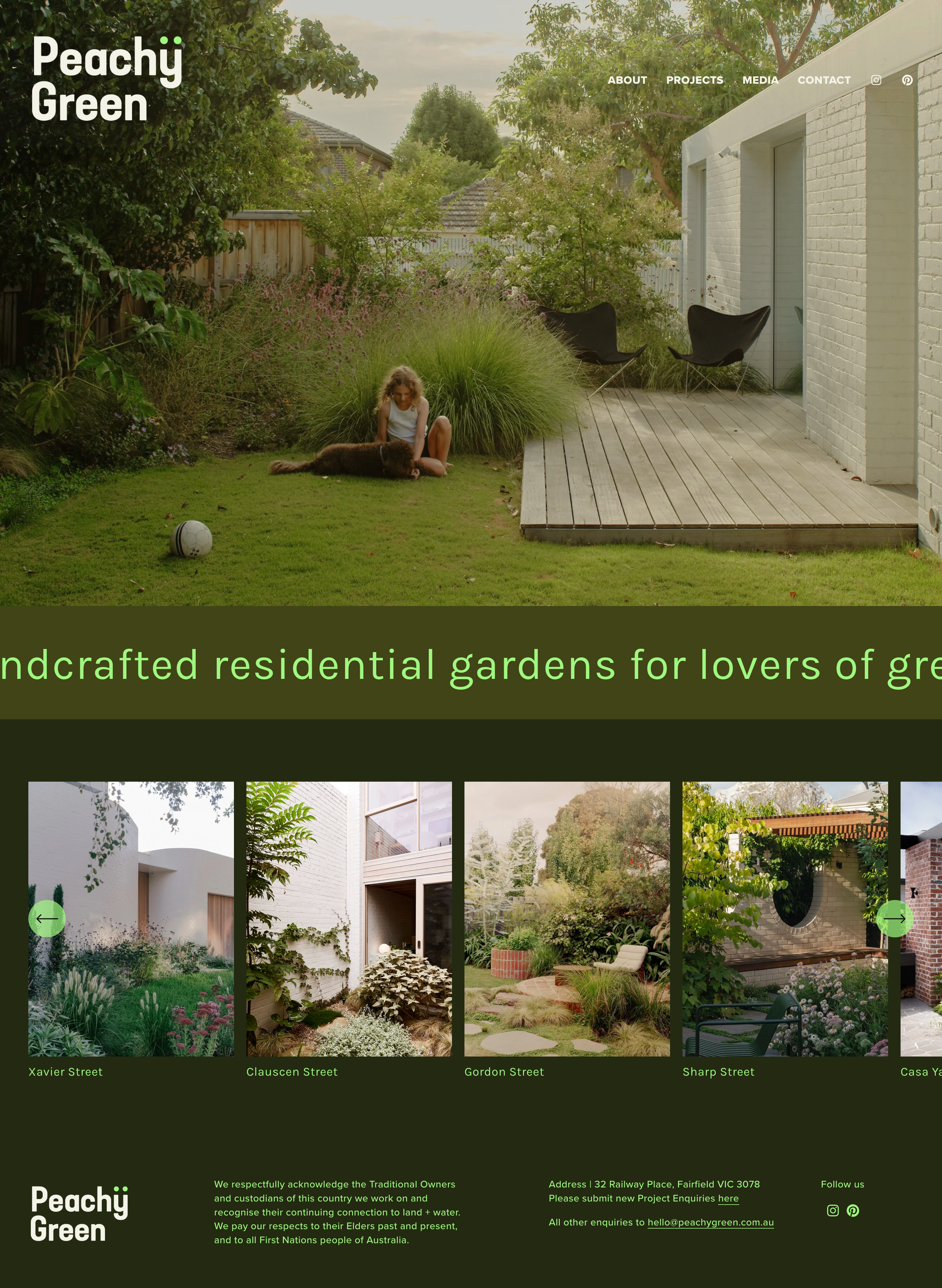
We love how quickly this homepage does its job. A full-screen photograph shows a woman sitting on the lawn with her dog, a ball nearby, which tells you these gardens are lived in. Under it, one sentence scrolls across a very dark green band in bright mint letters: "We create lush handcrafted residential gardens for lovers of green". Then a row of project photographs, each labeled with a street name, and a footer. That is the whole page, and the dark green and mint pairing stays with you.
Idea to borrow: Include a person or a pet in your main photograph. A garden being enjoyed is more persuasive than an empty one.
6. Mint
Melbourne, Australia · mintdesign.net.au
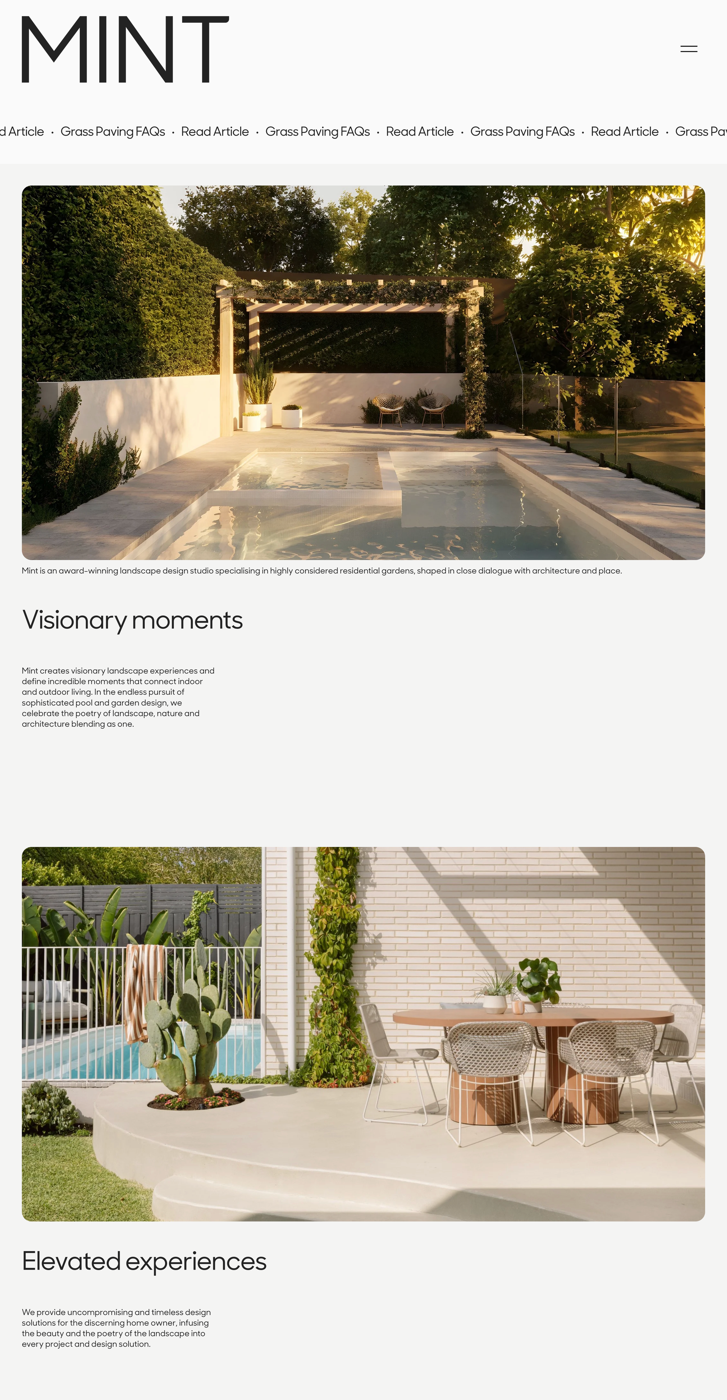
We love the confidence of the layout. The name MINT sits in very large, thin capitals at the top left, and wide photographs with gently rounded corners run down a pale gray page, each followed by a two-word heading ("Visionary moments", "Plant experts") and a narrow column of text. Further down, the studio sells downloadable planting guides based on its own projects, so a visitor who is not ready to book a consult can still take something home. A scrolling line at the top points to the latest journal article.
Idea to borrow: Turn the plant list from a favorite project into a downloadable guide. It gives visitors a small first step and shows your horticultural knowledge.
7. Lloyd Brunt Outdoor Design
London, UK · lloydbrunt.com
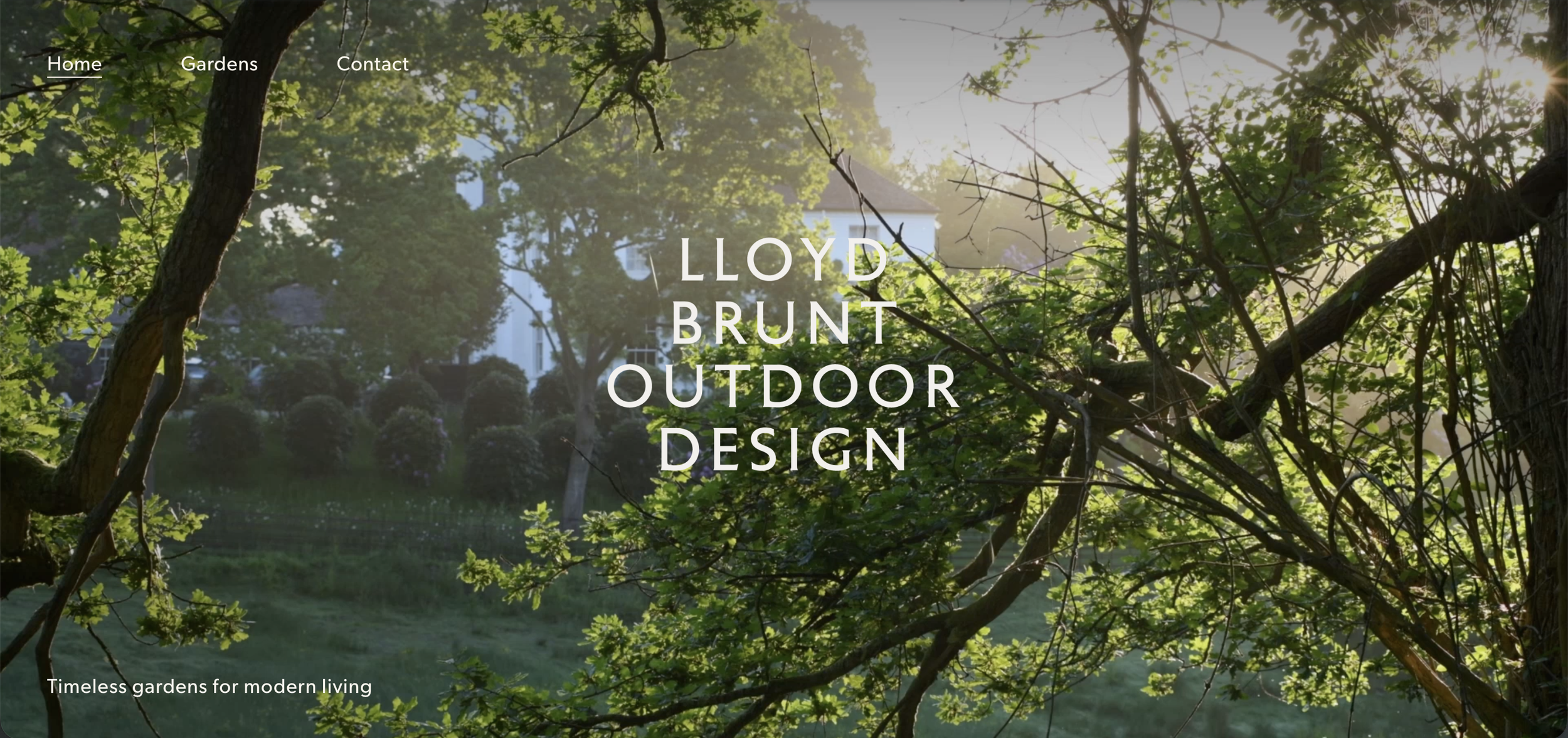
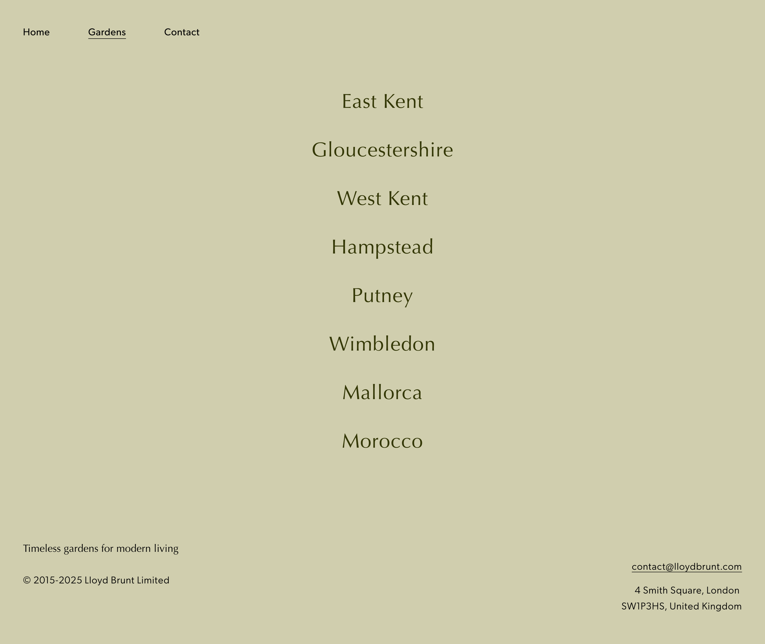
We love how quiet this site is. The homepage is a single deep olive screen with the studio name stacked in four lines of pale capitals at the center, three links in the top corner, and one sentence at the bottom: "Timeless gardens for modern living". Click through to Gardens and the background turns to a soft sage, with each project listed simply by its place in a large serif: East Kent, Hampstead, Putney, Mallorca, Morocco. The list alone tells you how far the work travels.
Idea to borrow: Name your projects by location. A plain list of places shows your range and where you work without a word of explanation.
8. Native Son Gardens
Austin, Texas, USA · nativesongardens.com
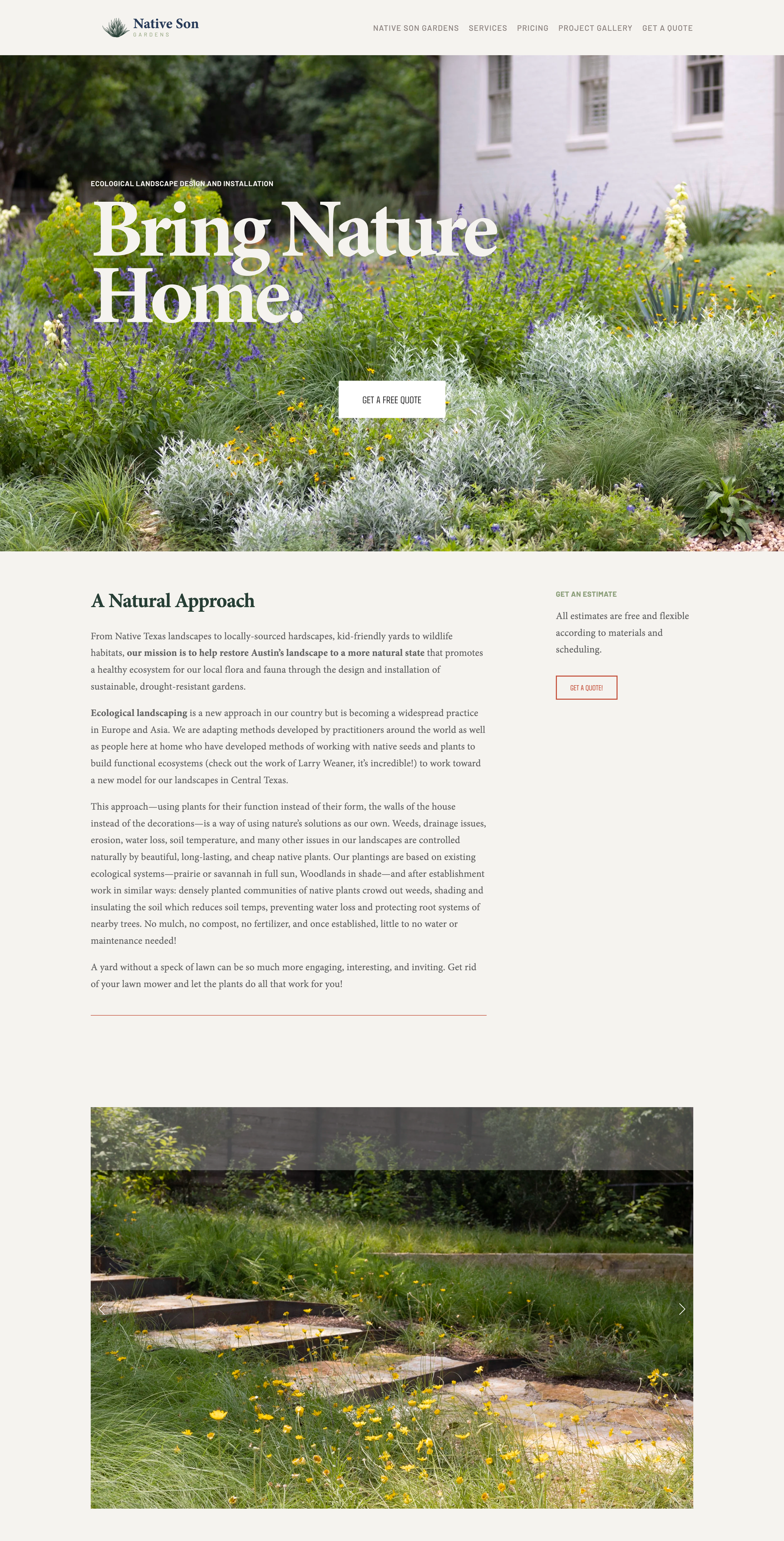
We love how clearly this site explains an idea. "Bring Nature Home." sits in a bold white serif over a photograph of a native Texas planting, with a "Get a free quote" button right beneath it. A section called A Natural Approach then describes ecological landscaping in plain, friendly language, and a narrow side column repeats the invitation to get an estimate. Further down, a long run of client reviews in large italics sits beside a column of garden photographs. Pricing even has its own link in the menu.
Idea to borrow: If your approach is unfamiliar to most homeowners, explain it on your homepage in everyday words. Clients who understand the thinking are far easier to work with.
9. Living Systems Studio
Los Angeles, USA · livingsystems.studio
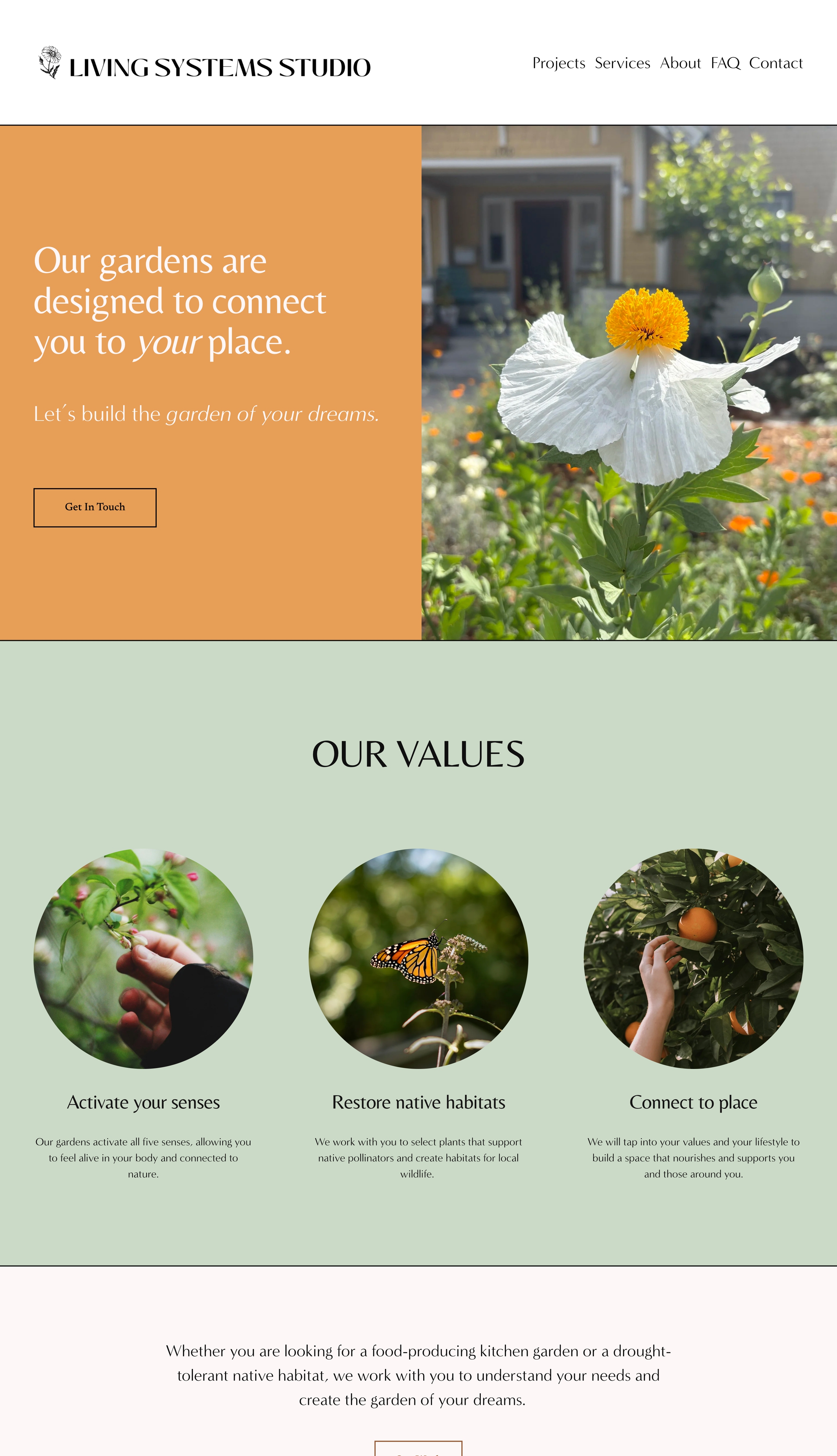
We love the color here. The page opens with a warm orange panel beside a close photograph of a white poppy, with the headline "Our gardens are designed to connect you to your place." Then a sage green band presents three values in circular photographs: a hand picking berries, a monarch butterfly, an orange on the tree. Below that, garden photographs of different sizes are scattered loosely down a pale pink page, and client testimonials rotate in a rust-colored serif. It feels sunny and hands-on.
Idea to borrow: Crop three photographs into circles and pair each with one of your values. It is a friendly way to say what you stand for in very few words.
10. Field Studio
Bozeman, Montana, USA · fieldstudiola.com
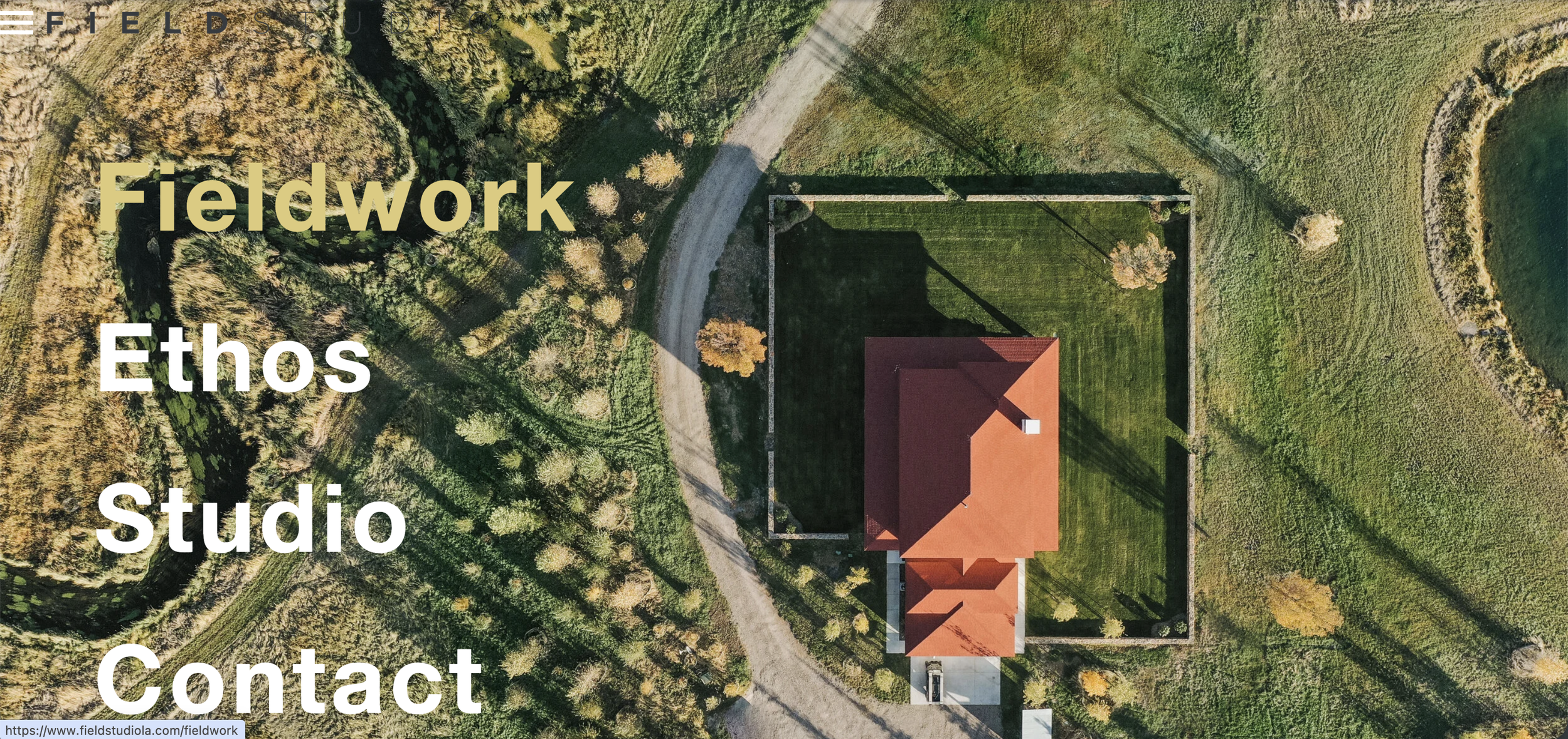
We love the drama of the entrance. The site opens on a full-screen black and white aerial photograph of textured ground, with the logo at the center: the studio name above a set of fine lines that dip like a contour drawing, one of them picked out in gold. A small gold button says "Enter". Step inside and the whole screen turns that same gold, with four words in large white letters: Fieldwork, Ethos, Studio, Contact. One accent color carries everything.
Idea to borrow: Choose a single accent color and use it in your logo, your buttons and one full background. Repeating it is what makes a site feel branded.
11. Svalbe & Co
Australia · svalbe.co
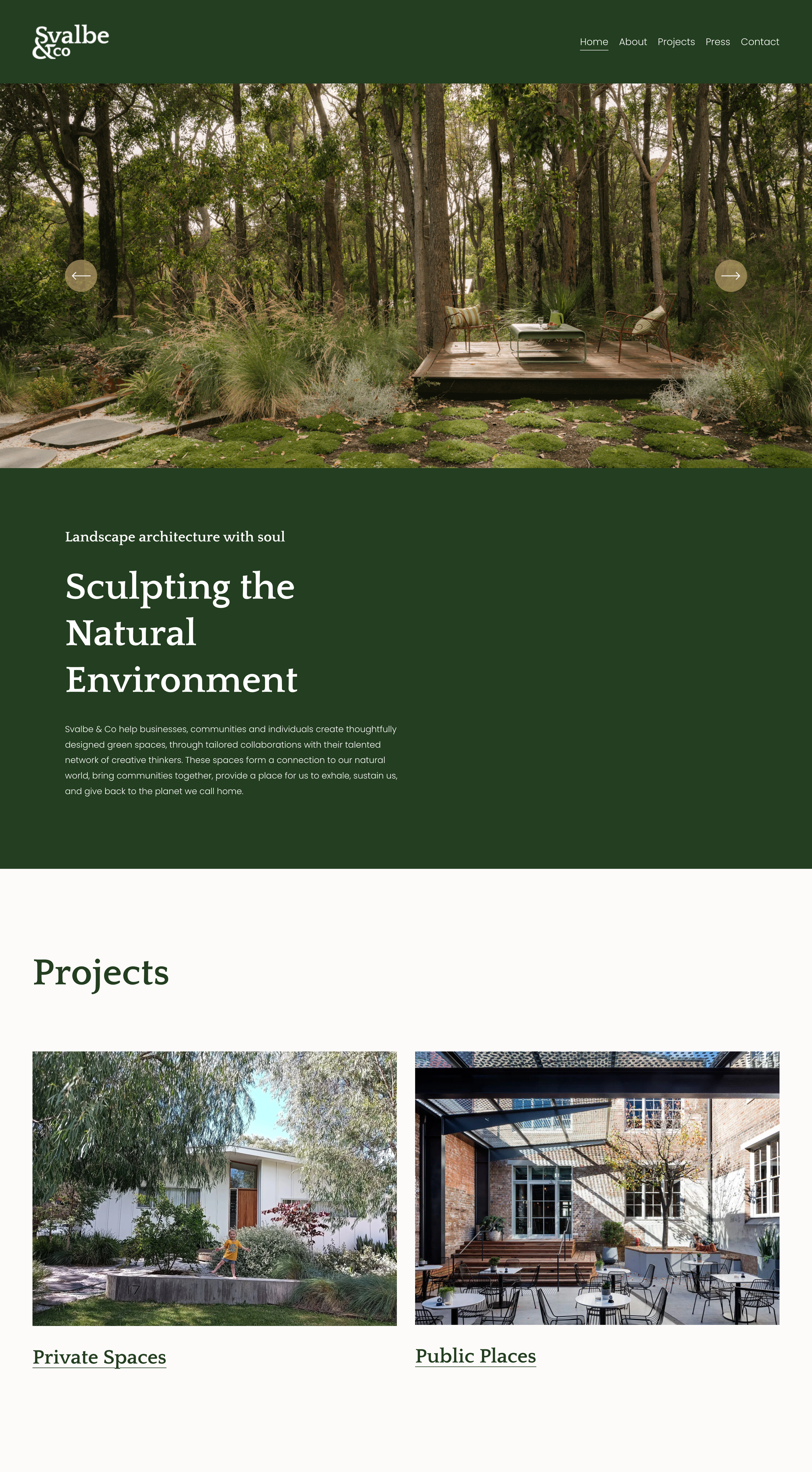
We love how grounded this feels. A deep forest green runs through the header, the introduction and the footer, with headings in a soft cream serif. Under the small line "Landscape architecture with soul", the headline reads "Sculpting the Natural Environment". The portfolio is divided into just two choices, Private Spaces and Public Places, each with one large photograph, so homeowners and commercial clients both know where to go. Three client testimonials follow, each beneath a photograph of the finished project.
Idea to borrow: Show a photograph of the finished garden above each testimonial. The client's words mean more when you can see what they are describing.
12. Lilyvilla Gardens
Portland, Oregon, USA · lilyvillagardens.com
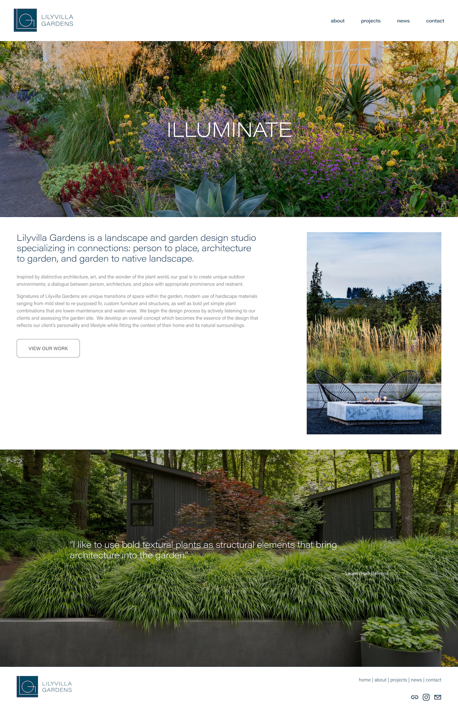
We love the single words. Over the opening photograph, one word at a time appears in thin white capitals, among them "ESSENCE", "OBSERVE", "RESTRAIN" and "BREATHE", which says a great deal about how the studio designs. Below, a headline in teal explains that the studio specializes in connections: "person to place, architecture to garden, and garden to native landscape." The page ends on a full-width photograph of grasses and a dark timber house, with a quote from designer Lauren Hall-Behrens laid over it.
Idea to borrow: Lay a short quote of your own, in your own voice, over a full-width photograph near the end of your homepage.
What the best landscape design websites have in common
Green does the branding. Moss, olive and forest green backgrounds appear again and again, so the site feels like the garden before a single photograph loads.
One sentence says what they do. Each studio states its work in a single plain line near the top, often with the place it works in.
Photographs are large and few. Most of these homepages show a handful of wide images instead of a crowded gallery.
The philosophy is written down. Whether it is native planting or formal structure, these designers explain how they think in short, clear sections.
Projects are named by place. Street names, suburbs and counties tell local clients that the studio works near them.
The next step is easy to find. A quote button, a consult link or a simple "Get in touch" is always within reach.
Want a website like these?
Our team designs custom Squarespace websites for landscape and garden designers. Your site is launched in one to two weeks, and you will be able to update your own portfolio afterwards, every time a new garden is finished. See our Squarespace web design services.