12 Beautiful Squarespace Website Examples for Boutique Hotels, Inns and Vacation Rentals
Nobody chooses a place to stay by reading the rate card first. They look at the photographs, get a feeling for the light in the rooms and the view from the porch, and decide within a few seconds whether they can picture themselves there. Your website has to win that moment, long before a guest reads a word about rates.
That is why Squarespace is such a good fit for small hotels, inns and vacation rentals. Photography leads on every page, the layouts give large images room to breathe, and it connects to the booking tools you already use, so a guest can go from looking to reserving without leaving your site.
We looked through hundreds of hotel, inn and vacation rental websites built on Squarespace and chose twelve that we keep coming back to. For each one we've noted what we love and one idea you can borrow. And if you would like yours designed for you, our team of Squarespace website designers builds custom sites for properties like these.
1. Captains Rest
Strahan, Tasmania, Australia · captainsrest.com
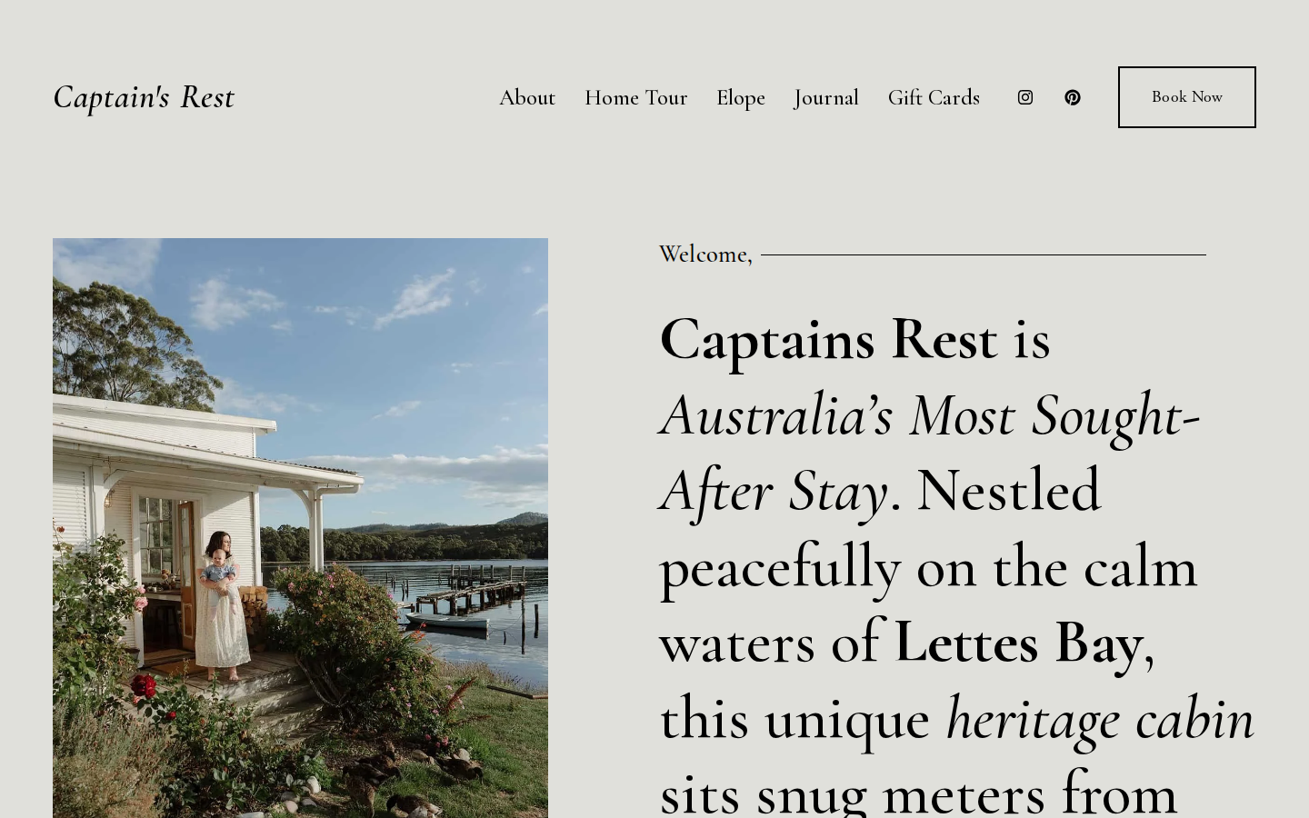
We love that this homepage is carried almost entirely by words. On a soft gray-green background, one tall photograph of the white cottage at the water's edge sits beside a welcome set in a very large serif, with the key phrases picked out in bold and italics so you absorb the place, the bay and the promise at a glance. The story of how the shack got its name follows, then a tidy FAQ and a grid of press logos, each with a short quote underneath.
Idea to borrow: Answer the questions guests always email about (how many it sleeps, how far ahead to book, how to get there) in a short FAQ right on your homepage.
2. The Henson
Hensonville, New York, USA · thehenson.com
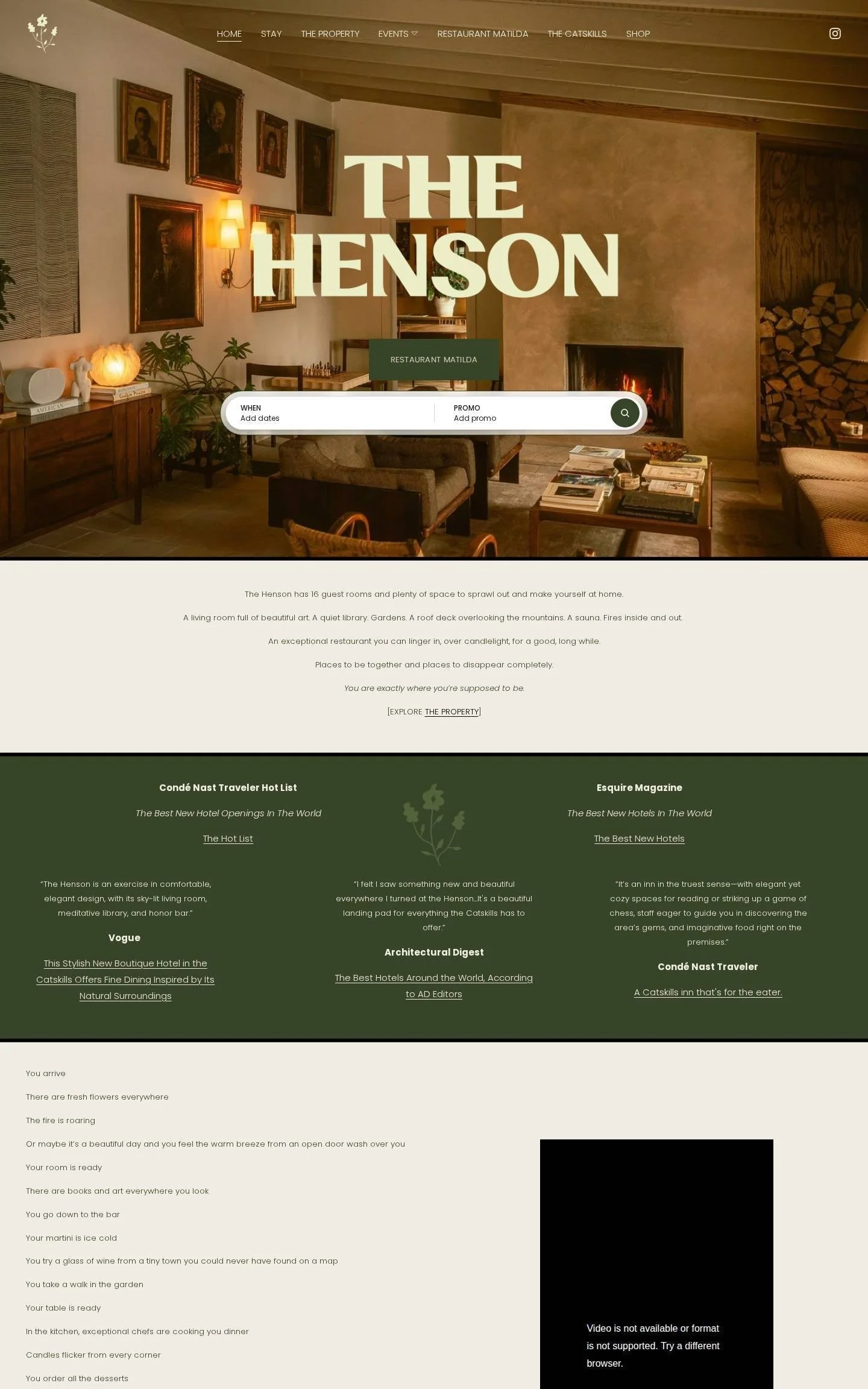
We love the warmth of the opening. The hotel name sits in huge cream letters over a photograph of the living room, fire lit and portraits on the wall, with a date search bar just beneath it. A deep green band of press quotes comes next, and then something we rarely see: a long list of single lines walking you through a stay from the moment you arrive to breakfast the next morning. Guests can picture themselves there before they have seen a single room.
Idea to borrow: Write out a stay at your property as a sequence of small moments, from arrival to checkout. It sells the feeling far better than a list of amenities.
3. Camptown
Leeds, New York, USA · camptowncatskills.com
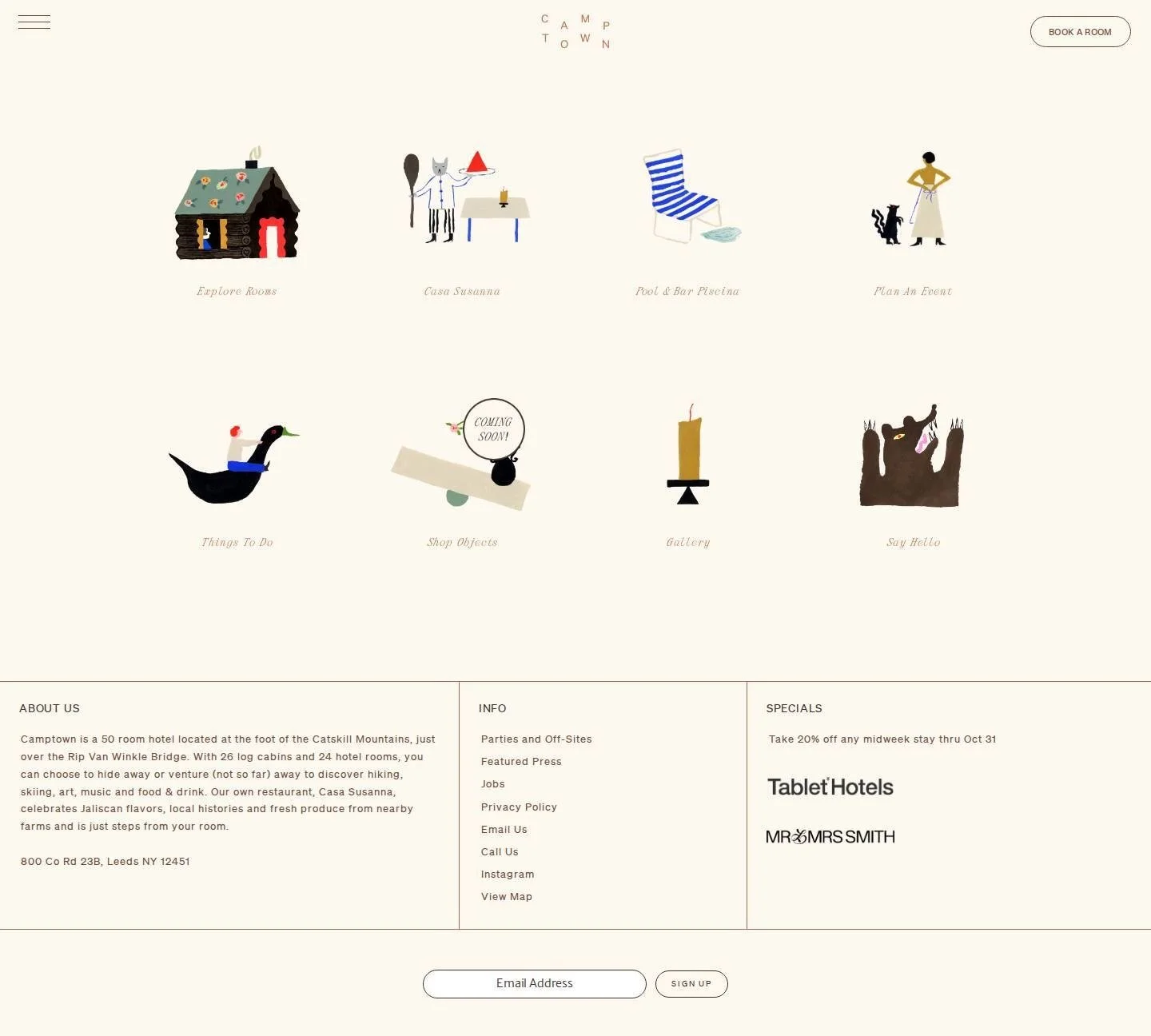
We love that the homepage is a menu of eight little paintings. A log cabin with a flowered roof leads to the rooms, a striped pool chair to the pool and bar, a bear to "Say Hello", each labeled in a fine coral italic on a cream background. The logo scatters its letters across the top, and a plain footer handles the practical details: the address, a short description and a midweek offer. It is playful and memorable, and every click is obvious.
Idea to borrow: Commission a small set of illustrations for your main pages. Guests will remember them, and they give you artwork for menus, key cards and signs too.
4. Glebe House
Southleigh, Devon, UK · glebehousedevon.co.uk
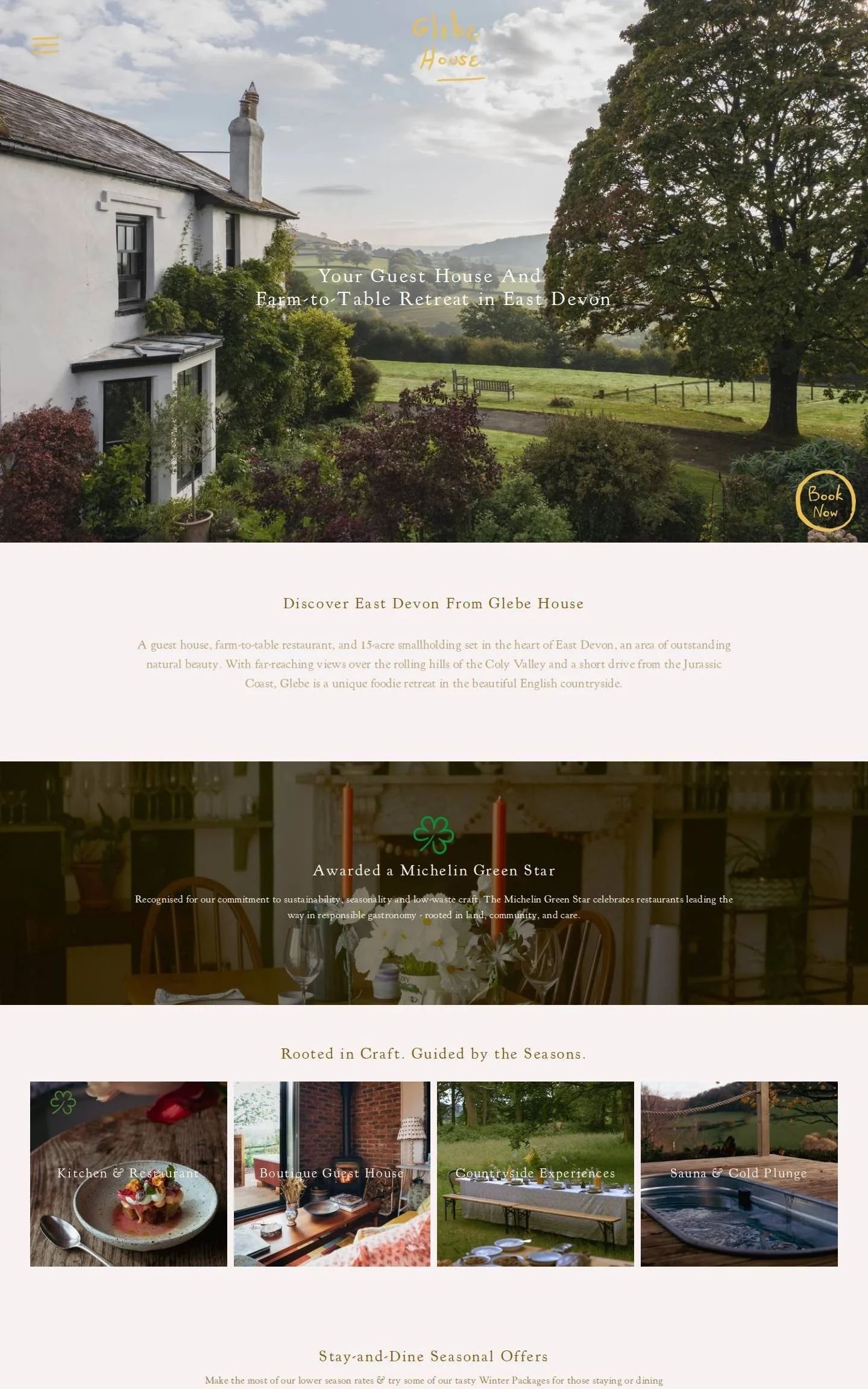
We love how this feels handwritten. The logo and the round "Book Now" button look drawn in yellow paint, and they sit over a photograph of the white house looking out across green hills. Below, four image tiles lead to the restaurant, guest house, countryside experiences and sauna, and the seasonal offers have handwriting scrawled across their photographs. A row of upcoming workshops with date badges shows a place where something is always happening, which gives guests a reason to pick a date.
Idea to borrow: Keep a booking button fixed in the corner of the screen so it follows guests down the page. They should never need to scroll back up to book.
5. Captains Cottage Hobart
Hobart, Tasmania, Australia · captainscottagehobart.com
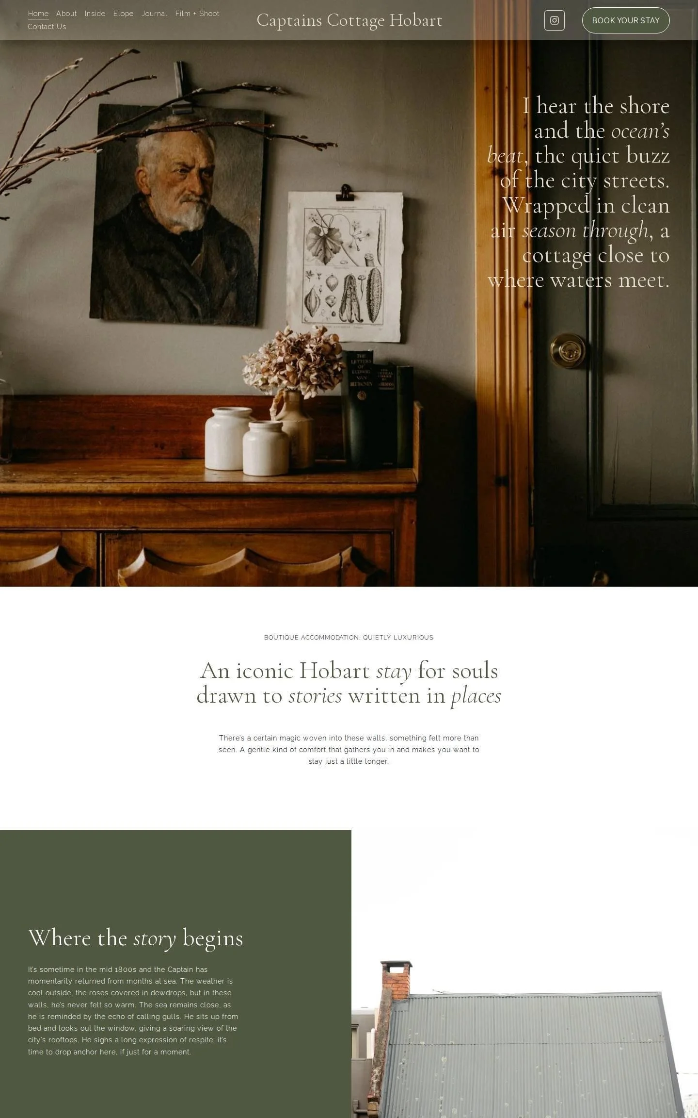
We love the mood this sets in one image. The hero is a close, dim photograph of an oil portrait, a botanical print and dried flowers on a wooden sideboard, with a short verse about the shore and the city set over it in a light serif. From there the page moves through blocks of olive green, warm beige and deep navy, each holding one idea: the cottage's story, elopements, guest reviews. Italic words inside every headline give it a quiet, romantic voice.
Idea to borrow: Open with a detail instead of a wide shot. A close photograph of a corner of a room can say more about how a stay feels than the whole building.
6. The Tillerman
Bristol, Vermont, USA · thetillermanvt.com
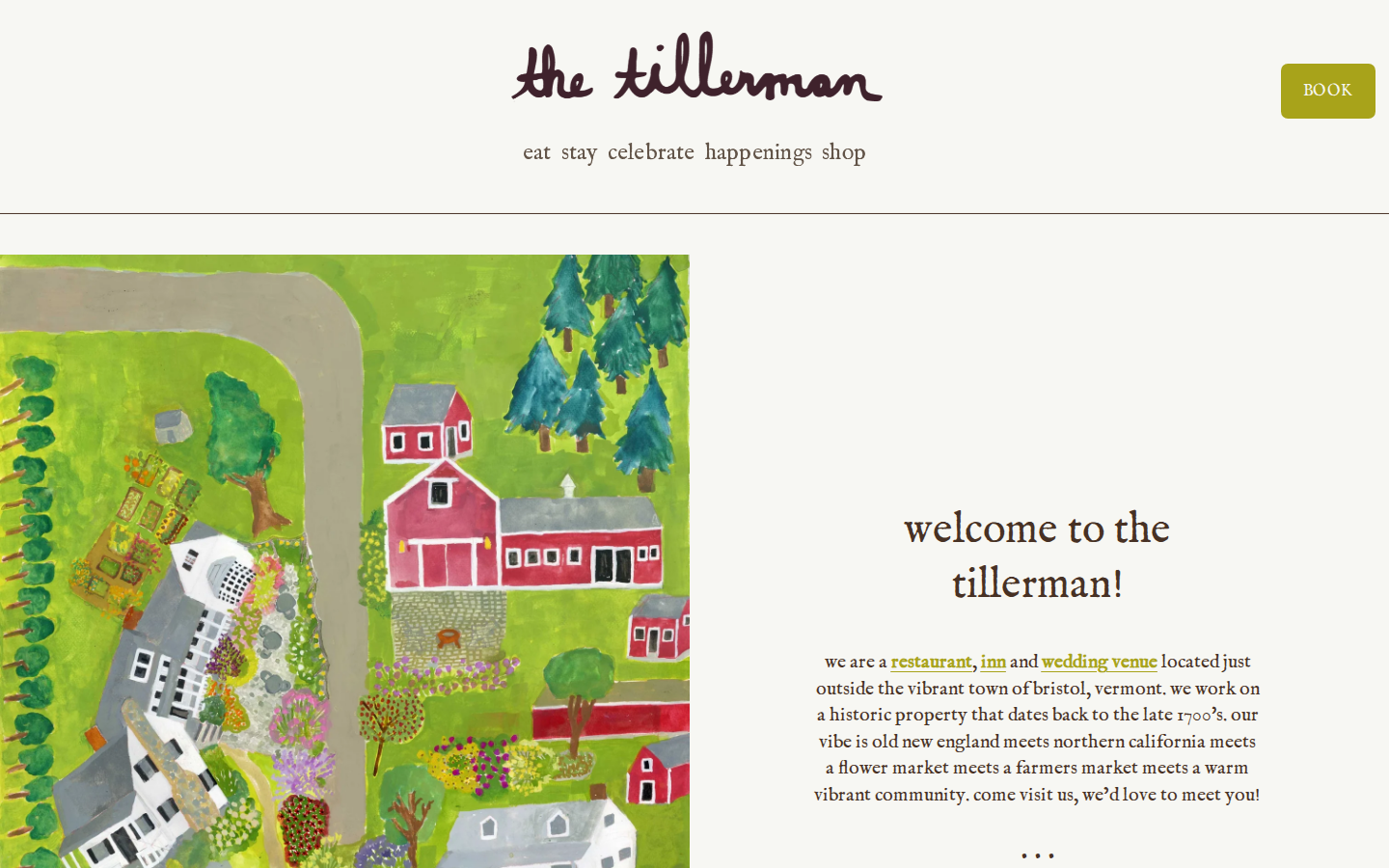
We love how hand-painted it all is. The name is written in loose brown script, and in place of a hero photograph there is a bright painted map of the property, with red barns, gardens and pine trees seen from above. The welcome is written entirely in lowercase and sounds like a friend talking. Under it, on a pale yellow band, three small paintings send you to book a table, book your room or plan your wedding, so every kind of visitor knows where to go.
Idea to borrow: If your property does more than one thing, put those choices side by side near the top of the homepage so each visitor finds their path in one click.
7. Mèlisses
Andros, Greece · melissesandros.com
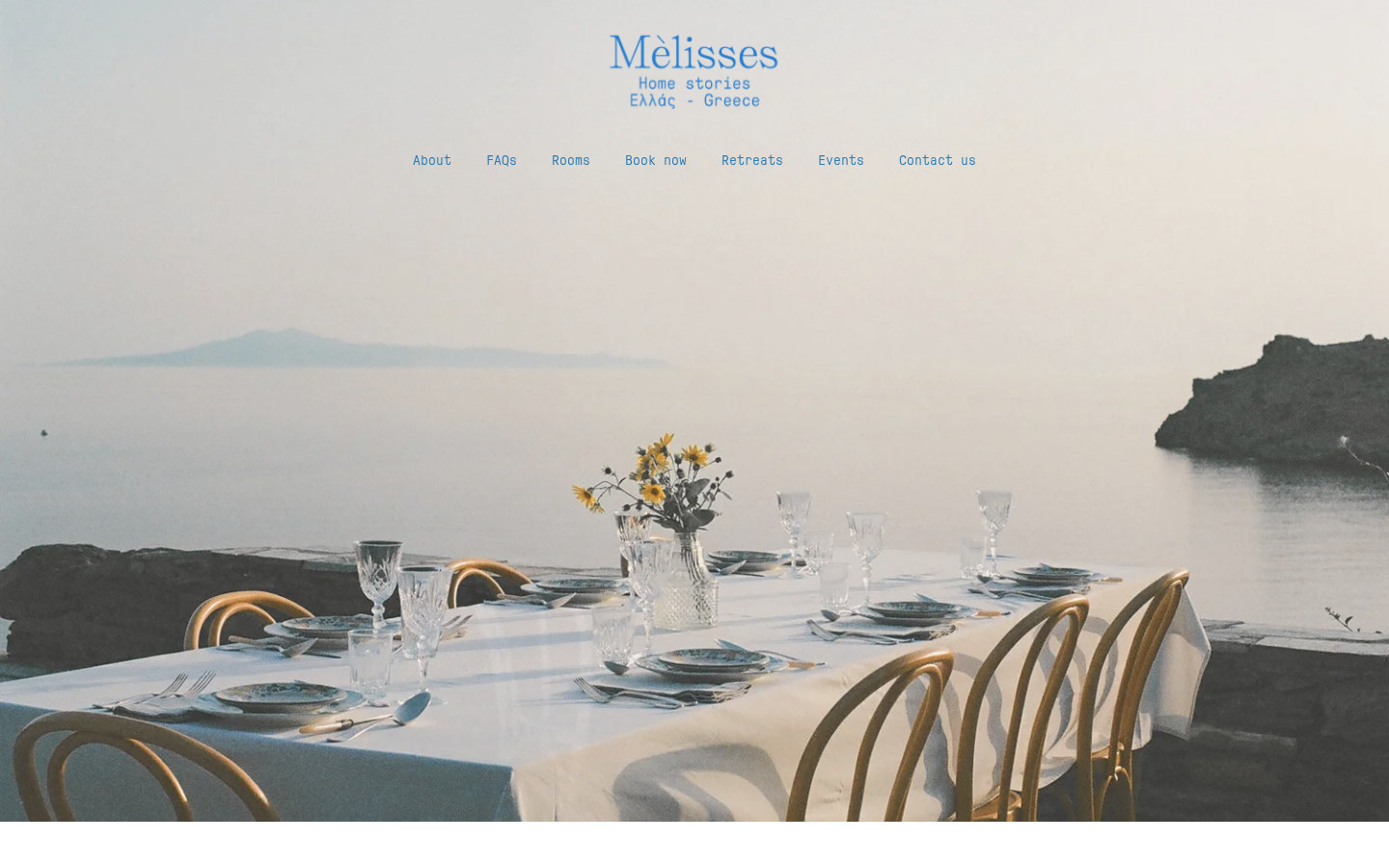
We love that the whole site is one color. The logo, the menu, the headlines and the buttons are all the same sea blue, set over a hazy photograph of a table laid for dinner above the water. Below that, small photographs are scattered around a single sentence of introduction, as if someone had laid prints out on a table. A typewriter-style font for the body text makes it read like a letter from the island, and a row of news from the house keeps it current.
Idea to borrow: Choose one color from your surroundings and use it for every piece of text and every button. A single color looks confident and is very easy to keep consistent.
8. Artist Residence
London, Brighton, Bristol, Oxfordshire and Cornwall, UK · artistresidence.co.uk
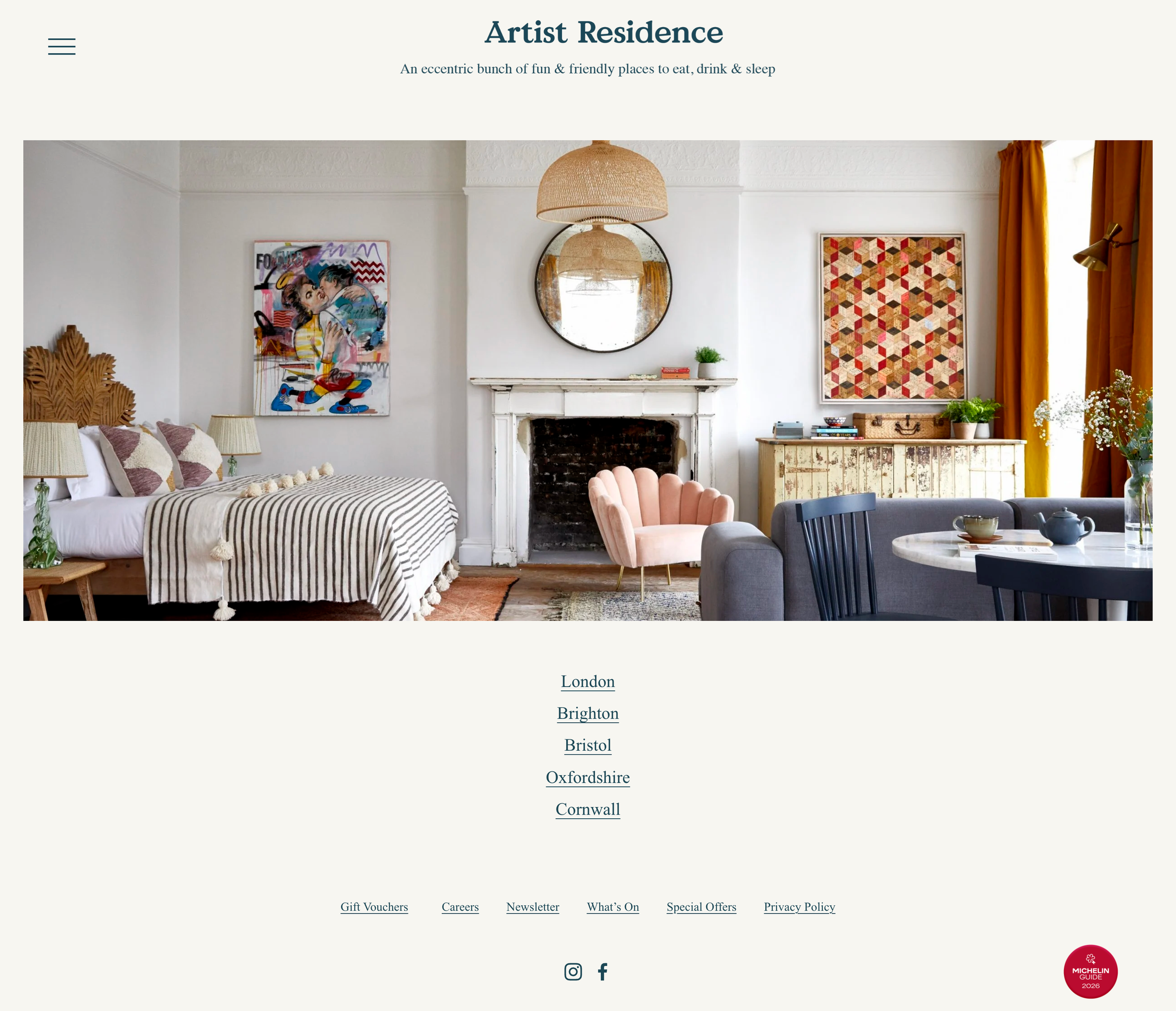
We love how little there is here. The name in a dark teal serif, one line underneath ("An eccentric bunch of fun & friendly places to eat, drink & sleep"), one large photograph of a bedroom with a wood stove and a blue barn door, and then five place names in a simple list. That is the homepage. For a group with several hotels it is exactly right, because the only thing a guest needs to do first is choose where they are going.
Idea to borrow: If you have more than one property, let the homepage do a single job: send guests to the right location. Save the detail for each property's own page.
9. River Lodge
Paso Robles, California, USA · riverlodgepaso.com
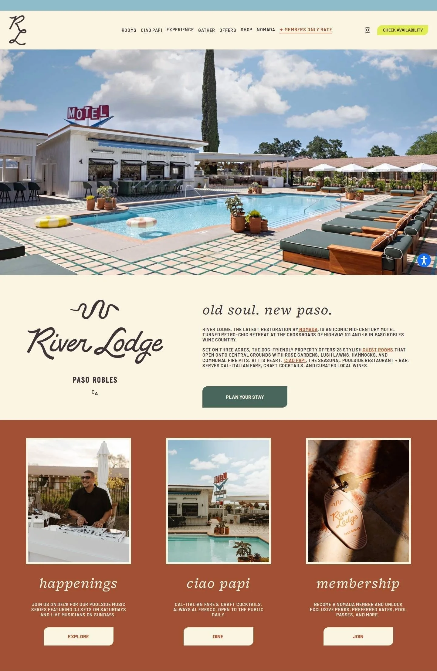
We love how much this looks like a vacation. A wide photograph of the pool, with its striped floats, green loungers and red "MOTEL" sign, fills the top, and the palette is taken straight from it: cream, terracotta, pale blue and a bright yellow availability button. The headline "old soul. new paso." sits beside a retro script logo, and three framed photographs on a terracotta band lead to live music, the restaurant and membership. A small palm tree drawing and squiggly lines finish it off.
Idea to borrow: Make your booking button the one color that appears nowhere else on the page. It will be the first thing a guest's eye lands on.
10. Swell Hotel
Byron Bay, New South Wales, Australia · swellhotel.com
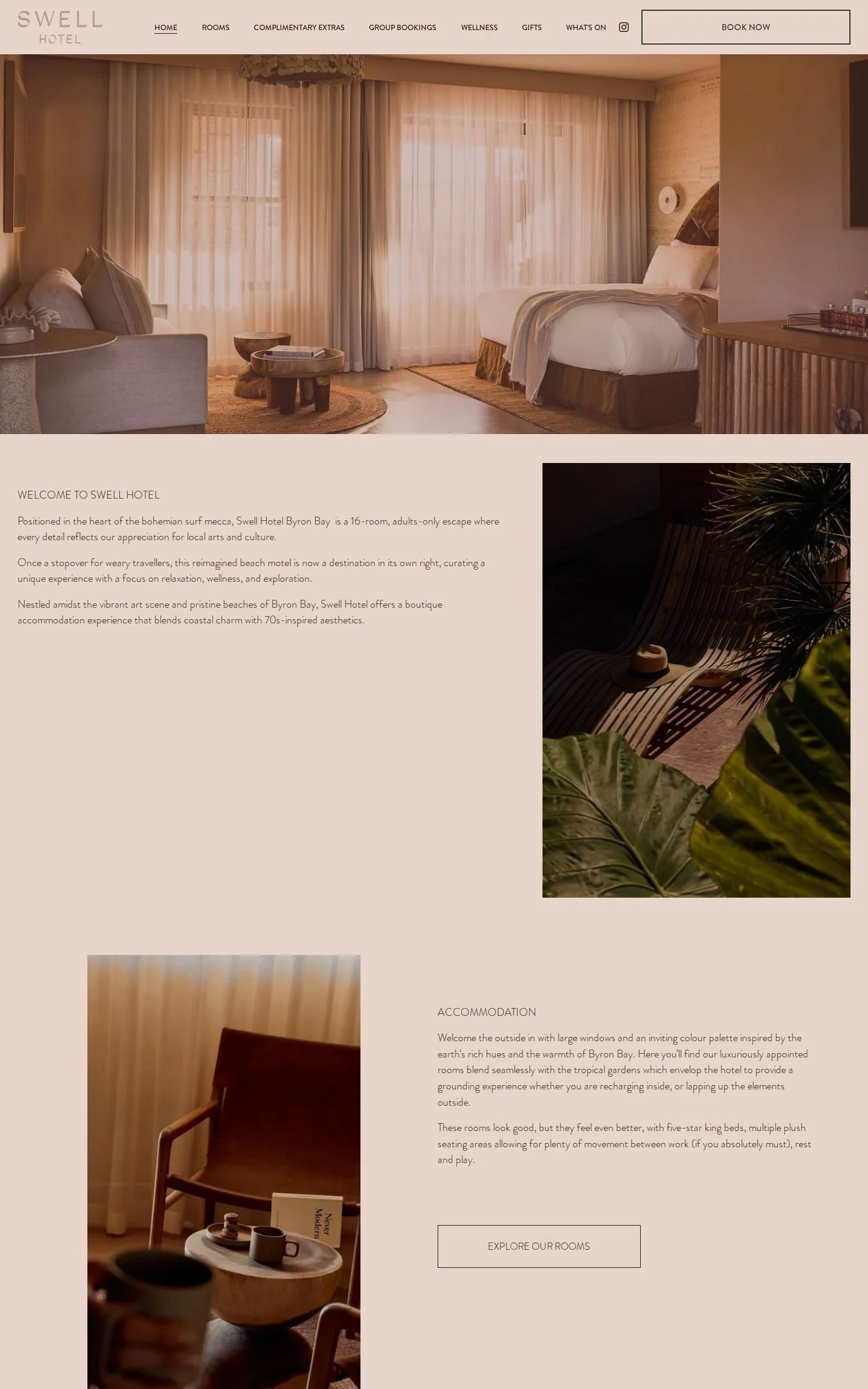
We love how calm this is. The whole page is washed in blush pink and warm brown, and a soft, sunlit photograph of a guest room with sheer curtains sits at the top. Three short sections follow, a welcome, the rooms and wellness, each pairing a tall photograph with a few lines of light, thin text and one outlined button. The photographs sit at different heights and sides of the page, and the last section deepens to a rich clay color. You feel slower by the end.
Idea to borrow: Limit your homepage to three sections with one button each. Guests who are not overwhelmed are far more likely to click through to the rooms.
11. 28 Gates
Derwent Valley, Tasmania, Australia · 28gatesfarmstay.com.au
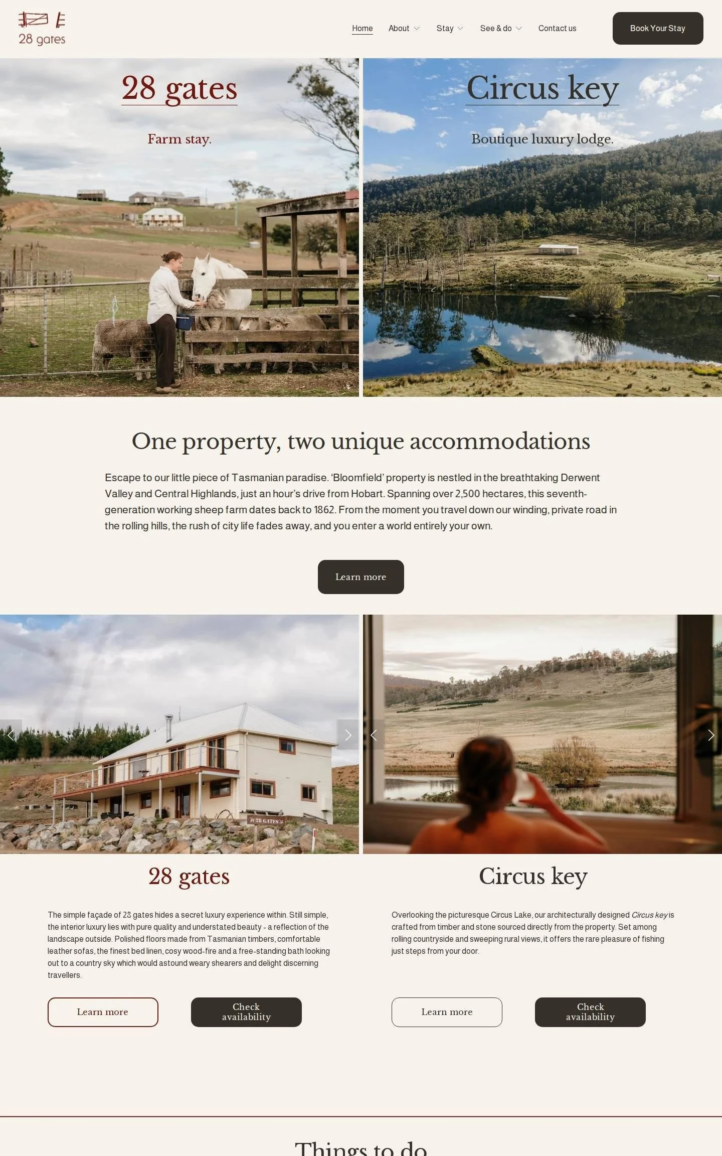
We love how clearly this explains itself. The top of the page is split in two: on the left, a woman feeding a white horse and sheep under the words "Farm stay.", and on the right, a lodge beside a still lake labeled "Boutique luxury lodge." Under the heading "One property, two unique accommodations", each stay gets its own photographs, a short description and two buttons, one to learn more and one to check availability. Fly fishing and a farm tour follow in overlapping photo and text panels.
Idea to borrow: Give each room or cottage two buttons: one for more detail and one for availability. Some guests want to read first, and others are ready to book.
12. The DeBruce
Livingston Manor, New York, USA · thedebruce.com
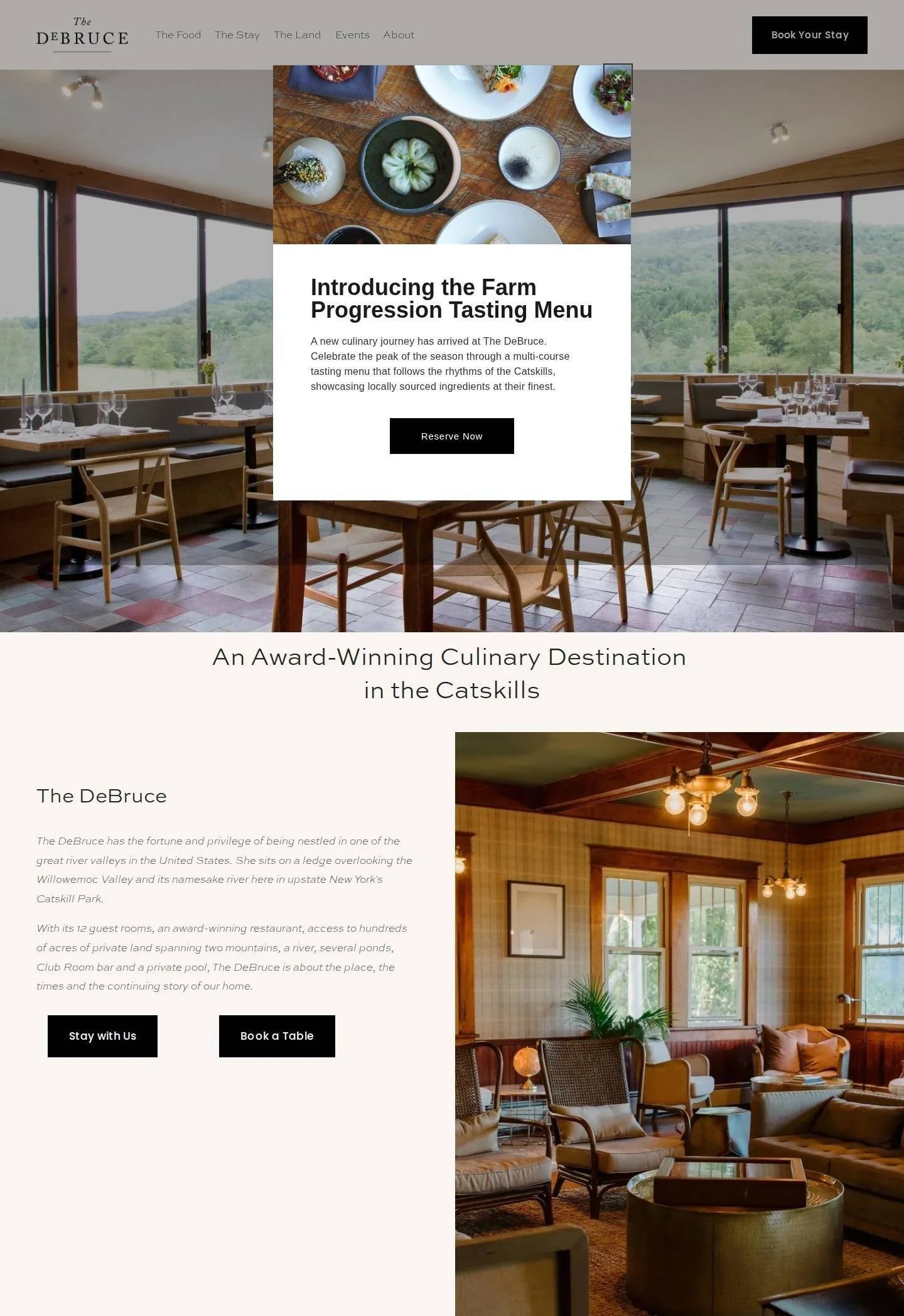
We love how this site puts dinner first. The opening photograph looks across the dining room to the hills beyond, and a white card laid over it introduces the tasting menu with a "Reserve Now" button. Under the headline "An Award-Winning Culinary Destination in the Catskills", a short introduction in soft gray italics sits beside a photograph of the plaid-walled lounge, with two black buttons: "Stay with Us" and "Book a Table". A small engraving of a trout, four photo tiles and an olive green band of award mentions complete the page.
Idea to borrow: Collect your awards and press mentions in one band of short cards, each linked to its source. Guests can check them in a click, which makes them far more convincing.
What the best boutique hotel websites have in common
One photograph does the opening. Almost every site here starts with a single strong image, whether that is a fire-lit living room, a pool or a dining room with a view.
The booking button never moves. It sits in the top corner or follows you down the page, so reserving is always one click away.
The palette comes from the place. Sea blue on a Greek island, terracotta by a California pool, olive and navy in an old Hobart cottage.
Location is stated early and plainly. Guests should know where you are before they scroll, and these sites tell them in the first headline or the line under the logo.
There is something only they would have. A painted map, a set of illustrations, a verse or a handwritten logo makes a property easy to remember after the tab is closed.
Other people do the praising. Press logos and guest quotes appear on the homepage, so the site does not have to sing its own praises.
Want a website like these?
Our team designs custom Squarespace websites for boutique hotels, inns and vacation rentals. Your site is launched in one to two weeks, and afterwards you will be able to update your own rooms, photos and offers whenever you like. See our Squarespace web design services.