
How to Build a Stunning Squarespace Website: Complete Guide (2025)

Prefer to watch?
Here’s the video!
Mentioned in the Video:
*Yup - that’s an affiliate link! My margarita fund thanks you kindly!
Rather read all about it?
Are you a beginner trying to build a website, but you don't want the website to scream
"An amateur DIY'ed me!" ?
Don't fret, I'm Paige, I've taught quite literally millions of people how to build sites on Squarespace, and I'll help you do the same today.
This is not your typical tutorial, we're going to be building this interior design company’s website together! 😍 👇


From finding your way around the back end of Squarespace, to styling the sites colors, fonts, spacing and buttons, to getting content onto the page, you'll learn it all. Of course, please follow along the steps & advice and put together a site for whatever dream you're launching, but the hope is that by building a real site together, you'll understand how Squarespace really works. So let's start!
Step 1: Setting Up Your Squarespace Site
Getting Started
Head to Squarespace.com and click Get Started. Depending on your setup, you’ll either see:
A beautiful lineup of templates, ready for your perusal.
A short questionnaire asking about your business.
✨ Pro tip: If you get the questionnaire, skip it. Trust me, this isn’t the curated shortcut you might be hoping for.
Why? Squarespace’s suggestions are based on the industry you select.
For example, if you’re a yoga studio in New York City, it’ll serve up yoga templates galore. The result? A website that looks eerily similar to every other yoga studio’s site—and let’s be honest, you deserve better.
Choosing the Right Template
Think of your template as your starting canvas. The closer it aligns with your vision, the less time you’ll spend adjusting styles later.
👉 Ask yourself: Does this match the look and feel I want for my site?
For this tutorial, I’ve chosen the Belisa template. While its demo content features a chic cocktail bar, that doesn’t matter. What counts is the layout and aesthetic, which we’ll customize to fit an interior design business.
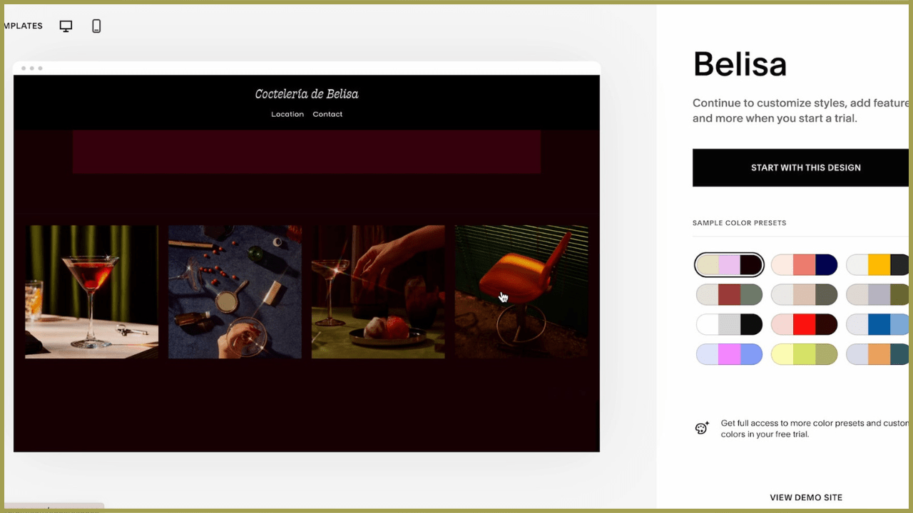
✨ Time-saving tip: Starting with a template that aligns with your vision means less fiddling with fonts, colors, and spacing later on.
Understand Your Free Trial
Squarespace offers a two-week free trial, which is plenty of time to explore and start building. But here’s an insider secret: if you need more time, just contact Squarespace support and ask for an extension. I’ve done this multiple times and have never been turned down.
💡 Good to know: Your progress won’t disappear when the trial ends. If you pause, your work will be saved, and you can pick up right where you left off when you’re ready.

Step 2: Navigating the Squarespace Workspace
Preview Pane (Right-Hand Side)
This shows exactly how your site will look as you edit it. No need to save, switch views, or wonder if your changes worked—everything updates in real time.
💡 Why I love this: Seeing your edits live is as satisfying as the first sip of a perfectly brewed cappuccino.
Navigation Menu (Left-Hand Side)
This is your control center, where you’ll manage pages, design settings, and more.
Use the Search Bar for Easy Navigation
If you can’t find a tool or setting, use the search bar in the top left. Squarespace occasionally updates its interface, and this feature is a lifesaver when things move around.
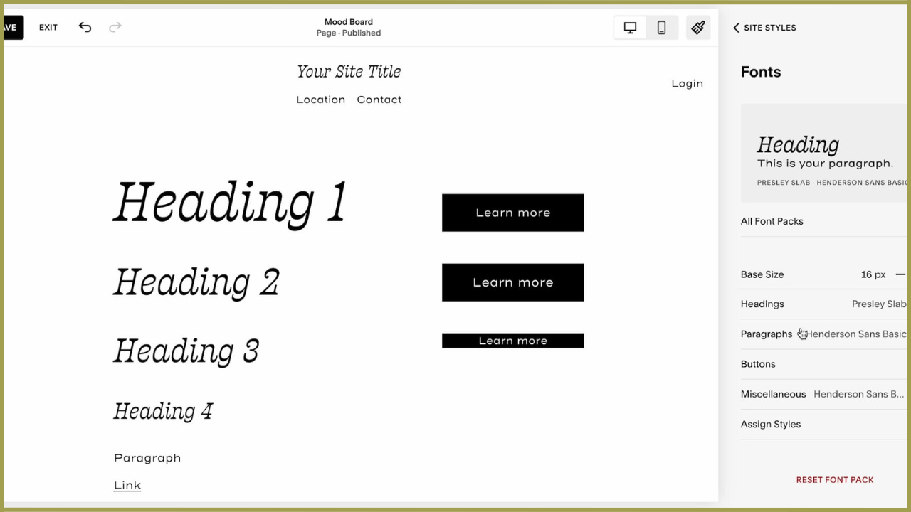
Step 3: Set Your Styles & Build a Mood Board
Start with Fonts, Colors, and Buttons
Before adding any content, take time to set your overall site styles. While it might feel counterintuitive, this step is a game-changer for consistency and efficiency.
💡 Why Start Here?
Consistency is key: Squarespace applies style changes globally. If you update a font or button style on one page, it updates across your entire site.
Save time and frustration: Setting styles upfront ensures every heading, paragraph, and button looks cohesive from the start.
✨ Smart Tip: Create a test page to experiment with your styles before applying them to live pages.
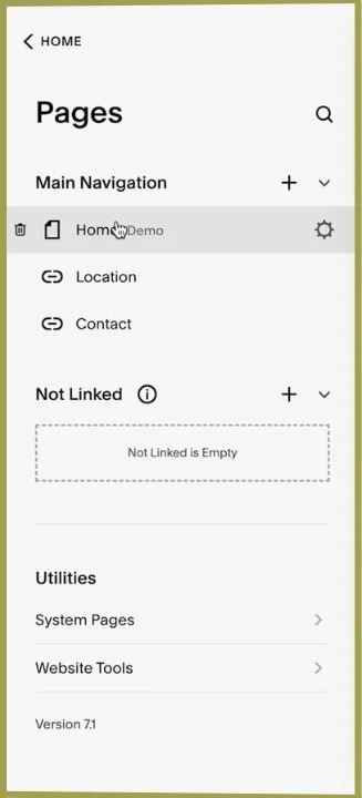
Create a Mood Board Page
Navigate to the Pages Menu
In the navigation menu, scroll to the Not Linked section and click the + button.Add a Blank Page
Select "Blank Page" and name it “Mood Board.” This page will act as your sandbox—a space to test fonts, colors, and layouts without affecting your live site.
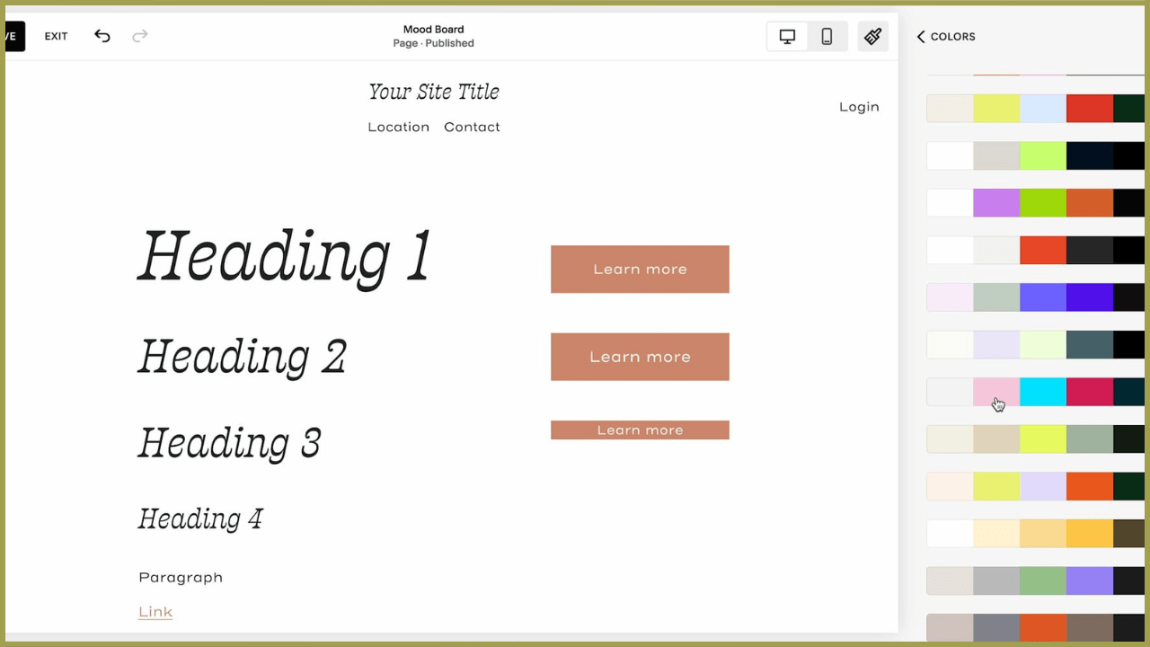
Experiment with Styles
Use your Mood Board page to test how your site’s text, buttons, and forms look together. Adjust and perfect your styles here before applying them across your site.
Add Text, Buttons, and Forms
Adding Text Blocks:
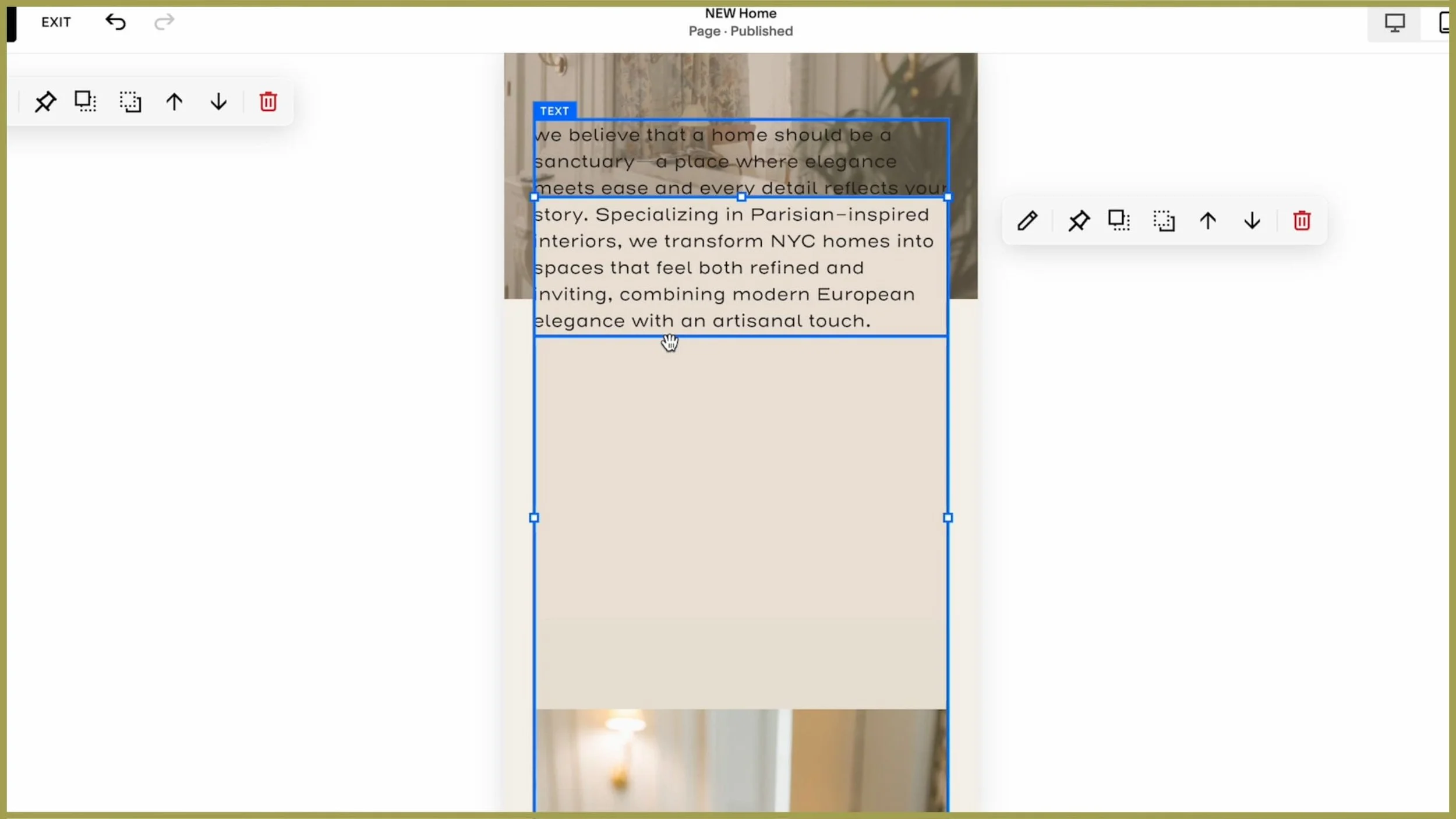
Insert a Text Block:
Click Add Block in the top-left corner and select Text. Once placed, your text block will appear as a blue rectangle. Click inside the rectangle to start typing.✨ Pro Tip: Add sample text for each heading style (Heading 1, Heading 2, Heading 3, etc.) and paragraph text. This allows you to preview and tweak all your text styles in one place.
Adjust Text Styles:
Highlight the text you want to edit, and use the dropdown menu to select a heading or paragraph style.Resize the Text Block:
If your text looks awkward or split across lines, resize the block by dragging the corners of the blue rectangle.Link Text:
Highlight your text and click the link icon in the text toolbar. From here, you can:Link to another page on your site.
Link to an external URL (e.g., your Instagram).
Link to a file (e.g., a downloadable PDF).
💡 Pro Tip: Keep links within the same tab for seamless navigation when linking to pages within your site.
Adding Buttons:
Insert a Button Block:
Click Add Block and select Button. Drag the button to your desired location on the page.Add Multiple Buttons:
Add two more buttons, labeling them “Primary,” “Secondary,” and “Tertiary” for easy reference.Style Each Button Type:
In the Button Settings, assign each button a type (Primary, Secondary, or Tertiary) for clear distinction.
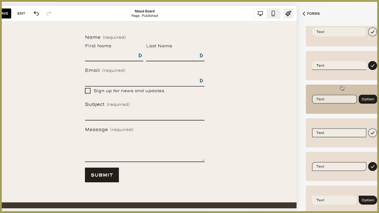
Adding a Form:
Insert a Form Block:
Click Add Block and select Form. Drag the form to your preferred location on the page.Expand the Section (If Needed):
If the form doesn’t fit, expand the section height by dragging the blue adjustment handle in the bottom-right corner.Style the Form:
Open the Site Styles menu (paintbrush icon) and customize the form’s spacing, borders, and button styles.💡 Minimal and clean forms often work best—think of this as the “little black dress” of website design.
💾 Save Your Progress
Squarespace doesn’t automatically save your changes while editing, so make it a habit to hit the Save button regularly.
Edits are private until saved: If your site is live, visitors won’t see your changes until you click Save.
Preview your changes: Before exiting the editor, take a moment to preview your work and ensure everything looks cohesive.
✨ Pro Tip: If you’re redesigning an existing site, rest easy knowing your changes won’t affect the live version until you save them.

Step 4: Setting Up the Homepage
Your homepage is the digital storefront of your website—it sets the tone and invites visitors to explore further. In this step, we’ll walk through creating a custom homepage using Squarespace, from setting up the page to designing key sections that highlight your services.
Decide How to Start
If your template already includes a homepage, you can start with that and replace the content. However, this often results in a site that feels too much like the template.
To create something unique, I recommend building a new homepage from scratch.
Keep Your Current Homepage Live (Optional)
If you’re redesigning an existing site, leave your current homepage live while you work on the new one. Once the new design is ready, you can easily set it as the homepage.
Click the Settings icon for the page.
Select Set as Homepage and confirm.
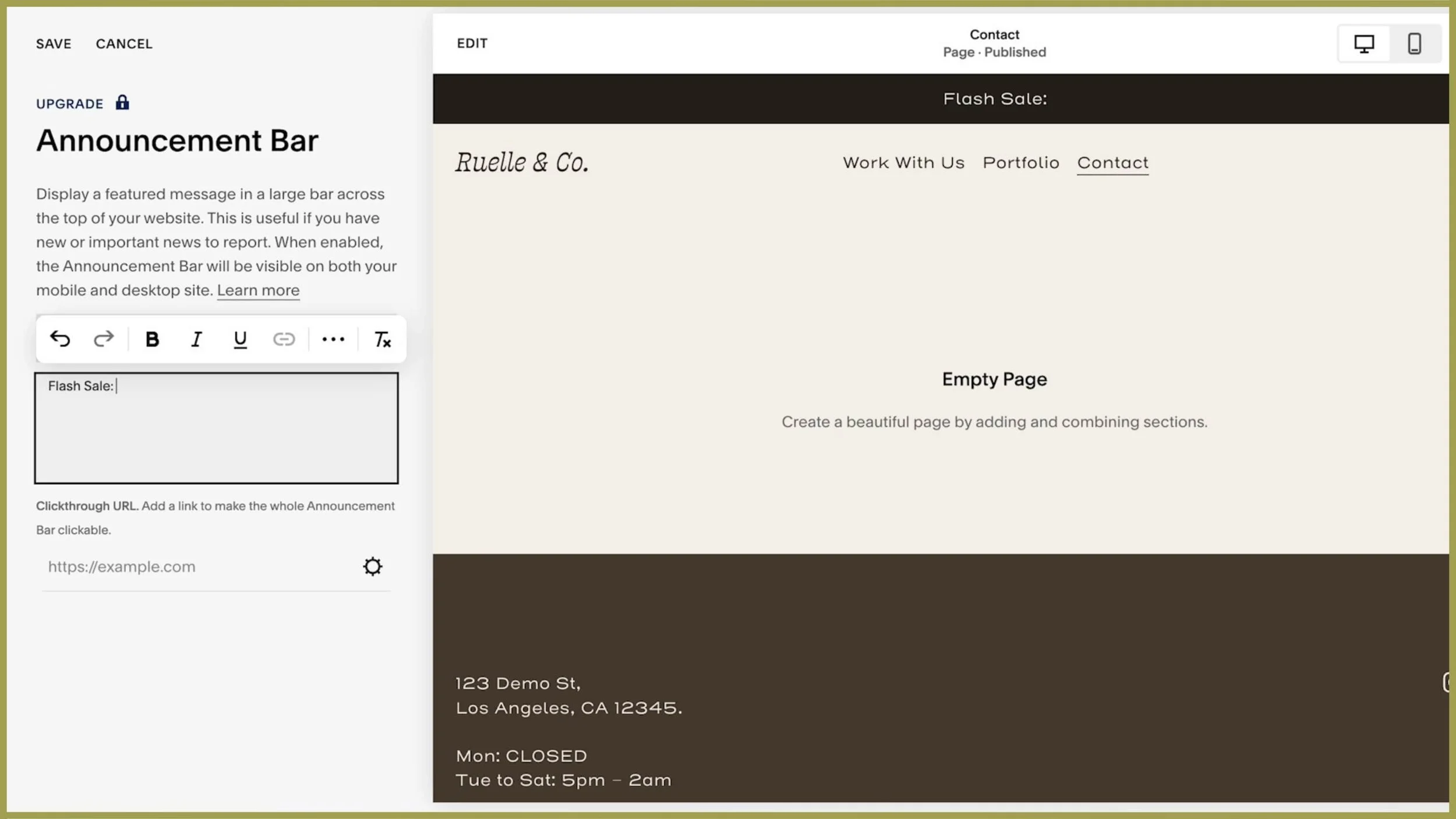
Create a New Page
Click the + icon in the Not Linked section of your navigation.
Select Blank Page to start with a clean slate.
Name the page (e.g., “New Home”) and hit Enter.
✨ Pro Tip: Keep your draft page in the Not Linked section while designing, so it’s not visible to visitors.
Step 5: Designing the First Section
Your homepage’s first section sets the stage for your visitors. Here's how to create a captivating and polished first impression.
Add a Section
Click Edit on your blank page and select Add Section.
Choose a pre-designed layout to kickstart your design.
Replace Images
Click on an existing image in the layout and select Edit.
Delete the placeholder image and upload your own file.
If you don’t have images ready, you can browse stock photos directly in Squarespace.
Prepare your images beforehand by renaming and resizing them for optimal loading speed and SEO.
✨ Pro Tip: If your image is cropped, adjust the focal point or resize the container by dragging its edges to fit your image better.
Add Text
Now this where my very handy homepage content planner comes into play. If you don’t already have the text content for your site mapped out, go ahead and grab your copy on the house! 👇
Use your content planner to determine what text to include in each section.
Copy your pre-written text and paste it into the text blocks.
Adjust the text style (e.g., heading or paragraph) to match your design hierarchy.
Enhance Readability
If your text is difficult to read over an image, add a shape block behind the text for contrast.
Drag the shape block to position it and resize it by pulling its edges.
Use Shift + Click to select multiple blocks (e.g., text and shape) for alignment adjustments.
Step 6: Adding Call-to-Action (CTA) Sections
CTAs are essential for guiding your visitors toward key actions, like exploring services or making purchases. Let’s create visually appealing and effective CTA sections.
Create a New Section for CTAs
Add a blank section below the first section.
Edit the section background color to differentiate it visually from the previous section.
Use your site’s color palette for cohesion.
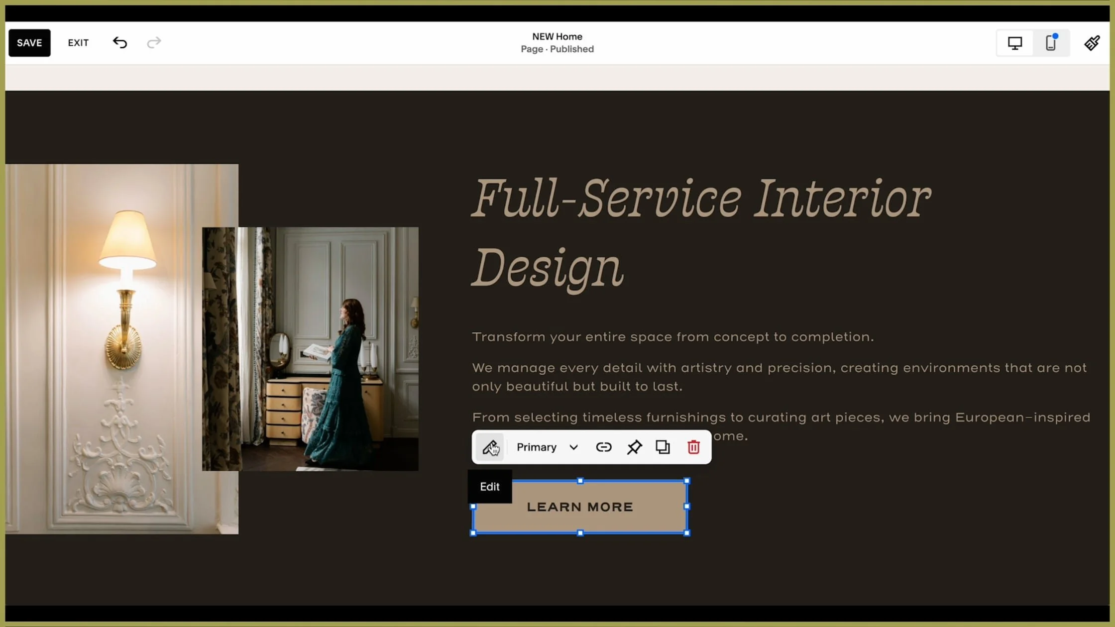
Design the CTA Layout
Add a heading, paragraph text, and a button for your first service offering.
Include an image aligned to one side for visual interest.
Use the Fill option under Design to ensure the image fills its container.
Position the elements by dragging them into place for optimal layout.
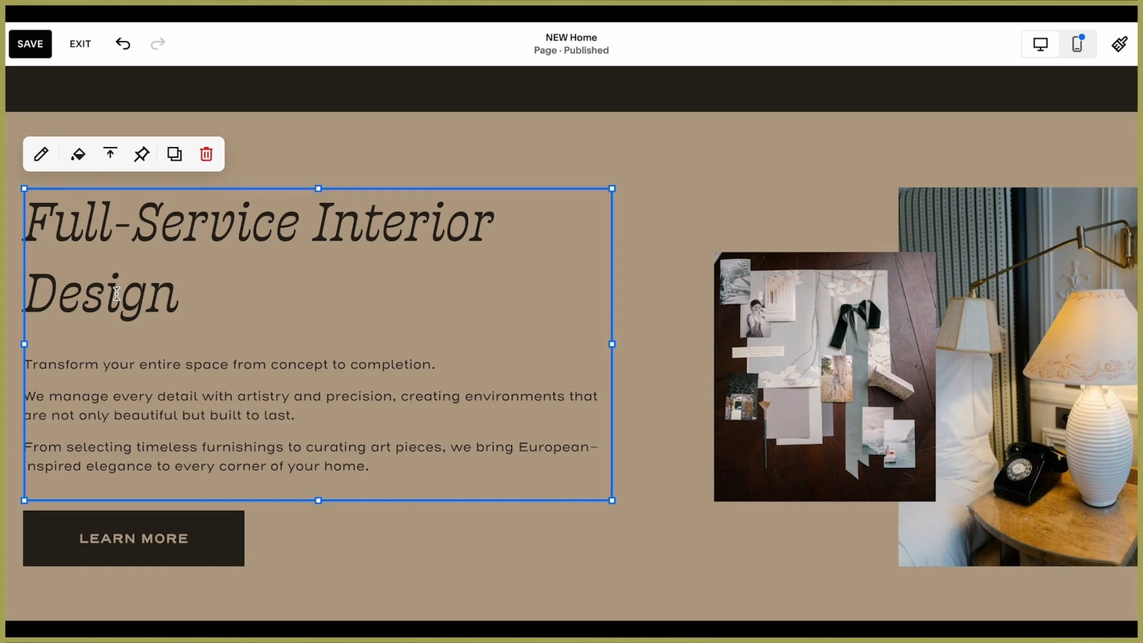
Duplicate the Section for Additional CTAs
Instead of recreating the layout for your second service offering, duplicate the section.
Edit the content:
Replace the text and button link with information about the second service.
Swap out the images for ones that fit the second offering.
Formatting Tips:
Try flipping the layout of the duplicated section (e.g., move the image to the opposite side) to create visual balance.
Ensure the amount of text in each section is roughly similar for consistency.
Cohesion is key. Avoid vastly different image colors or text lengths between sections, as this can feel unpolished.
Step 7: Adding Testimonials
Showcasing client testimonials is an excellent way to build trust and credibility. Let’s create a dedicated section that highlights the satisfaction of your past clients.
Creating the Testimonial Section

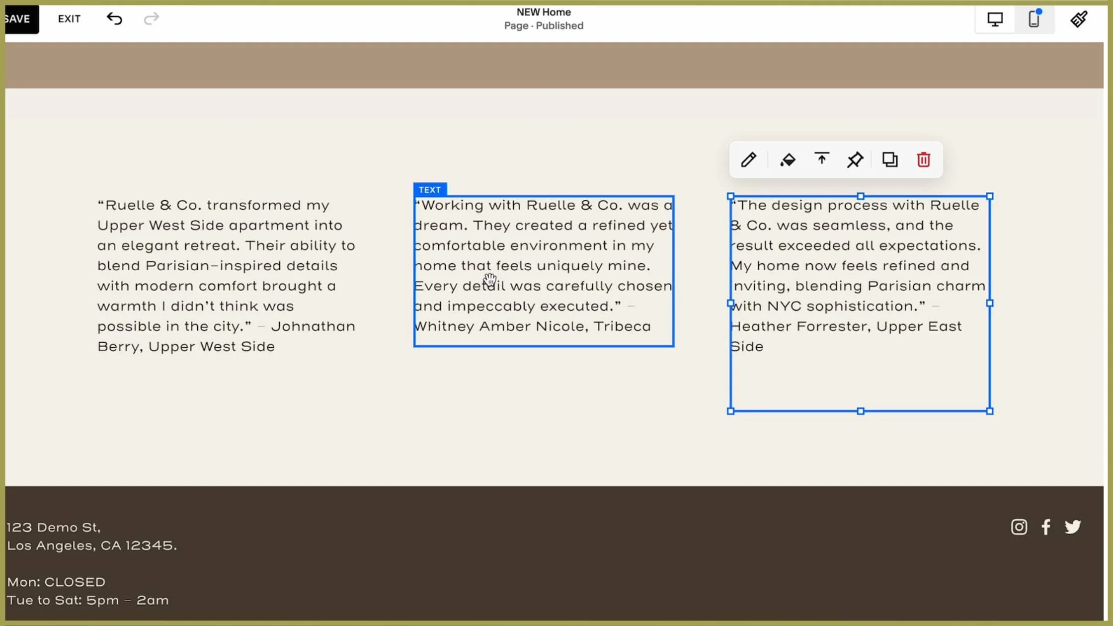
Add a New Section
Click Add Section in the editor and select a layout for testimonials.
A side-by-side layout works well for multiple client quotes, but feel free to pick a style that suits your brand.
Insert Client Testimonials
Paste in your client quotes one by one, ensuring each testimonial gets its own text block.
For a cohesive look, keep testimonials roughly the same length. If one is too long, summarize it for balance and alignment.
Adjust Spacing
Ensure there’s equal space above and below each text block.
Remove unnecessary blank space at the bottom of blocks by deleting extra line breaks or invisible spaces.
Styling Your Testimonial Section
Choose the Right Fonts
Opt for clean, readable fonts for the main text. Consider a decorative font for client names to add a touch of personality.
Play with Colors
Match the section’s background color to your site’s overall palette. For an elegant, feminine vibe, use light beige or soft pastels.
Add Design Elements
Include subtle touches like quote marks, small icons, or borders to make the testimonials visually engaging without overwhelming the design.
Align for Consistency
Use Squarespace’s grid system to neatly align text blocks. Consistent spacing and alignment give the section a polished and professional look.
Step 8: Save and Preview
Saving and previewing your work is crucial to ensure your website looks polished and cohesive. Let’s go over how to save your progress and refine your design.
Save Regularly
Squarespace Doesn’t Auto-Save
Make it a habit to click Save frequently to avoid losing changes.
Changes Are Private Until Saved
Any edits made are only visible in the editor until you hit Save. Visitors to your live site won’t see the changes until you publish them.
Preview Your Design
Exit the Editor to Preview
Click Preview to see how your design looks outside the editor.
Review for Cohesion
Check for proper alignment, readability, and a balance between text and visuals.
Refine as Needed
Tweak Elements That Feel Off
Web design is often a process of trial and error. Adjust any layouts, text, or visuals that don’t feel right.
Play Around with the Design
Experiment with spacing, colors, and images until your layout feels just right.
✨ Pro Tip: After styling your testimonials, save and refresh the page. Take a moment to review your testimonial section on a desktop screen to ensure everything looks perfect before moving on to the next step.
Step 9: Optimizing for Mobile
Your website should look just as stunning on a smartphone as it does on a desktop. While Squarespace automatically adjusts your design for mobile, a few tweaks can make all the difference.
Switching to Mobile View
Access Mobile Preview
In the top-right corner of the editor, click Mobile View to see how your site appears on smaller screens.
Review Each Section
Scroll through your site, paying close attention to key areas like testimonials, images, and text blocks.
Watch for elements that are out of order, overlapping, or misaligned.
Adjusting Testimonials for Mobile
Rearrange Elements
If blocks have shifted, drag them back into the correct order.
For example, move text above or below images for better alignment.
Fix Overlaps and Spacing
If text blocks overlap, resize them by dragging the blue toggles inward.
Add or remove vertical spacing as needed to create a clean, readable layout.
Resize Fonts and Blocks
Check the font size for readability. Adjust overly large or small fonts to ensure they’re legible on a mobile screen.
Double-Check Design Elements
Ensure quote marks, icons, or borders still look balanced and don’t overpower the section.
Final Mobile Touches
Save Your Changes
Click Save to lock in your adjustments.
Test on a Real Device
View your site on an actual phone or tablet. Real-world testing often reveals small tweaks you may have missed in the editor.
✨ Pro Tip: Mobile users expect a seamless, intuitive experience. Take your time to ensure everything feels polished and user-friendly.
Bonus: Creating Pop-Up Banners
Pop-up banners are a powerful way to grab your visitors' attention—whether you’re announcing a sale, promoting a freebie, or sharing important updates. Let’s create one together using the example of a pillow sale.
Setting Up the Pop-Up
Enable the Pop-Up:
Go to Marketing in the left-hand navigation menu.
Select Promotional Pop-Up and click Enable to turn on the feature.
Choose a Layout:
Click Change Layout to browse the pre-designed pop-up options.
Select a clean, modern design that complements your site’s aesthetic.
Designing the Content
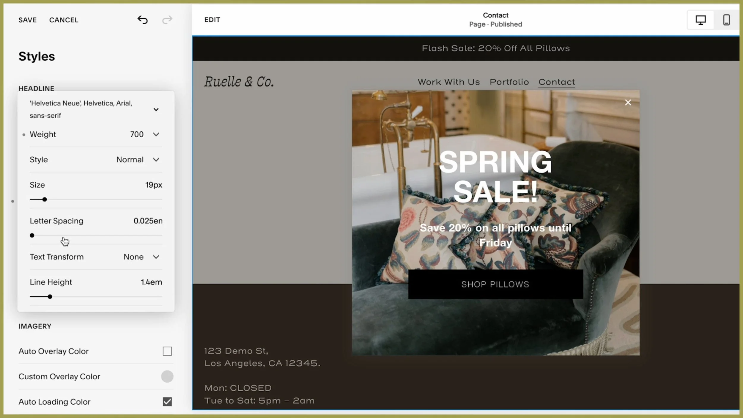
Add a Headline and Message:
Example headline: Spring Sale Alert: 20% Off All Pillows!
Example message: Shop our exclusive collection of luxury pillows and save big. Offer ends Friday!
Add a Call-to-Action (CTA):
Include a button that links to the relevant page, such as your shop or sale category.
Example button text: Shop the Sale Now.
Link the Button:
Highlight the button and click the link icon to add a URL. For example, link it to your “Pillows” category page.
Customizing the Design
Upload an Eye-Catching Image:
Click Upload Image and select a photo of the pillows you’re promoting. Make sure the image is high-quality and styled to match your brand.
Use the Focal Point Tool to adjust the image focus and highlight the products.
Add an Overlay for Text Readability:
Adjust the Image Overlay settings to darken or lighten the background image so the text is easy to read.
Example: Use a soft beige overlay for a neutral, elegant look.
Style the Text:
Use bold fonts for the headline and smaller, clear fonts for the body text.
Match the colors to your site’s palette to ensure the banner feels cohesive.
Timing and Display Options
Set Display Timing:
Choose when the pop-up appears:
Timer-based: Show it after the visitor has been on the page for a few seconds.
Scroll-based: Display it after the visitor scrolls a certain percentage of the page.
Decide Where to Show It:
Choose whether the pop-up appears on desktop, mobile, or both.
Set Frequency:
For a limited-time sale, consider showing the pop-up once per visit to avoid annoying repeat visitors.
Preview and Save
Preview the Pop-Up:
Click Preview to see how your pop-up will appear on your site.
Make adjustments as needed to ensure the text, images, and layout look perfect.
Save and Test:
Click Save and refresh your site to test the pop-up in action.
Ensure the button link works and leads visitors to the correct page.
✨ Pro Tip: Use pop-ups sparingly. Overusing them can annoy visitors and drive them away. Stick to high-value announcements like sales, freebies, or sign-ups.
By following these steps, your promotional pop-up will be a polished, professional way to drive engagement and sales!
Step 10: Launching Your Website
You’ve done it—your website is ready to go live! Here’s how to make it public and share it with the world.
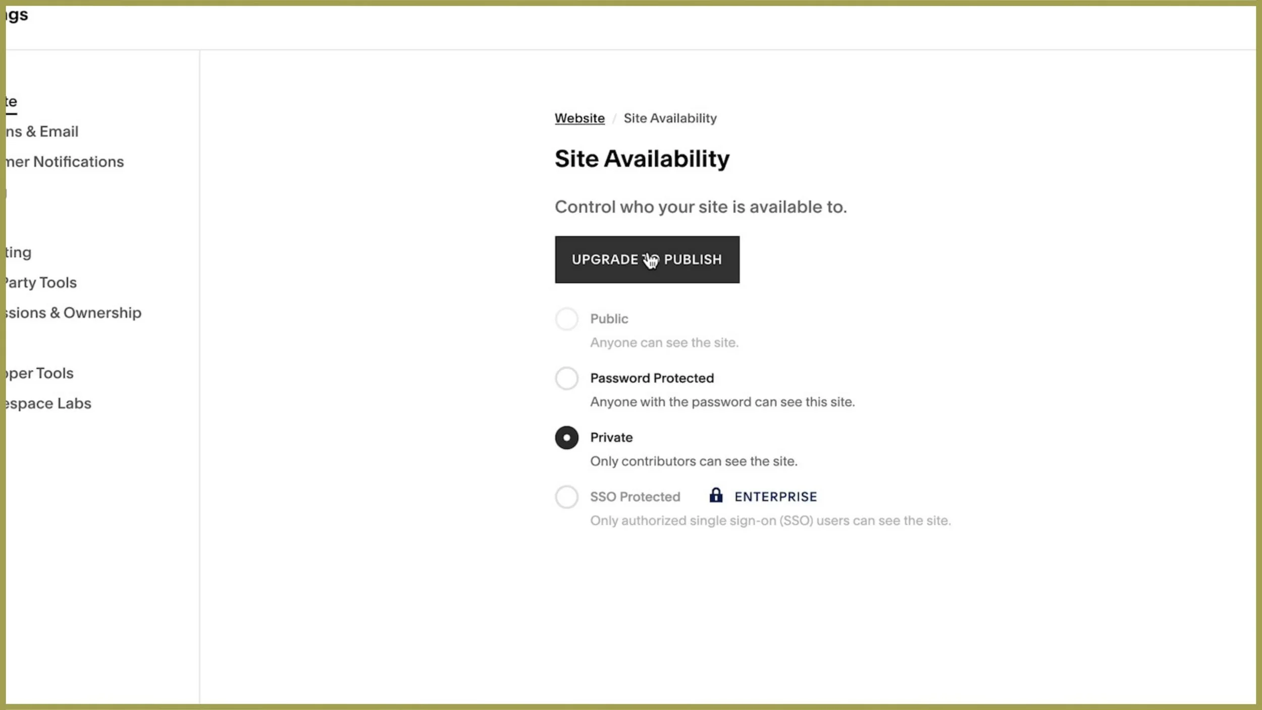
1. Adjust Site Availability
By default, Squarespace sites in trial mode are only visible to contributors (those managing the site). Follow these steps to make your site public:
Access Settings
Go to Settings → Site Availability.
Make Your Site Public
You’ll see the site is restricted to contributors only.
To make it public, you’ll need to upgrade your plan.
2. Choose and Upgrade Your Plan
Squarespace lets you design your site for free during the trial period, but you’ll need to select a plan to launch it.
Extend Your Trial
Not quite ready to launch? Contact Squarespace support via email or live chat to request an extension—they’re usually happy to oblige.
Upgrade to Publish
When you’re ready, click Upgrade to Publish in the site availability settings.
Choose Your Plan
For most users, the Business Plan is the best option, especially if you’re not selling physical products.
If you plan to sell products or need advanced e-commerce features, explore the Commerce Plans.
Payment Options
You can choose to pay annually or monthly.
💡 Pro Tip: Use my discount code PAIGE10 at checkout for 10% off your purchase. To maximize your savings, apply the code to an annual plan—it discounts the entire year, not just one month.
3. Launch Your Website
Once you’ve selected and paid for your plan:
Finalize Setup
Squarespace will guide you through the last steps, such as entering your business address and payment details.
Go Live
After completing the setup, your website will officially be live for the world to see!
🎉 Congratulations on launching your site! 🎉
Next Steps:
Now knowing the tech of how to build a site is one thing, but making it look good is quite another.
Nothing says "I'm an imposter business owner" quite like bad design.
But what exactly is bad design?
Watch this video next and I'll share with you the outdated trends you definitely want to avoid on your website this year!
