
7 Website Mistakes That Make Your Site Feel “Off” (Fix These Now!)

Prefer to watch?
Here’s the video!
Mentioned in the Video:
*Yup - that’s an affiliate link! My margarita fund thanks you kindly!
Rather read all about it?
You tweak the colors, adjust the fonts, move things around… but something about your website still doesn’t feel right—and you can’t quite figure out why.
Chances are, you’re making one of these common website design mistakes. But don’t worry! By the end of this post, you’ll know exactly how to fix them.
We’re diving into real website submissions from this community, covering major struggles like:
“My color palette just isn’t giving the right vibe—HELP!”
“This section feels like a mess… do you have better layout ideas?”
“My photos don’t feel polished or professional—how do I find better, more cohesive ones?”
And, there’s one major mistake I see all the time—one that instantly makes a website feel unpolished. We’ll get to that in just a sec.
Let’s start with fixing your layout—because a confusing or cluttered layout can make even the most beautiful brand feel disorganized.
Mistake #1: Cluttered or Confusing Layouts
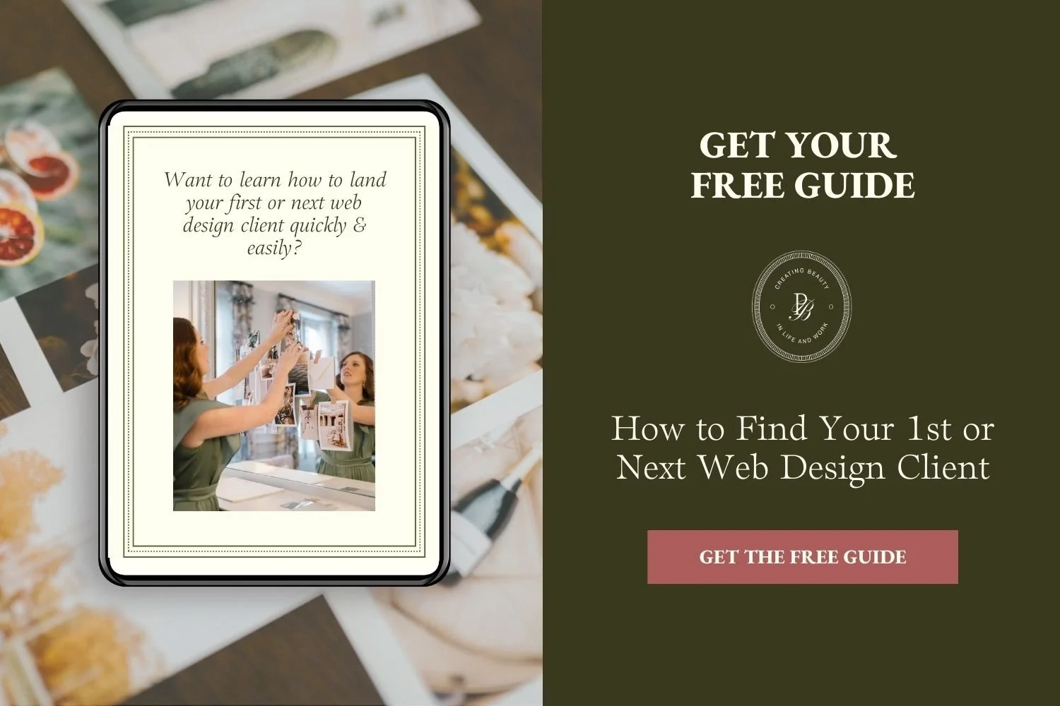
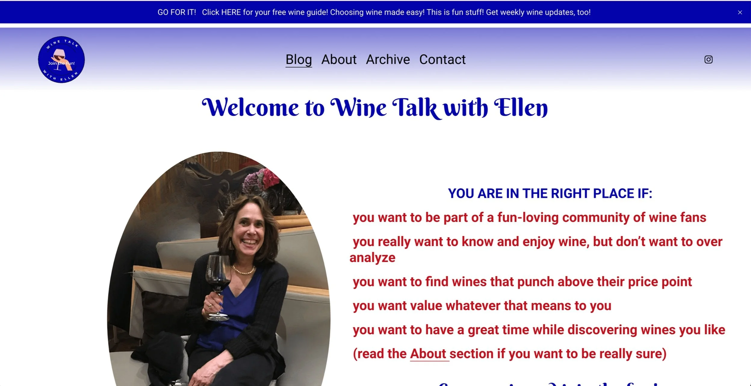
We’re starting with Gayle Riley’s website and taking a look at the opt-in gift section on her homepage.
This section is so important because your opt-in freebie is one of the most powerful ways to turn website visitors into subscribers (and eventually, paying clients).
What Works Well?
✔ The heading text clearly explains what the freebie is.
✔ The sign-up option is obvious and easy to find.
What Could Be Improved?
🔹 Add a strong visual of the item.
A graphic is great, but placing it inside a laptop mockup (or an image of a notebook, phone, or workbook) would immediately tell visitors what they’re getting…
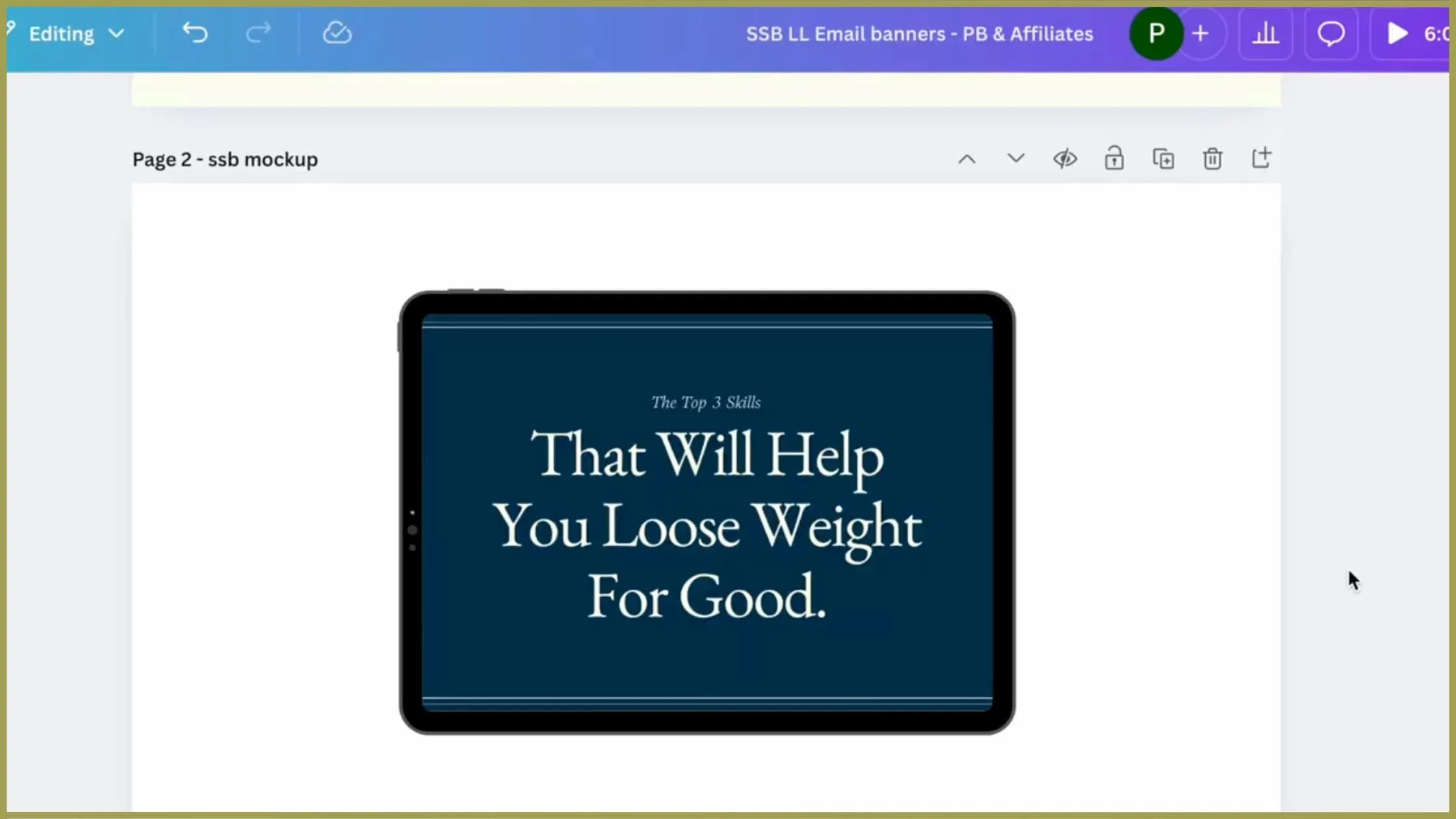
👈 See what I mean?! 😍
🔹 Make the title easier to read.
Right now, the script font is too small and difficult to read.
A larger, bolder font will instantly improve readability and draw attention to the offer.
🔹 Include a curiosity-driven description.
People sign up when they feel intrigued—so this is where you want to break a common belief or hint at surprising insights.
Keep it short—2-3 sentences is ideal.
Example:
“Most people think losing weight is all about cutting calories—but these 3 skills will completely change the game for you.”
SOLUTION
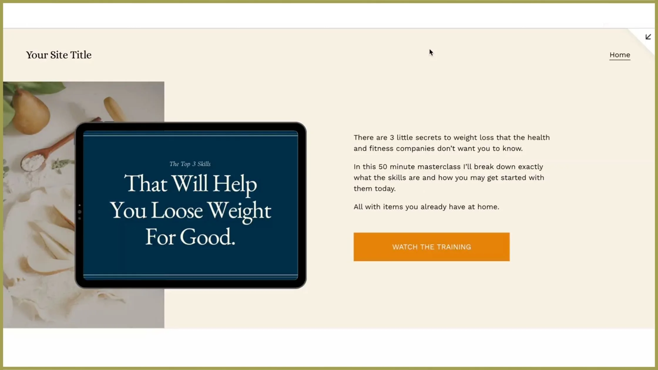
✔ A clear visual that represents the freebie (e.g., placed inside a laptop or workbook mockup).
✔ A bold, easy-to-read title.
✔ A short, curiosity-driven description that sparks interest.
✔ A strong call to action to encourage sign-ups.
I actually designed a brand new opt-in section layout that follows these best practices—and you can see the step-by-step breakdown in this video
Mistake #2: Unbalanced or Clashing Color Palettes
Next, let’s talk color palettes. A well-chosen color scheme can completely transform your website—making it feel more polished, professional, and aligned with your brand’s personality.
We’re taking a look at Wine Talk with Ellen, which already has a beautiful deep wine red as its primary brand color. But to really make the design shine, we need to find a secondary color that complements it without competing.
Choosing Colors That Work Together

First, I used Image Color Picker to pull the exact hex code for Ellen’s wine red…
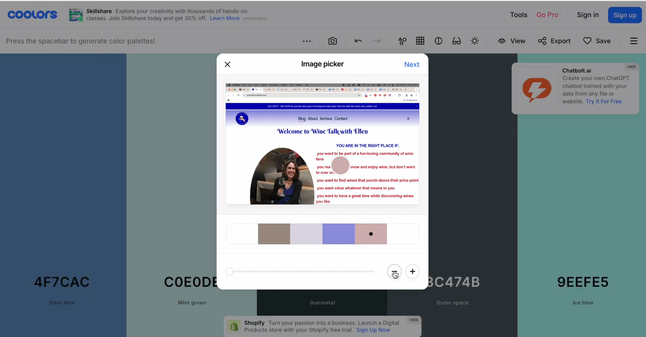
Then, I plugged it into Coolors.com to generate harmonious color palettes.
A few of the options it generated:


MY Initial pick:

💜 A grapey deep purple (which ties into the wine theme beautifully)
🤍 Soft neutrals for balance
🔥 Wine red remains the hero color
Refined SELECTIon:

Instead of the deep purple, I went for English Violet, a slightly muted shade that:
✔ Allows the red to take center stage
✔ Feels more elegant and sophisticated
✔ Creates a cozy, intimate feel—perfect for a wine-focused brand
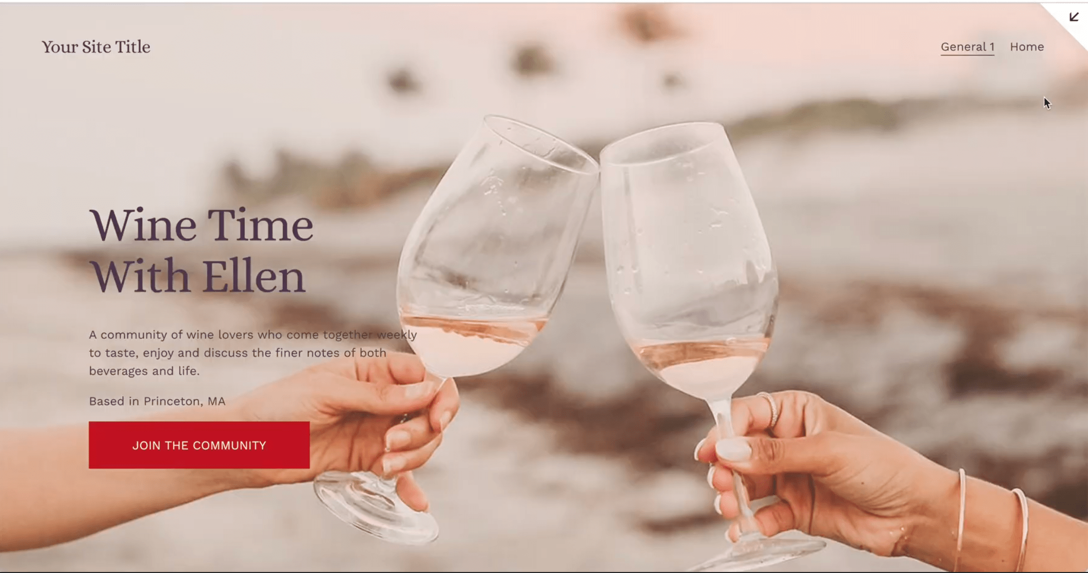
How to Use These Colors on Your Site:
🎨 Apricot & melon as background accents
🎨 English violet for subheadings
🎨 Fire brick red for call-to-action buttons
To show you how impactful color changes can be, I put together a quick redesign that uses these colors in a balanced, sophisticated way:
Mistake #3:Your Website Looks Good, But Isn’t Converting
Okay, so we’ve talked about fixing layouts and colors—but let’s be honest, none of that matters if your website isn’t generating revenue.
A beautiful website is important—it builds trust and credibility. But if visitors aren’t converting into clients or customers, something is missing.
How to Fix This
That’s exactly why I created my free training, 4 Simple Steps to Double Your Site Sales. It walks you through the biggest shifts that make a website actually work to bring in revenue—and they’re super easy to implement.
Want to make sure your website isn’t just pretty, but profitable?
Grab the free training here!
Mistake #4: No Clear SEO Strategy
Now that we’ve covered layouts and color palettes, let’s talk about something equally important: SEO and branding details that can instantly boost your website’s effectiveness.
We're diving into two real website examples from the community, covering:
SEO mistakes that hurt your visibility on Google
How to seamlessly add location-based keywords for better rankings
Fixing logo & image issues for a more polished, professional brand feel
If you want more website traffic, a cohesive brand, and a site that feels effortlessly high-end, keep reading!
The Crucial SEO Fix That Every Photographer Needs
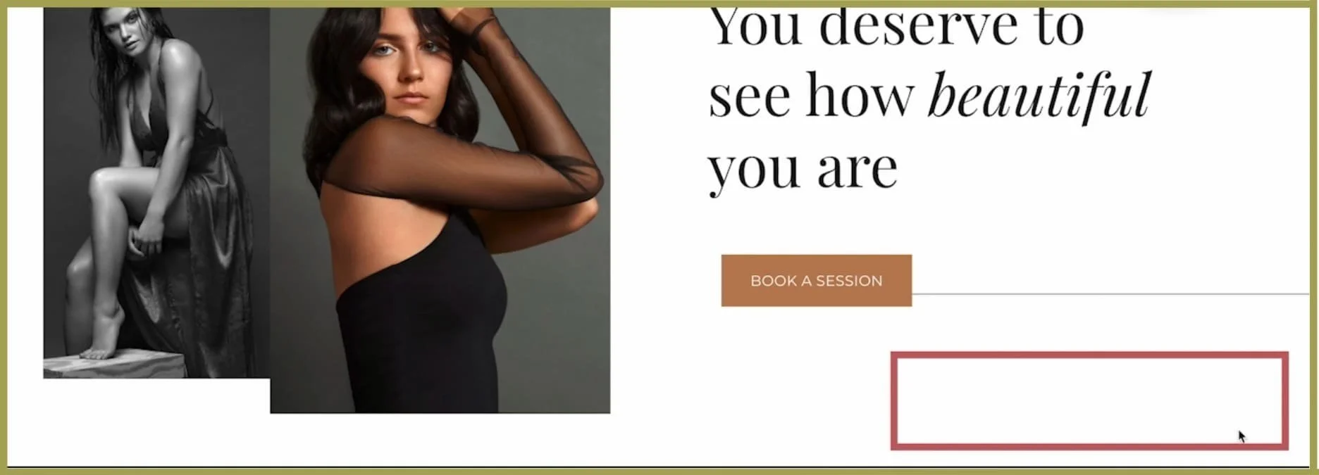
First up, we’re looking at Heather Hammer Photography.
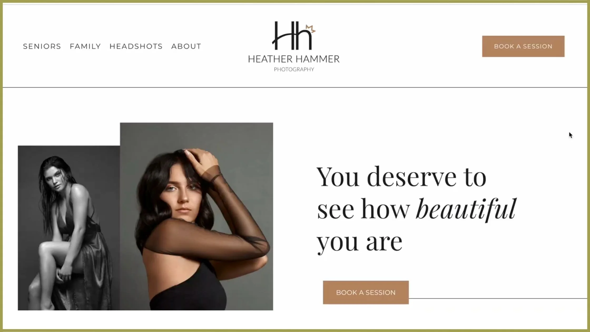
Heather, first off—beautifully designed website! ✨ Seriously, amazing job with the visuals.
But there’s one thing missing that could be hurting your search rankings in a big way…
Why Location Matters for SEO
📍 Heather, I couldn’t find where you’re located on your website.
As a photographer, your business is location-based—meaning your clients need to know if you’re in their area.
If your website doesn’t clearly state your location, Google won’t rank it when someone searches for:
🔹 “Wedding photographer in [your city]”
🔹 “Portrait photographer near me”
🔹 “Family photography in [your area]”
And that means you’re missing out on potential clients who are actively searching for your services.
Quick Fix: Where to Add Location Keywords
💡 The good news? This is a super easy fix. Here’s where you should add your location to boost your SEO:
1. Homepage
Add a small line in the header or subheading (e.g., "Louisiana-based portrait photographer")
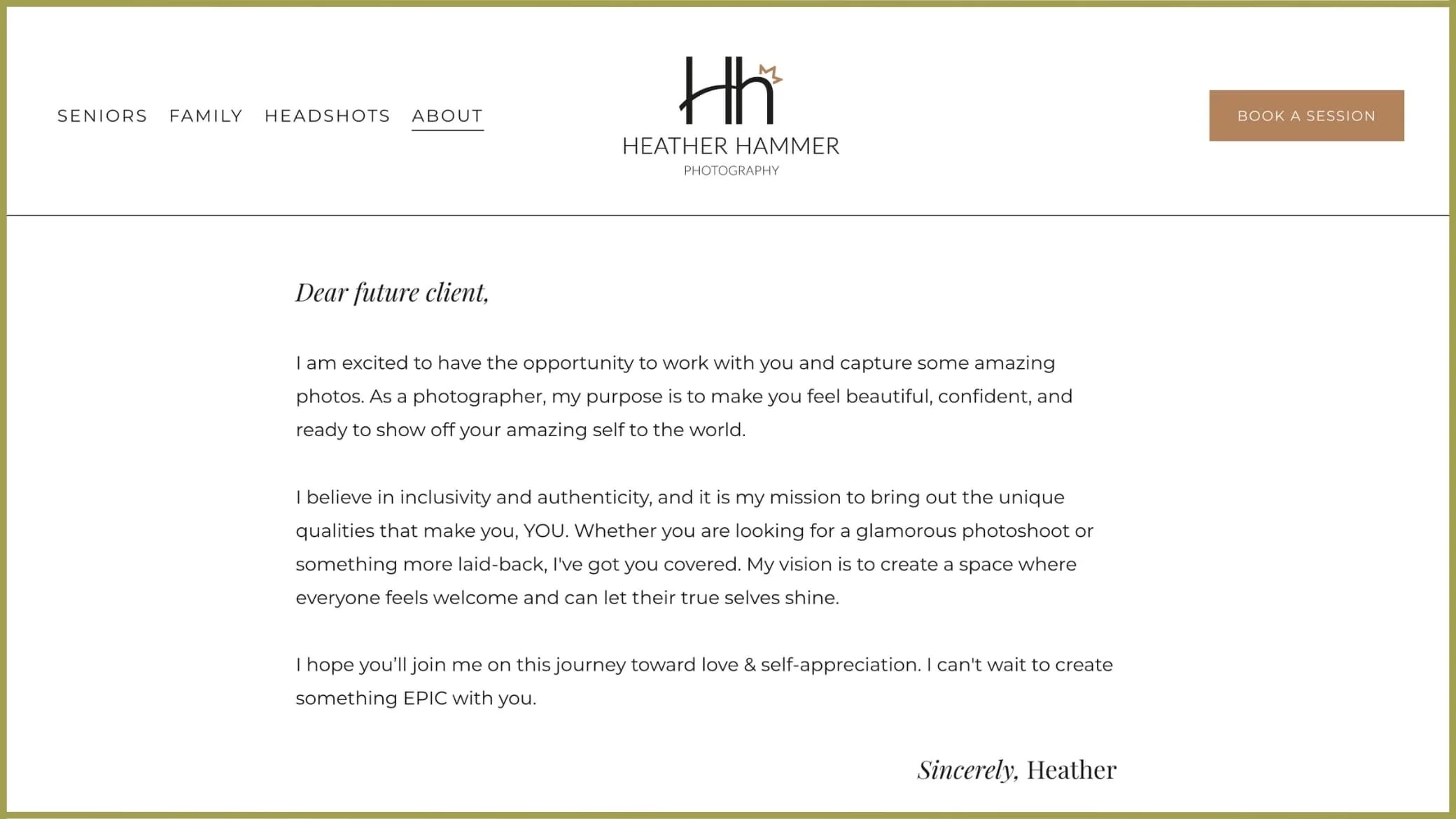
2. About Page
A natural spot to include something like “I’m a portrait & wedding photographer serving the [specific area] of Louisiana.”
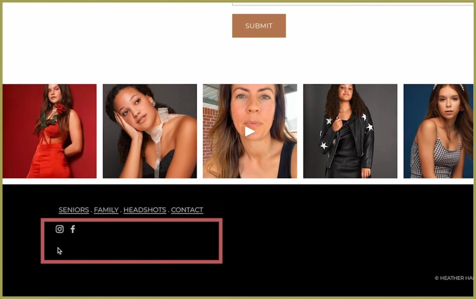
3. Footer
A simple “Serving [your city] & surrounding areas” ensures every visitor sees it
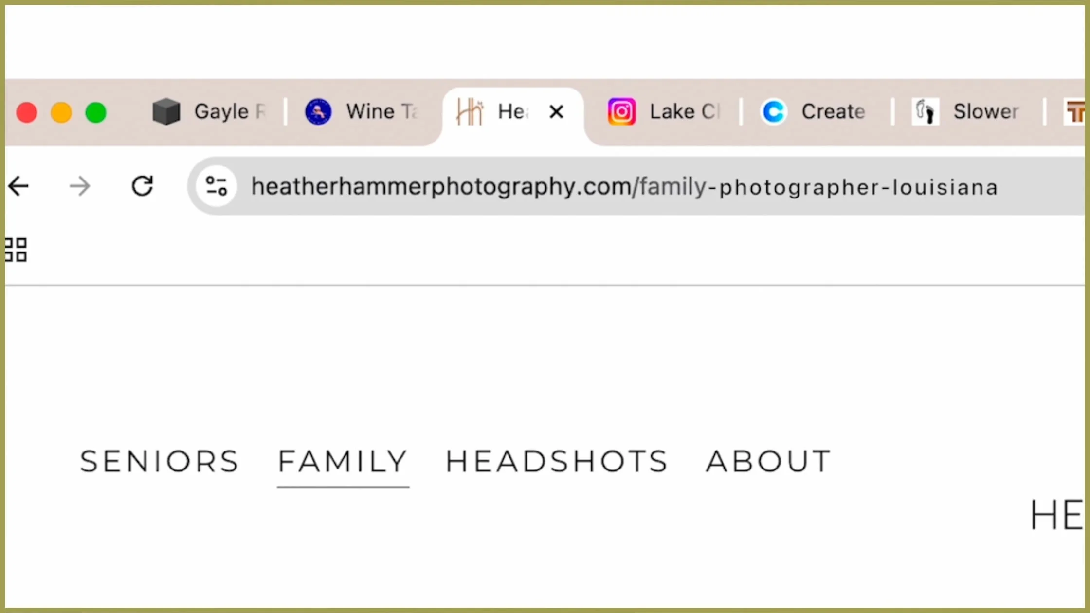
4. Page URLs
Instead of www.yoursite.com/family, use /family-photographer-louisiana
SOLUTION
🔹 Update the footer with your service area
🔹 Mention your location in the homepage header
🔹 Use location-based keywords in your URL slugs
This one tiny SEO change can make a massive impact on how well you rank in Google and how many clients find you.

Mistake #5:Inconsistent Branding That Feels Unpolished
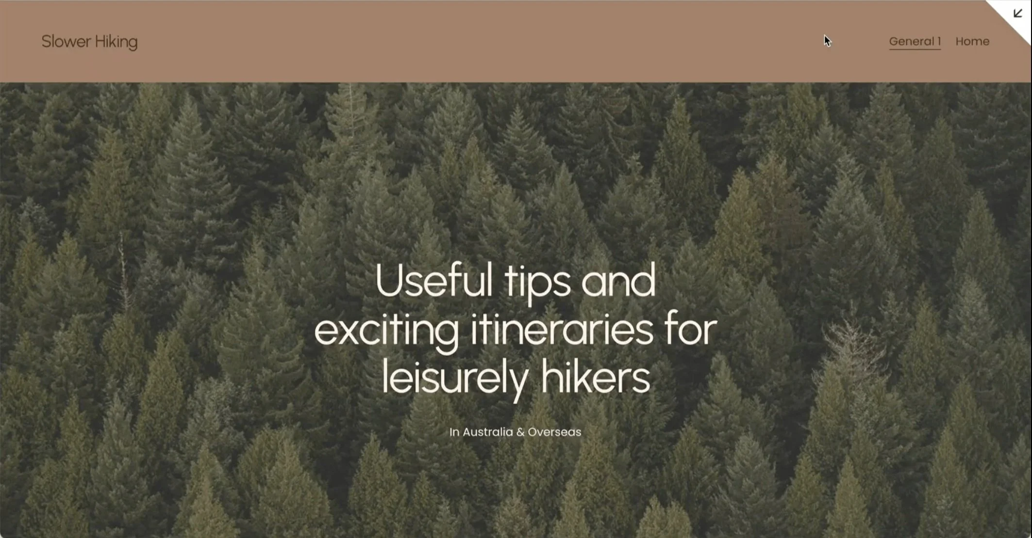
Now, let’s move to Slower Hiking—a fantastic blog by Helen and Jeff that shares their hiking adventures.

The content is engaging, well-written, and inspiring—but there are a few quick design tweaks that could make it feel even more professional and cohesive.
Fixing Logo Transparency Issues
The first thing that stands out? The logo background.
Right now, the Slower Hiking logo has a gray background, which doesn’t blend in with the site’s brown navigation bar. Ideally, logos should have a transparent background so they feel seamlessly integrated with the design.
💡 Quick Fix: If you have access to the original logo file, export it as a PNG with a transparent background.
If you don’t have the original file, you can:
🔹 Use a free tool like remove.bg to remove the background
🔹 Recreate the logo in a simple font (which I did in this case for a cleaner look)
Choosing the Right Colors for a Cohesive Brand
The earthy tones of this site work beautifully, but the gray didn’t quite complement them. Instead, I chose to:
✔ Pick one primary color and then find a perfect pairing
✔ Use warmer, nature-inspired tones that feel cohesive with the hiking theme
💡 The Result? A logo that blends seamlessly into the site, creating a more refined and professional look.
Mistake #6: Poorly Chosen or Misplaced Images
Another key branding element that instantly elevates your site? Your images.
Helen & Jeff, you’ve done an amazing job capturing your adventures! 📸 But on a few blog posts, we could swap in stronger images for an even better first impression.
Example: Lightweight Backpacking Breakfasts Post
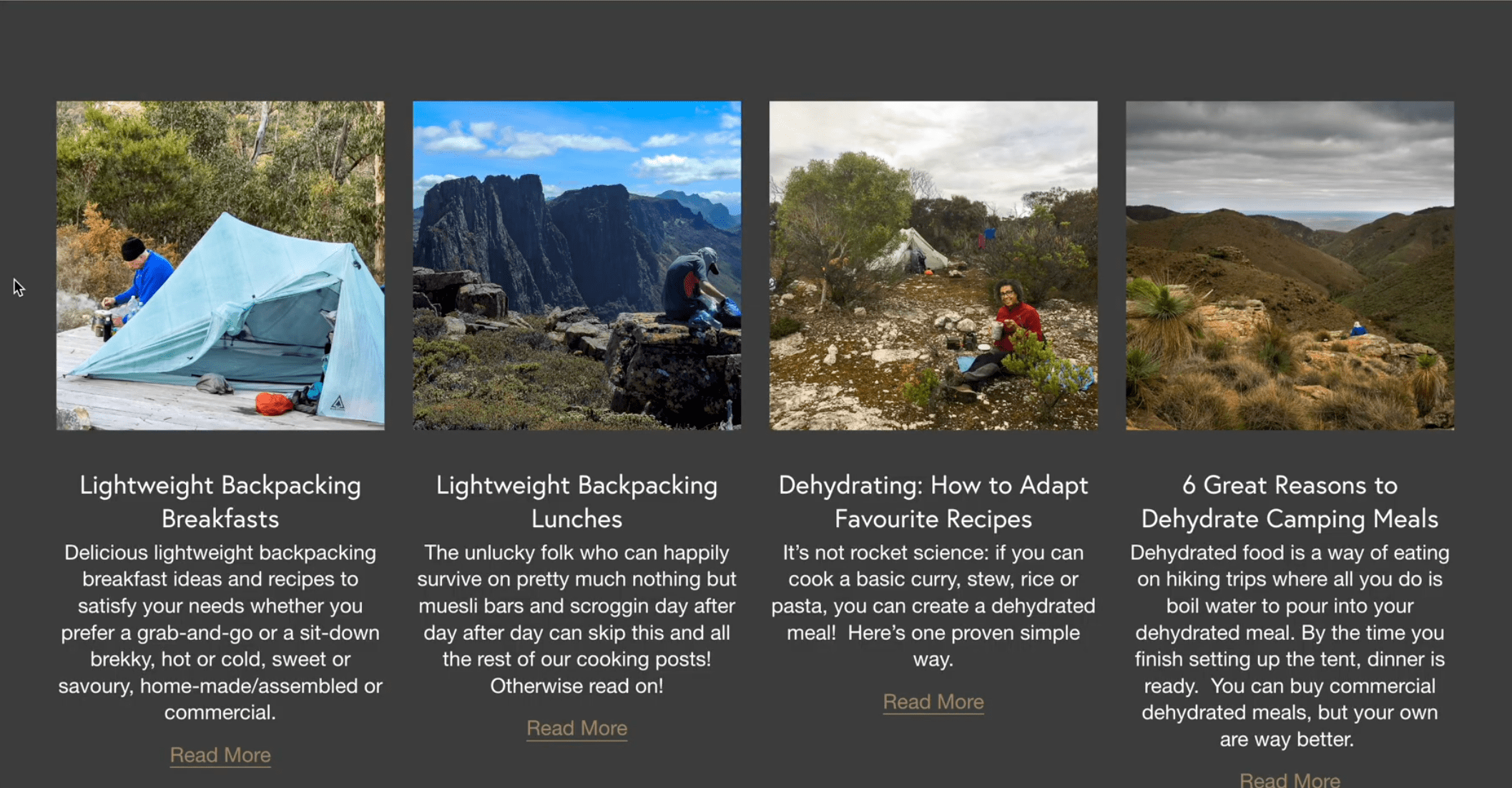
The current thumbnail for this post didn’t immediately scream “delicious breakfast”. Since images are the first thing readers notice, the thumbnail should match the topic perfectly.

✅ Inside the post, there was a much better image—a stunning outdoor breakfast shot with great lighting and an immersive feel.
💡 Switching the thumbnail to this image would:
✔ Make the post more visually appealing in previews
✔ Instantly communicate the topic (lightweight backpacking breakfasts)
✔ Feel higher quality & more professional
Small tweaks like this can make a huge impact on how polished your site looks!

Mistake #7: Text-Heavy Pages Without Visual Breaks
Now that we’ve covered SEO and branding, let’s talk about something that can make or break your website’s usability: readability.
A beautifully designed website is great, but if visitors are overwhelmed by long paragraphs of text, they won’t stick around to read them. Instead, they’ll skim—or worse, leave entirely.
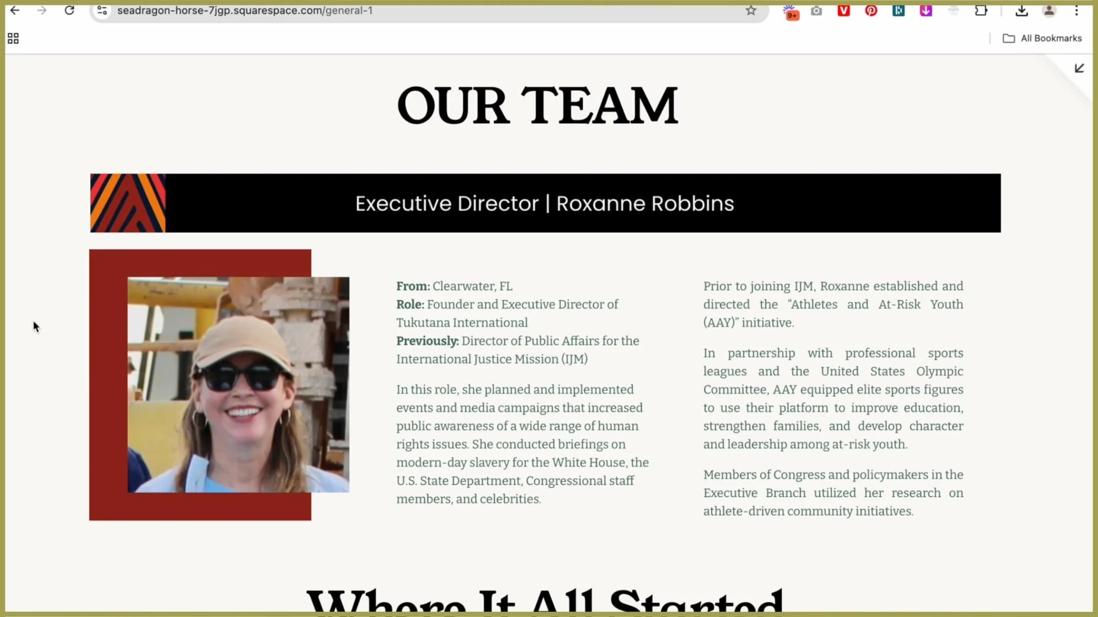
Today, we’re looking at Tukutana.org’s About Page and tackling one of the biggest challenges: how to structure long sections of text for maximum readability.
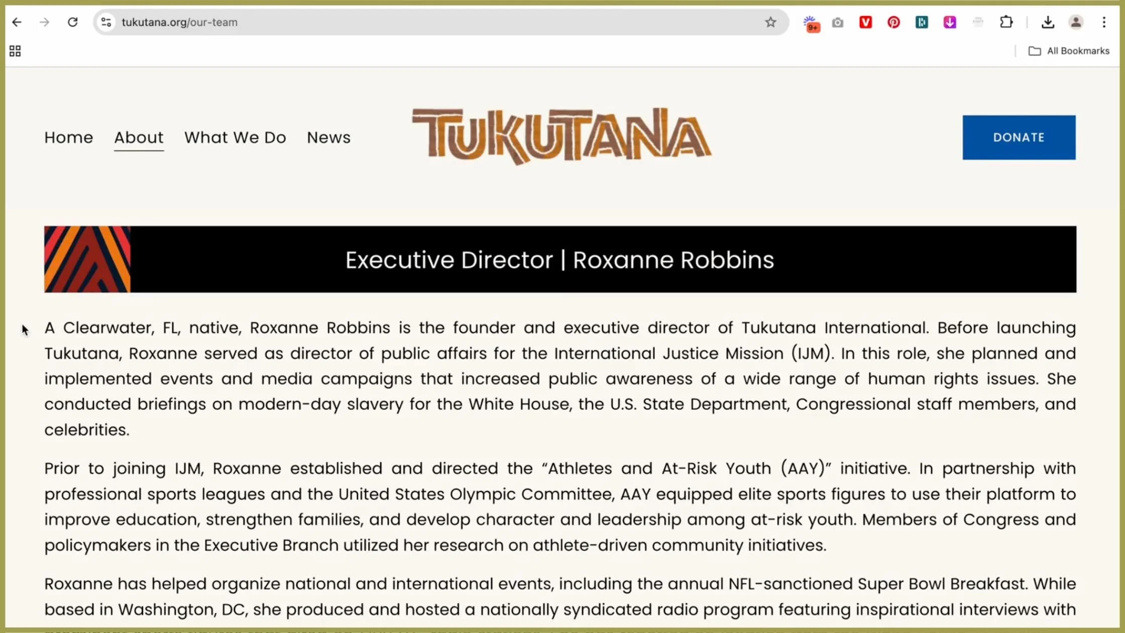
Why Long Blocks of Text Don’t Work
When your About Page (or any page, really) is filled with long, unbroken paragraphs, it creates two problems:
✔ Overwhelm – Visitors land on the page, see a wall of text, and immediately feel like it’s too much work to read.
✔ Skimmability Issues – Most people don’t read websites word-for-word—they scan for key info first. If they can’t quickly find what they need, they leave.
So how do we fix this? By making the text visually digestible and easy to navigate.
Simple Layout Fixes for Better Readability
Break Up Large Paragraphs
Long paragraphs feel like a chore to read. Instead, break them into shorter, punchier sections so that:
Visitors absorb the information quickly
The text feels less overwhelming
It’s easier to follow the story
Use Subheadings & Bolded Keywords
Most people skim first and decide later if they’ll read.
✔ Add subheadings to create natural stopping points and guide the reader.
✔ Bold important phrases to highlight key information.
✔ Use italics sparingly to emphasize certain words.
Example Fix:
Instead of:
"I started my journey in 2005 when I first discovered my love for journalism and international reporting. Over the years, I’ve worked in multiple countries, covering stories that have taken me from the depths of refugee camps to high-profile international summits."
Try this:
🗞️ A Journey Through Journalism
In 2005, I discovered my love for journalism and international reporting. Since then, I’ve worked across multiple countries, covering stories that span from refugee camps to high-profile international summits.
✔ Easier to read, easier to skim, and more visually appealing!
Use Columns or Cards for Large Text Sections
If you have a long list of achievements, instead of a solid block of text, try:
Breaking it into two columns – one for years or locations, one for descriptions
Using a card-style layout – visually separates different career highlights
Example Fix:
Instead of:
"I have spoken at major global events, including the United Nations Summit, the International Journalism Conference, the Global Women’s Forum, and the TEDx Summit in New York."
Try:
🎤 Speaking Engagements
United Nations Summit
International Journalism Conference
Global Women’s Forum
TEDx Summit – New York
✔ Bullet points & columns make it easier to scan!
Add Photos to Create Visual Breaks
📸 People connect with faces. If you mention a specific person, event, or achievement, add an image next to it.
✔ Headshots – If talking about yourself, a clear, smiling photo (without sunglasses!) makes you more relatable & engaging.
✔ Event Photos – If you’ve spoken at Olympics, TEDx, or global summits, add a photo of you on stage for credibility.
✔ Candid Lifestyle Shots – Adds depth and personality to the story.
💡 Quick Idea:
If you have a long story (e.g., your career timeline), try:
A single-column text layout in the center
Images aligned on the left or right side
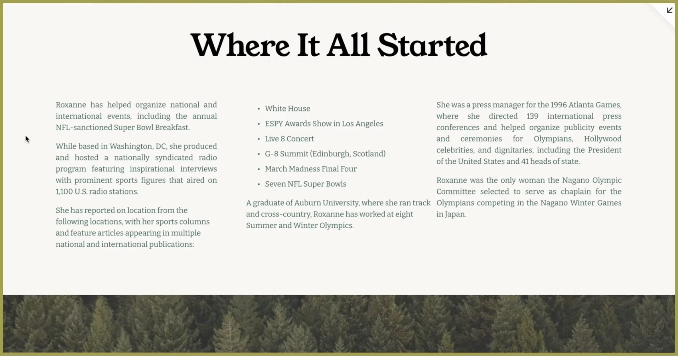
Quick Readability Fixes in Action
I made some quick tweaks to the Tukutana About Page to improve readability:
✔ Added a headshot for a personal connection
✔ Broke long paragraphs into smaller chunks
✔ Used bolding & subheadings for easier skimming
✔ Converted a long list of achievements into a bullet point format
✔ Suggested adding images for context
Example Before & After:
Before:
"I have worked with major news organizations, covered global conflicts, and reported on international diplomacy. My experience includes investigative journalism, field reporting, and public speaking at international forums. I have presented at the Olympics, TEDx, and UN conferences, and my work has been featured in various global publications."
After:
🎤 Global Reporting & Public Speaking
I’ve spent my career covering international conflicts, global diplomacy, and investigative journalism.
I have spoken at major events, including:
Olympics – Field Reporter
TEDx Summit – Speaker
United Nations Conference – Panelist
International Journalism Forum – Presenter
📸 (Insert speaking event image here!)
✔ The new version is concise, scannable, and visually engaging!
The Power of Readability
If you want your story to resonate, your achievements to stand out, and your website visitors to stay longer, you need readable, skimmable, and engaging text layouts.
Break up long paragraphs
Use subheadings & bold text for emphasis
Convert lists into columns or bullet points
Incorporate images for visual interest
Final Thoughts: Your Website, Elevated
At this point, you now know exactly why your website felt "off"—and how to fix it.
By making these small but powerful tweaks, your site will instantly feel:
✔ More polished – No more clunky layouts or awkward color pairings.
✔ More cohesive – A design that flows seamlessly from section to section.
✔ More put together – Giving visitors a clear, elevated experience.
But here’s the thing…
If you want your business to not just look okay, but genuinely high-end and expensive, there’s actually a bit more to it.
✨ There are 6 key design rules that instantly elevate a website—making it look high-end, refined, and professional.
📌 Click here to watch my video on 6 Design Rules to Instantly Make Your Website Look Expensive. You are going to love it!
